
As our brains process information, we constantly make comparisons. It’s how we decide if something is good or bad—by it being better or worse than something else. However, like apples and oranges, not all things can readily be compared, even if they appear similar enough on the surface. We often make this mistake with data because we want to be able to draw simple conclusions. But when our goal is accurate information, it’s imperative to look at presentations of data through a critical lens by applying these basic strategies.
So who’s better?
Let’s say you wanted to determine whether Library A or B was doing a better job at reaching its community. To do so, you compare annual visits at both. This chart would lead you to conclude Library B has much more annual traffic and is therefore reaching more of its community than Library A. But are Library A and B comparable?
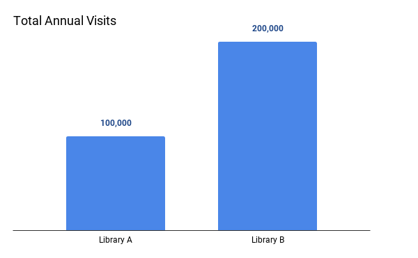
Library A serves a population of 5,400 while Library B serves a population of 30,500. When making comparisons among different populations, data should be represented in per capita measurements. Per capita simply means a number divided by the population. For instance, when we compare countries’ Gross Domestic Products (GDP), or value of economic activity, we usually express it as GDP per capita because it would be misleading to compare China’s GDP to that of Denmark. China’s GDP trounces Denmark’s, but that doesn’t mean Denmark’s economy is struggling. China is larger both in terms of the land it covers and the number of people that live there. It would be really weird if they had similar GDPs without the per capita adjustment. The same is true in this example. Take a look at how we draw an entirely different conclusion when total visits are expressed in a per capita measurement.
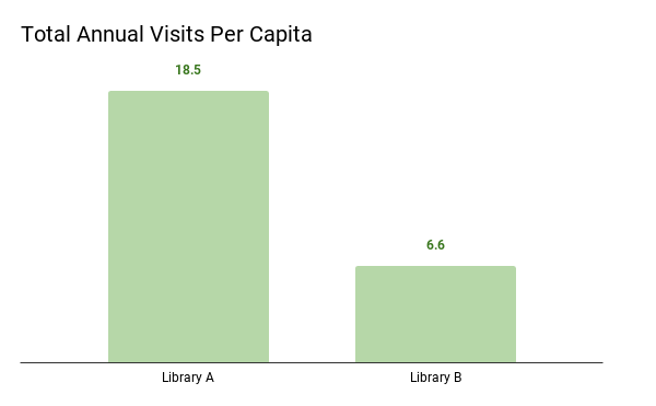
*Due to a 2-month closure, Library B’s data was only collected over a 10-month period
Now we can see that Library A has 18.5 visits per person i(100,000/5,400), whereas Library B only has 6.6 visits per person (200,000/30,500). These are the same data, but expressed in more comparable terms.
Let’s say Library B also closed for two months to do some construction on their building. Therefore, their annual visits account for 10 months of operation, not 12. Contextual information like this – which has a direct effect on the numbers – needs to be clearly called out and explained, like in the example above.
Breaking it down…
To check for comparability, it’s helpful to keep three things in mind: completeness, consistency, and clarity.
Completeness: are the data comparing at least two things?
It would be incorrect to say “Library B has 100,000 more visits.” More visits than…Library A? Than last year? Also be wary of results indicating that something is better, worse, etc. without stating what it is better or worse than.
Consistency: are the data being compared equivalent? And even if they appear equivalent , what information is needed to confirm this assumption?
One of the best examples of inconsistency occurs when comparing data from different populations, particularly when we focus on total counts. “Totals” are often a default metric because it’s simple for a range of audiences to understand, but it can be very misleading, like in the first chart above. By expressing the data as per capita measurements, we can account for population differences and create a basis of similarity. Additionally, even if data appear similar enough to compare, you also need to review how they were collected. Any reliable research will include these details (big red flag if it doesn’t !). For instance, it would be important to know that Library A and B were counting visits in the same way. If Library A is counting one week during the summer and multiplying that by 52 that wouldn’t be consistent with Library B who is counting during a week in the winter.
Clarity: Is it obvious and clear what is being compared?
Data visualizations allow our brains to interpret information quickly, but that also means we may jump to conclusions. Be a critical data consumer by considering what underlying factors might also be at play. The second chart above clarifies that two months of data were missing from Library B. This could be one reason why Library B’s total visits per capita were so much lower than Library A’s. Also beware of unclear claims supposedly supported by the data, like “Library A has higher patron engagement than Library B.” Perhaps Library A defines engagement in terms of number of visits, but Library B’s definition is based on material circulation and program attendance. The data above do not provide enough information to support a comparable claim on engagement.
Comparisons are messy. Whether in library land or elsewhere, keep in mind that comparisons are always tricky, but also very useful. By engaging critically using the strategies above, we CAN compare apples and oranges. They are both fruit afterall…
LRS’s Between a Graph and a Hard Place blog series provides strategies for looking at data with a critical eye. Every week we’ll cover a different topic. You can use these strategies with any kind of data, so while the series may be inspired by the many COVID-19 statistics being reported, the examples we’ll share will focus on other topics. To receive posts via email, please complete this form.