
It’s hard to know who you can trust out there. “Fake news” is now a prevalent concept in society and the internet makes it possible for anyone to publish—well, anything. As library professionals, you’ve probably already acquired a great deal of experience determining the credibility of sources. Many of the same skills are needed to evaluate the credibility of data. So amid the bombardment of new (sometimes conflicting) data out there, here are some questions to ask when verifying sources and checking for bias. Although not fool-proof, these strategies can help you avoid misleading information and false claims.
Let’s establish something important upfront: ANY scientific paper, blog, news article, or graph can be wrong. No matter where it’s published, who wrote it, or how well supported are the arguments. Every dataset, claim, or conclusion is subject to scrutiny and careful examination. Sounds like a lot of work? As we incorporate these strategies into our everyday consumption of information, they become second-nature, like checking your blind spots when changing lanes in traffic. You don’t have a sticky note on your dashboard reminding you to do it, but you do it without even thinking about it.
When reviewing any kind of research, we often think of the five Ws—where, when, who, what, and why. The same can apply here.
Question 1: Where are the data published?
Imagine a spectrum of credibility with reputable scientific journals on one end and blogs on the other. Government, public sector, and news media sources fall somewhere in between. What distinguishes one source from another on the spectrum is their verification process. Most journal articles undergo peer-review, which checks if a researcher’s methods are sound and the conclusions consistent with the study’s results. But be aware of “predatory journals” that charge authors to publish their research. Here’s a nifty infographic to help tell the difference.
On the other end of the spectrum, anyone can create a blog and publish unfounded claims based on questionable data. Somewhere between these two extremes are government and public-sector (think tanks, non-profits, etc.) sources. It wouldn’t make much sense for an organization to publicize data that doesn’t support their mission. So while the data might be accurate, it might not contain the whole story. On the other hand, objectivity serves as a foundation for journalism, but the speed at which journalists are forced to get the news out there means mistakes happen. For instance, data might be misrepresented to visualize the attention-grabbing portion of the story leading to distortions in a graph’s axis. When mistakes happen, it’s a good sign if the news source posts retractions and corrections when appropriate.
Question 2: When were the data collected?
I was looking at a dataset recently on the use of technology in a given population. Only 27 percent accessed the internet and 74 percent had a VCR in their home. In this case it’s probably safe to assume the data are outdated, but it might not always be so obvious. Additionally, some data become outdated faster than others. For instance, technology and medicine can change day to day, but literacy rates don’t skyrocket overnight. Always try to contextualize information within the time it was written.
Question 3: Who are the authors?
Part of the reason we aren’t talking specifically about COVID-19 data is because we aren’t experts in the fields of public health or epidemiology. When looking at data, take a minute to assess who conducted the research. Google their name to find out if they’re an expert on the topic, have published other articles on the subject matter, or are recognized as a professional in a related field.
Question 4: What are their sources?
Police don’t take a suspect’s alibi at face value, they corroborate the story. Sources should also corroborate their claims by citing other credible sources. Journal articles should have a lengthy works cited section and news articles should name or describe their sources. Charts and graphs usually cite a source somewhere underneath the visual. For primary data, try to find a methodology section to check things like how the data were collected and if there was a sufficiently large sample size.
Question 5: Why did they publish this?
For years, one of the world’s largest soft drink companies funded their own research institute to publish studies that said exercise was far more important than diet in addressing obesity. Their motivation? As obesity levels rose globally, they wanted to ensure people would continue buying their products. In short, everyone has a motivation and it’s our job to uncover it. A good place to start is by tracing the money trail. Who is funding the publication or study? Do they have an incentive (political, business, financial, to gain influence, etc) other than getting the data out there? Use this information to decide what kinds of bias might be impacting the findings.
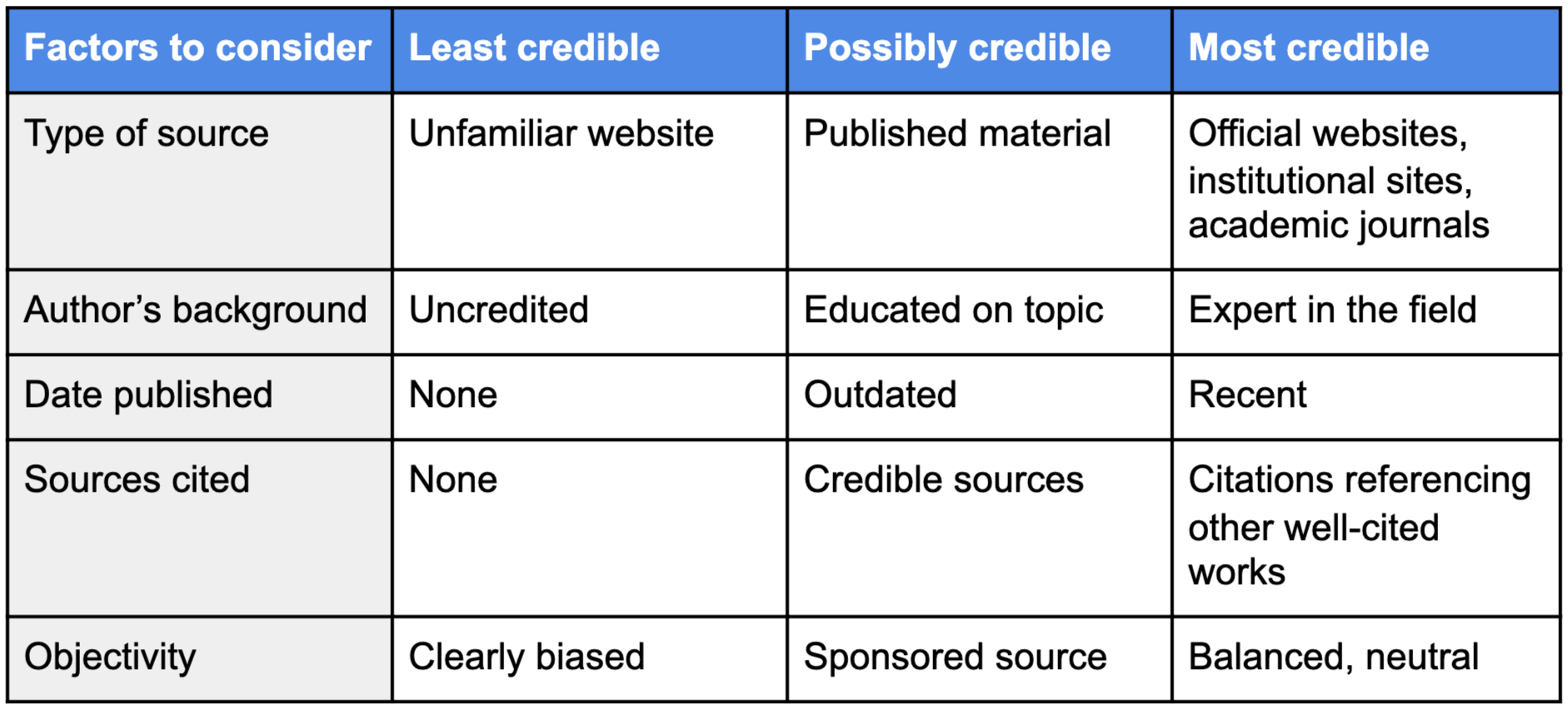
Whew, that was a lot. Here’s a simple chart that summarizes the info if you need a review. Just remember, it’s hard to ever know if something is 100% accurate. By asking these questions, we aren’t just accepting information on its face, but rather taking the time to review it critically.
| Factors to consider | Least credible | Possibly credible | Most credible |
|---|---|---|---|
| Type of source | Unfamiliar website | Published material | Official websites, institutional sites, academic journals |
| Author's background | Uncredited | Educated on topic | Expert in the field |
| Date published | None | Outdated | Recent |
| Sources cited | None | Credible sources | Citations referencing other well cited works |
| Objectivity | Clearly biased | Sponsored source | Balanced, neutral |
LRS’s Between a Graph and a Hard Place blog series provides strategies for looking at data with a critical eye. Every week we’ll cover a different topic. You can use these strategies with any kind of data, so while the series may be inspired by the many COVID-19 statistics being reported, the examples we’ll share will focus on other topics. To receive posts via email, please complete this form.