With the official start of summer just a couple of weeks away and students on summer vacation, public libraries are focused on kicking off their summer reading programs! I have fond memories of participating in these programs and competing for fun prizes many years ago, but summer reading doesn’t have to end with childhood. As we will see in the visualizations below, many libraries across Colorado have programs for teens and adults as well!
In the summer spirit of spending more time in the sunshine and less time staring at a screen, this post will share a few tools in Excel that can help you quickly display data trends without the time consuming process of building fully developed charts and graphs. I began developing content for this post by exploring sparkline options in Excel, but along the way I discovered additional options in Excel, similar to sparklines, which can convey information often just as effectively!
Sparking Concerns
Before we get too far ahead of ourselves, however, let’s begin with sparklines. Sparklines are small depictions of data that appear within a cell near the numeric data. Their simplicity sets them apart from many charts, as they don’t often include axes or coordinates. Being such a simple sketch of the data, there are many circumstances and audiences for which they may not be appropriate. They break many of the “rules” for traditional visualizations because they lack the context needed in more complex visuals, making them susceptible to misinterpretation. Let’s take a look at Figures A and B below to explore some of their strengths and weaknesses.


Figures A and B show the same table with the same data, but the sparklines are formatted slightly differently in each. In both figures, the three right columns show the total number of children, teen, and adult summer reading registrants in all Colorado public libraries from 2018 to 2022. The sparklines are included in the bottom row, each one depicting the trajectory of the data in its column over five years. The sparklines allow the reader to quickly see that children’s summer reading program registrations have made the best recovery since COVID-19, although in 2022 the number of registrants had not yet returned to pre-pandemic levels. The number of teen registrants in Colorado also began to recover in 2021 but declined again in 2022. The number of adult registrants has only slightly increased since dropping in 2020 due to COVID-19. These are all observations that would take more time to decipher, or might be overlooked entirely, if this table was presented without the sparklines.
Playing With Fire (aka Axis Options)
Both Figures A and B are included in this post to show how Excel automatically sets a sparkline’s axis within a cell and that adjusting this axis can impact how sparklines are interpreted. Even though visible axes do not appear with sparklines, a sparkline still needs to be plotted along a minimum and maximum value within the cell. When sparklines are first inserted into Excel, the bottom of the axis is automatically set at the smallest number in the data set, and the top of the axis is automatically set at the largest number in the data set. This causes the sparkline to take up the entire area of the cell from top to bottom. The sparkline is a visualization of where each value falls within the range of data, or in other words, the distribution of the data in relation to the minimum and maximum of the data set. This differs from most regular charts, where it’s typical to start the x- and/or y-axes at zero and not the minimum value of the data.
Figure A contains the sparklines that are initially produced with these default axis settings. Unfortunately, this makes it difficult to actually compare the differences in the data fluctuations over time between each column. For example, between 2019 and 2020 teen summer reading registrants dropped by 76% but adult registrants only declined by 37%. In Figure A, the declines in participation for teens and adults look similar because the automatic axis settings cause each sparkline to take up the entirety of the cell from top to bottom. Luckily, Excel allows you to control these settings which can allow for more accurate comparisons between sparklines. In Figure B, the axis for all three sparklines is set to start at zero. This makes it much clearer that the number of adult registrants declined less dramatically than teen registrants between 2019 and 2020.
Beyond Lines
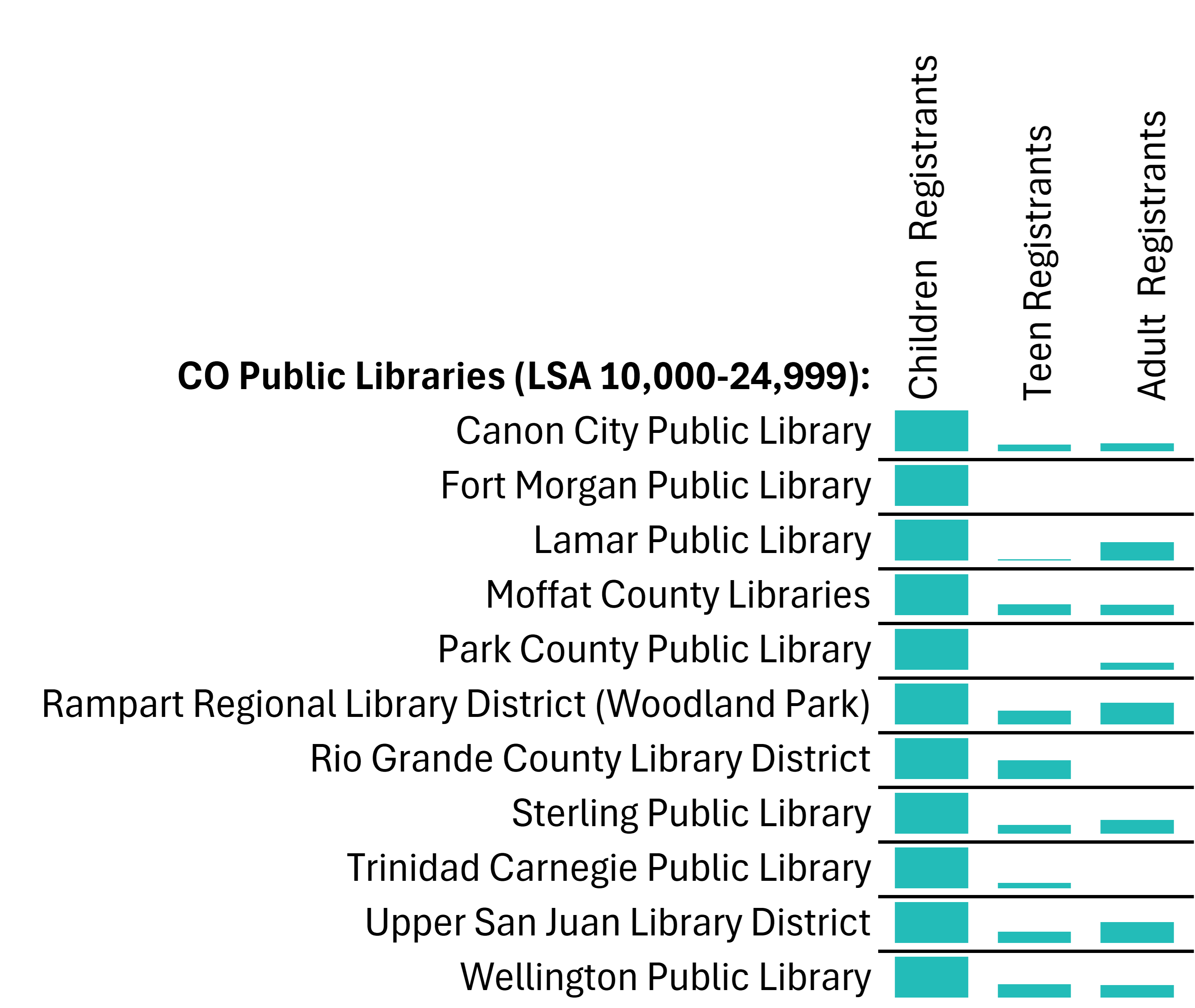
Sparklines don’t actually have to be lines at all! In Excel there are three different sparkline options: lines, vertical bars, and win/loss visuals. As with full size charts, lines are best to show trends over time and bars are best for categorical comparisons. With this in mind, I tried using sparkline bars to compare the number of children, teen, and adult summer reading participants for individual libraries in the year 2022. Figure C shows the results for libraries with an LSA (Legal Service Area) population of 10,000-24,999 after I changed the axis minimum to zero.

Sparklines are best for comparing where values fall within a data set, and Figure C accurately shows the distribution of registrants between children, teens, and adults for each individual library in 2022. For example, Lamar Public Library had almost half as many adult summer reading registrants as children and seven teen participants. However, as explained above, the top of each cell is still automatically set at the maximum number of each data set. This is why the bars for children registrants are all the same length for each library in Figure C. Each library had more participating children than teens or adults, making the number of children summer reading registrants the maximum number in each data set. If a library did not report the number of registrants in an age group for 2022, no bar is present.

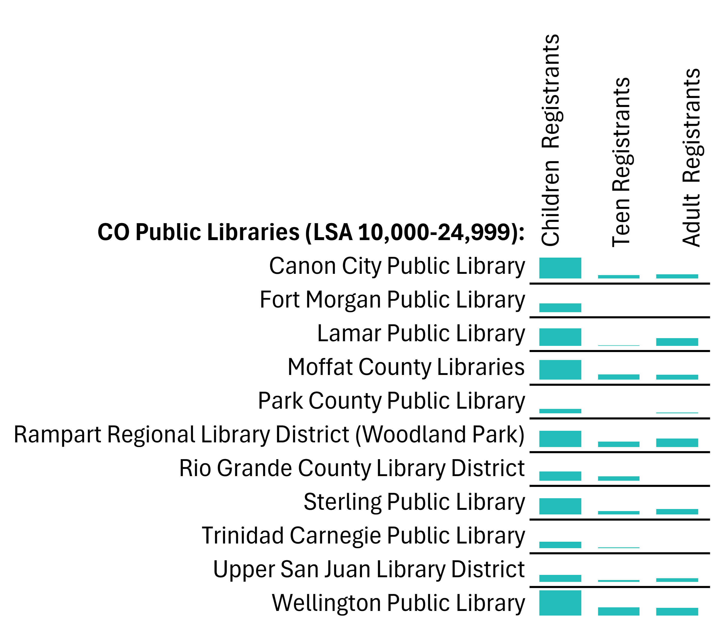
For some data sets, comparisons can be made across sparkline visuals by selecting the vertical axis maximum option “same for all sparklines.” This sets the top of each sparkline axis at the maximum for the entire data set. Figure D is an example of this setting in use. The only bar in Figure D that takes up the entire cell is the bar for Wellington Public Library’s children registrants because, with 360 children participating in summer reading, this is the highest number of registrants across all three age categories for this entire LSA grouping. Using the same axis settings for a group of sparklines works for peer libraries when the data is not too widely distributed. This setting is less practical to use for data sets with a wide range because high outlying maximum values can shorten the rest of the bars, making them look insignificant. If you do not have the same axes between sparklines, such as in Figure C, then the sparklines can only be used to visualize the distribution of the data for each library individually, not across libraries.
Beyond Sparklines
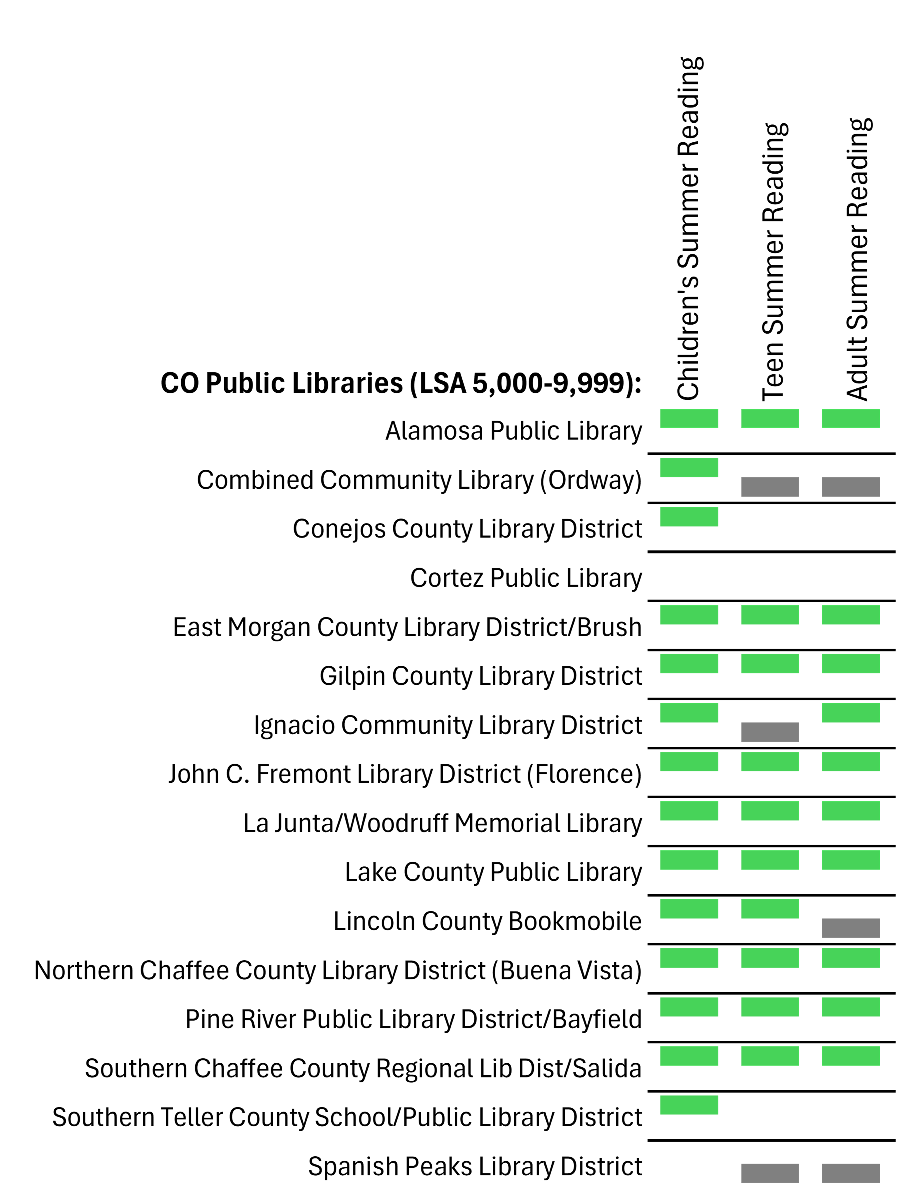
Now that we’ve run through some examples of how to adjust the axis minimum and maximum to avoid misleading line and bar sparklines, let’s touch on the final type of sparkline option in Excel, win/loss visualizations, and then wrap up this post with some alternatives to sparklines. Win/loss sparklines are best used when a data set contains two main opposing responses. This could quite literally be a sports team’s record of wins and losses, but responses to simple yes or no questions can work as well. Figure E below shows libraries’ responses to the question of whether or not they held summer reading for children, teens, and/or adults. To use this type of sparkline, I first had to prepare the data by replacing all positive “yes” responses with the number 1 and replacing all the negative “no” responses with a -1. The higher rectangles indicate positive responses and the lower rectangles represent the negative responses. Using two contrasting colors also helps differentiate the two.


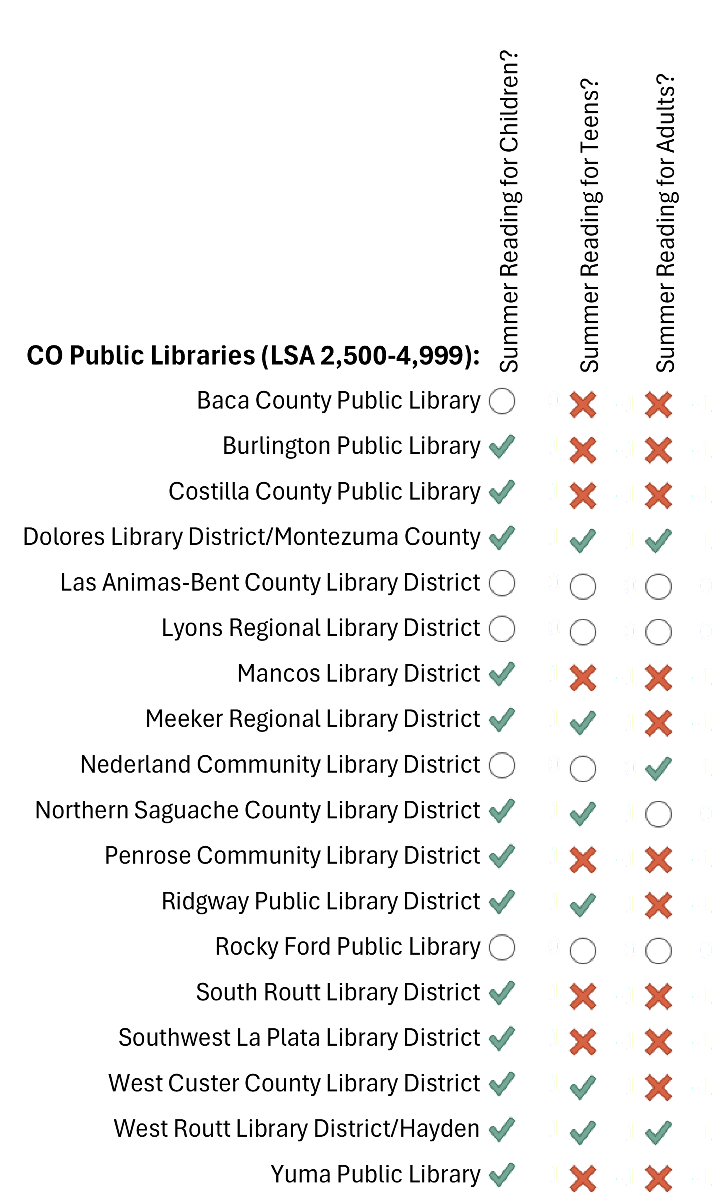
While the win/loss sparklines in Figure E work for this type of data (the green block indicates a “yes” and the gray block a “no”), I prefer the icons used in Figure F to convey the responses. The icons in Figure F are more universal (accessible) than Figure E’s sparklines, and the different shapes make them easier to differentiate. These icons can be found under the “conditional formatting” dropdown of the home tab in Excel. Here there are options for data bars, color scales, and icon sets. These simple ways to highlight data trends differ from sparklines because they appear in the same cell as the data. In Figure F, I’ve hidden the data next to each icon because it is a series of “1”, “-1”, and “No Data” entries that don’t add any additional value to the icons already used.
Sparking Ideas
If you spend time with data sets in Excel, understanding how to use both sparklines and conditional formatting to your advantage opens up many new ways to identify and visualize patterns in a data set. Figure F is just one example of many simple icon sets available in Excel, and if a predetermined icon set doesn’t immediately fit the needs of your data, you can edit the icons used and the data range they are used for to customize the visuals.
Although there are many different options for customization, it is just as important to understand the limitations of both sparklines and conditional formatting to know when to avoid using them altogether. Without axes or labels, sparklines and conditional formatting can lack key context, especially if your audience doesn’t understand the axis settings used. I often find them more helpful as an internal tool to help identify patterns and trends within a data set which can then point to the correct visualization to spend time creating and sharing for an external audience.
There were many more conditional formatting options than could be included in this post, but we hope this sneak peek has sparked some curiosity and shone a light on new ways to approach data in Excel. Although this post was initially intended to show quick and easy Excel tools, it actually took quite a bit of time to understand the best uses for sparklines, their axis settings, formatting within the cells, and when conditional formatting visuals can be just as (if not more) helpful. If you have any questions on how I created these visualizations or would like more information on using either sparklines or conditional formatting in Excel for your library data, please don’t hesitate to contact the Library Research Service. Thanks for reading!
LRS’s Colorado Public Library Data Users Group (DUG) mailing list provides instructions on data analysis and visualization, LRS news, and PLAR updates. To receive posts via email, please complete this form.