
Correlation ≠ causation
Data are pieces of information, like the number of books checked out at the library or reference questions asked. Those pieces of information are simply points on a chart or numbers in a spreadsheet until someone interprets their meaning. People create charts and graphs so that we can visualize that meaning more easily. However, sometimes the visualization misleads us and we come to the wrong conclusions. Such is the case when we confuse correlation (a statistical measurement of how two variables move in relation to each other) with causation (a cause-and-effect relationship). In other words, we assume one thing is the result of the other when that might not be the case.
Strong correlation = predictability
The confusion often occurs when we see what’s called a strong correlation—when we can predict with a high level of accuracy the values of one variable based on the values of the other. As an example, let’s say we notice our library is busier during the hotter months of the year, so we start writing down the temperature and number of people in the library each day. Our two variables are temperature and number of people. A graph representing these data might look like this:
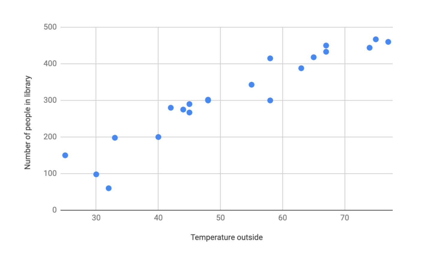 This graph is called a scatterplot, and researchers often use it to visualize data and identify any trends that might be occurring. In this case, it looks like as the temperature increases, more people are visiting the library. We would call this a strong positive correlation, which means both variables are moving in the same direction with a high level of predictability.
Correlation = positive or negative; weak or strong
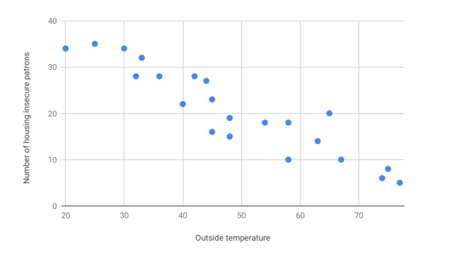
You can also have a strong negative correlation, which would show one value increasing as the other decreases. It would look something like this, where the number of housing insecure patrons in the library are decreasing as the temperature outside increases.
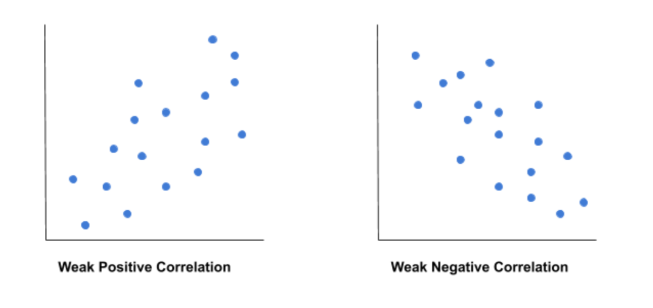
 The closer the points are to forming a compact sloped line, the stronger the correlation appears. If the points were more scattered, but we could still see them trending up or down, we would call that a “weak” correlation. In a weak correlation the values of one variable are related to the other, but with many exceptions.
Correlation = a statistical measurement known as r
Without getting too deep into statistical calculations, you can determine how strong a correlation is by the correlation coefficient, which is also called r. Values for r always fall between 1 and -1.
- The closer r is to 1, the stronger the positive correlation is. In the first example graph above, if r = 1, this would mean there is a uniform increase in temperature and patrons visiting the library, with no exceptions. An 80-degree day would always have more visitors than a 75-degree day. The points on the graph would form a straight line sloping up.
- The closer r is to -1, the stronger the negative correlation is. In the second example graph above, if r = -1, this would mean there is a uniform increase in temperature and decrease in housing insecure patrons visiting the library, with no exceptions. A 40-degree day would always have less housing insecure patrons than a 35-degree day. The points on the graph would form a straight line sloping down.
- The correlation becomes weaker as r approaches 0, with a value of 0 meaning there is no correlation whatsoever. The change of one variable has no effect on the other. In the first example above, if r = 0, one 80-degree day may have more visitors than a 40-degree day, whereas a second 80-degree day may have less visitors than a 40-degree day. There is no consistent pattern.
Correlation = an observed association
Let’s focus on the first chart. If we did this calculation, we would find that r = 0.947. Should we conclude that high outside temperatures cause more people to visit the library? Does that mean we should crank up the air conditioning so we can draw in more visitors? Not so fast.
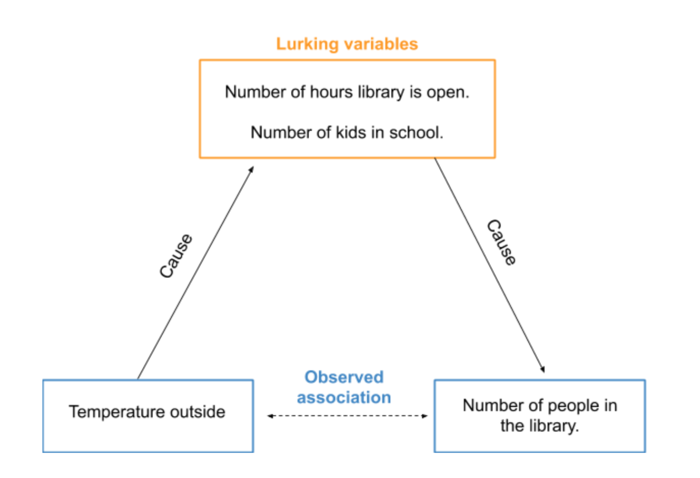
All we can conclude from these data is that there is an association between the outside temperature and people in the library. It’s a good first step to figuring out what is going on, but it’s not possible to conclude temperature causes people to visit or not visit the library. There could be other causes at play. We call these lurking variables.
Correlation (might) = something else entirely
A lurking variable is a variable that we have not measured, but affects the relationship between the other two variables (outside temperature and number of people in the library). Warmer weather usually occurs in the summertime when kids are out of school. So the increase in the number of people could be because of your summer reading program and kids having more time to come visit. The temperature outside might also affect the hours of your library. Did you have to close often during the winter because of snowstorms? Maybe you operate longer hours in the summer because you know it’s busier that time of year.
The point of the previous example is to show that association does not imply causation. You could find support for a cause-and-effect link by asking patrons their reasons for coming to the library through surveys or interviews. However, only by conducting an experiment can you truly demonstrate causation.
Correlation = a starting point, not a conclusion
Before I leave you, there’s one very important point to make. Sometimes the best we can do is say there’s a correlation between these data and that’s it. In the real world, dealing with real people, it can be difficult or controversial to investigate causation through experiments. For instance, does education reduce poverty? There’s a strong correlation, but we can’t run an experiment where we educate one group of children and withhold education from another. Poverty is also a really complex issue and it’s difficult to control for all other interacting variables. In this case, and many others, researchers use the observed association as a first step in building a case for causation.
LRS’s Between a Graph and a Hard Place blog series provides strategies for looking at data with a critical eye. Every week we’ll cover a different topic.You can use these strategies with any kind of data, so while the series may be inspired by the many COVID-19 statistics being reported, the examples we’ll share will focus on other topics.