 With great power comes great responsibility—that’s how I feel about data visualizations. Good ones help readers quickly understand the data and can convey an important message to a lot of people. However, bad data visualizations can intentionally or unintentionally mislead, causing us to come to the wrong conclusions. In this multi-part post, we’ll unpack some of the most common mistakes and give you the tools to spot them.
Omitting the baseline
Imagine you’re telling someone the plot of a novel, but you start in the middle. All of the sudden the protagonist slays the dragon, which is a huge jump from introduction to climax. The character arc would feel pretty extreme, right? This is the literary equivalent to omitting the baseline in data visualizations.
Omitting the baseline means the y-axis (height of the graph) doesn’t start at zero, resulting in a truncated graph. Truncated graphs might be unintentionally used to save space or intentionally done to cause one group to look better than it should. Take a look at the truncated graph below. The creator of this visualization (me) made a design choice to start the y-axis at 3,000 instead of zero because all of the data were around 3,000. Then it’s easier to see the differences right?
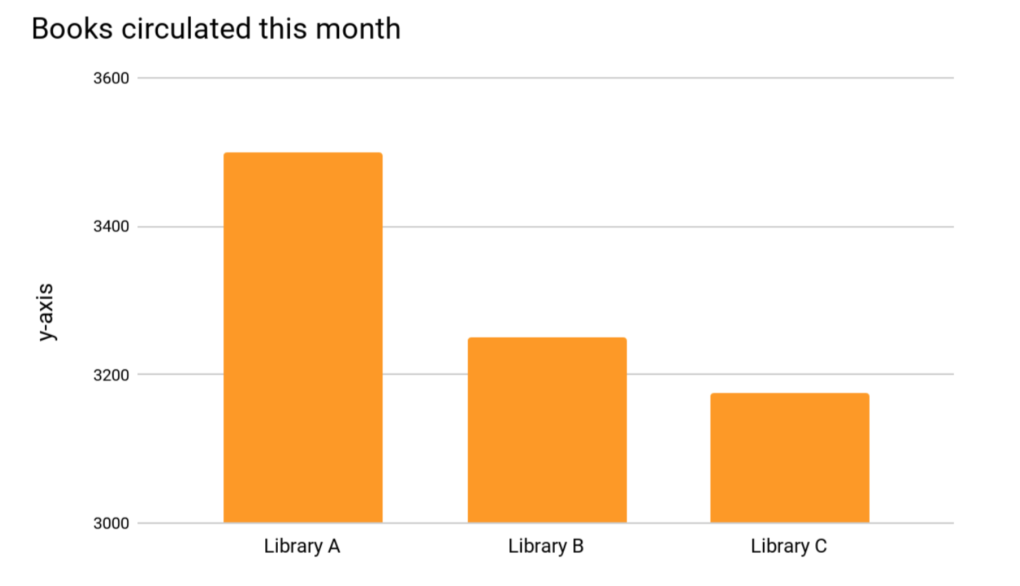 Yes, but now Library A appears to have circulated more than twice as many books as Library B or C this month and that’s just not true. Below are the same data with the baseline. In comparison, all three libraries circulated about the same number of books. The difference between Library A and C appears much less significant.
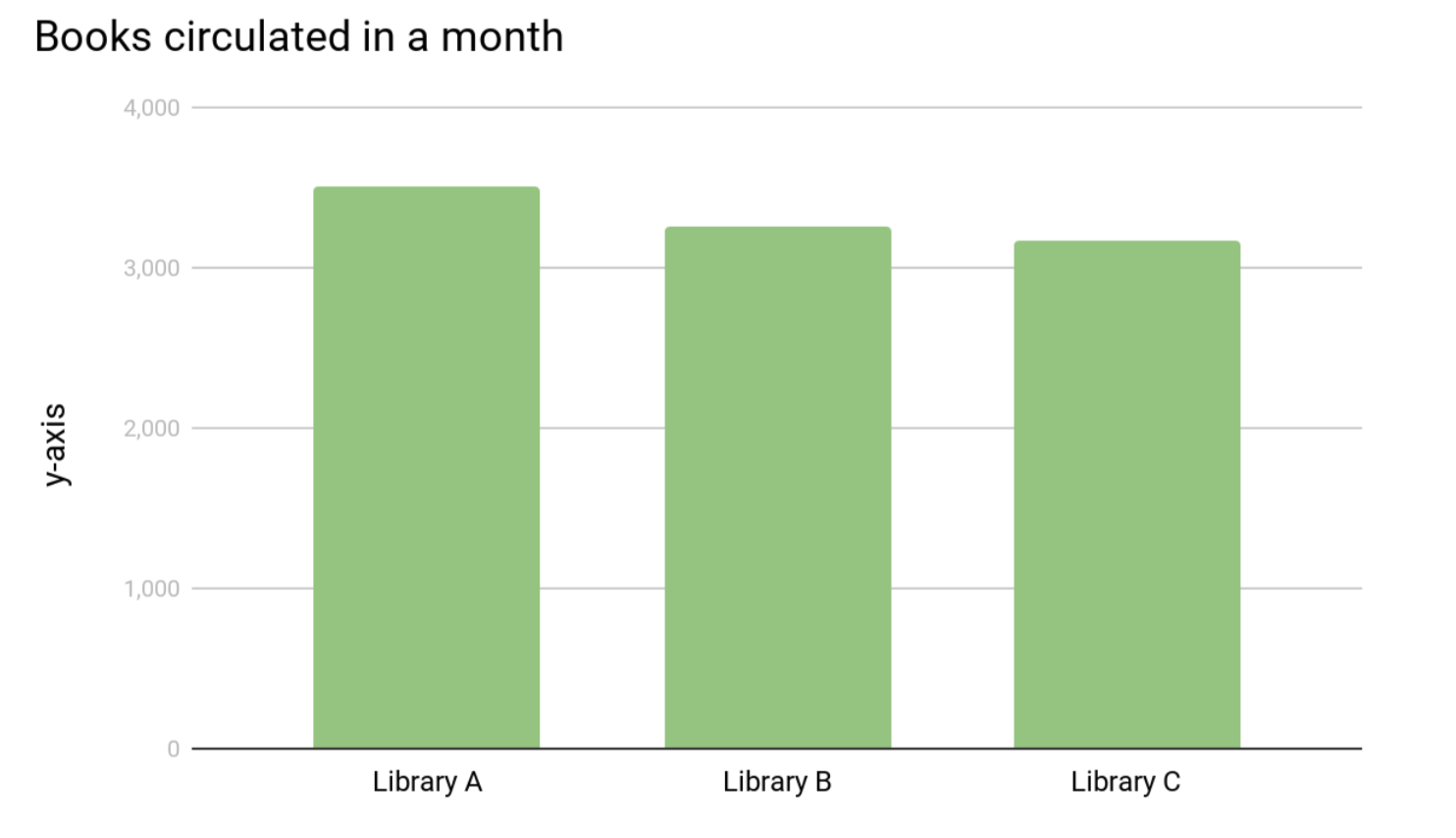 Some graphs might leave off the y-axis entirely for a cleaner look making it harder to tell if the data are truncated. Ask yourself if the different columns look proportional. For instance, if 3,200 should look like half the size of 3,500. If not, then your baseline isn’t zero.
Manipulating the y-axis
Manipulating the y-axis can be thought of as the exact opposite of truncating data. This visualization tactic is used to blow out the scale of a graph to minimize or maximize a change. For instance, this graph shows average annual global temperature from 1880 to 2015.
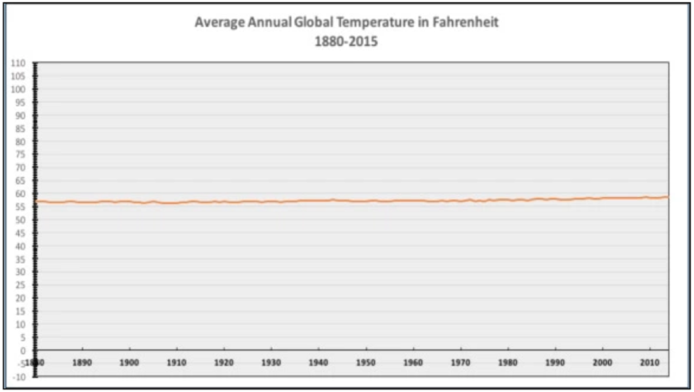
The scale goes from -10 to 110, which I suppose is the range of possible temperatures in fahrenheit. However, this scale doesn’t make sense for these data. Instead, it serves to flatten the line and convey the idea that average annual global temperatures really haven’t changed in the last 135 years. Here’s the graph again with a more meaningful y-axis. Now we can see the upward trend more clearly.
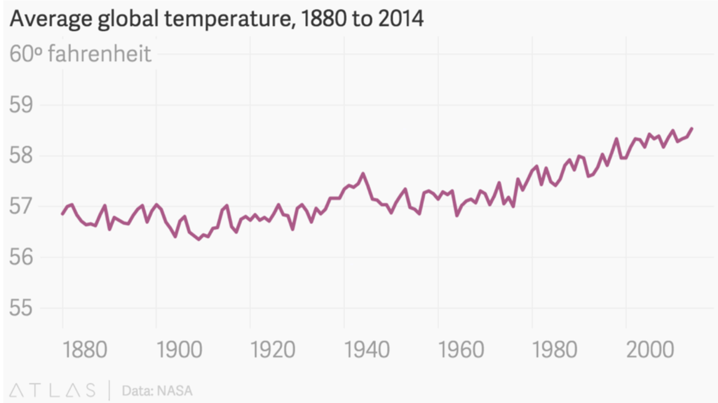
You may have noticed this graph has a truncated scale (missing baseline)! So why is ok in this situation and not others? When talking about scales and axes, one way isn’t necessarily wrong or right, it’s about the message the visualization is designed to convey. You want to make sure that the data are not visualized to be intentionally misleading—making you think something is more or less important than it really is.
Conclusion
None of these data visualization tactics that we covered today are inherently wrong. Remember that data visualizations are all about conveying the data’s story and like any story, people can take creative license. It’s important to be able to spot these scale manipulations to avoid getting the wrong idea about what the data are really telling you.
Next week we’ll cover some more common tactics, so stay tuned!