 Welcome to part 2 on data visualizations. If you’re just joining us, we talked last week about how the y-axis can be altered to mislead a reader about the data. You can find that post here. Now, let’s jump right back into another big data visualization misunderstanding.
The goal of data visualizations is to allow readers to easily understand complex data, but sometimes it’s the data visualization that we don’t understand. Certain techniques are utilized because they are the best fit for the data—not the best fit for the reader—and that can cause quite a bit of confusion if we don’t know what we’re looking at! Such is the case with logarithmic scales, which most people are unfamiliar with, but encounter all the time. Let’s break it down together.
That scale is growing out of control!
Logarithmic (or log) scales are simply another way to display your y-axis. Unlike linear scales, where the distance between each interval increases by the same amount (adding x each time), the distance between each interval in a log scale increases by the same percentage (multiplying by x each time). Log scales are useful because they show rates of change—the percent something increases or decreases.
Imagine your library grows its print collection yearly by 100 percent. That means every year you double the number of books on your shelves. The first year you have only 192, the next year 384, then 768…1,536…Fifteen years later you’d have more than 3 million books! Good luck using a linear scale to show that kind of growth in your annual report. A better option would be to use a log scale where you can show your collection has grown annually by 100 percent. Take a look at the same data using a linear scale versus a log scale. Can you tell which one is which?
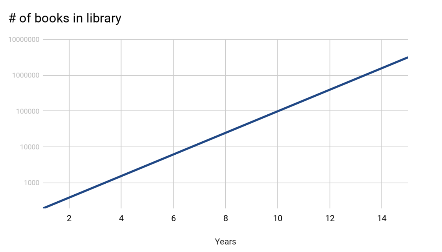
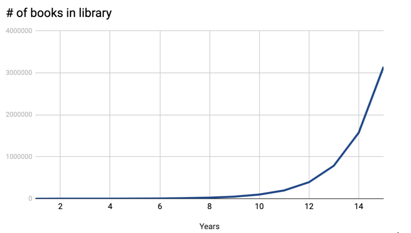
That’s right, the one on top uses a log scale (x10) and the one on the bottom uses a linear scale (+1 million). As you can see, the linear scale makes these data look like you didn’t get any books until eight years after you opened! However, if you weren’t familiar with log scales you might also think you increased your collection by the same number of books every year, instead of at the same rate.
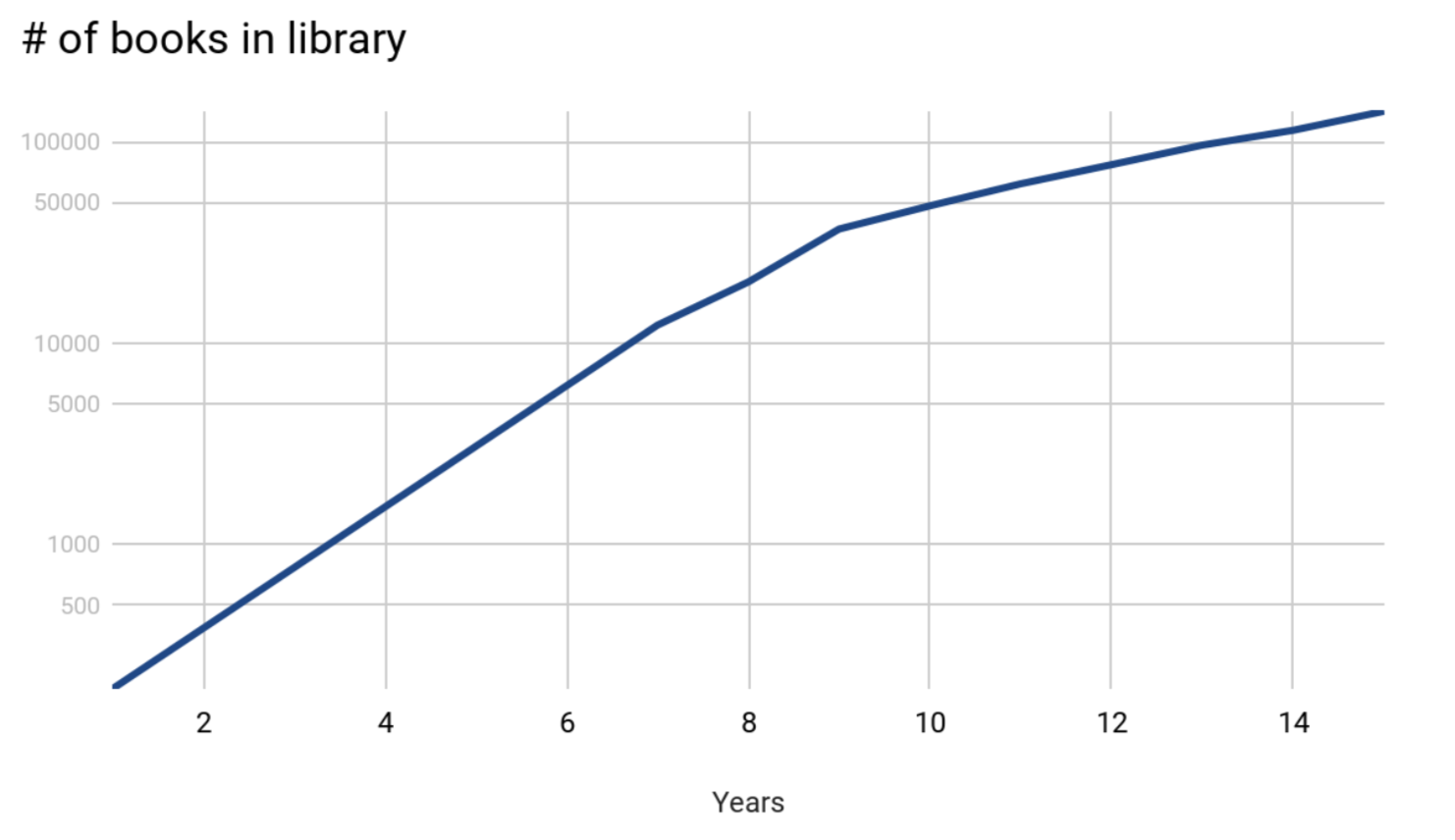
Let’s say instead of expanding your book collection by 100% annually, that growth rate begins to slow down after eight years. You still increased your collection by 27,000 books in the last year, but the log scale might make you assume you got less books than you did the first couple of years. This flattening effect is often misleading, but it simply shows a decrease in the rate, not in absolute numbers.
Log scales have their advantages and are often used to display data that cover a wide range of values or numbers that are growing exponentially. For epidemiologists who study disease spread, log scales allow them to chart the first outbreak (often a couple of people) up to community or global spread. The volcanic explosivity index and the Richter scale, which measures earthquakes, are other common uses of a log scale.
Conclusion
Like we mentioned last week, data visualizations are all about conveying the data’s story. When you see a log scale, remember that the story is about the rate of change, not the absolute numbers. Understanding how and why certain data visualization tactics are used will help you read any data story. Next week we’ll cover some new tactics so be sure to join us!
LRS’s Between a Graph and a Hard Place blog series provides strategies for looking at data with a critical eye. Every week we’ll cover a different topic. You can use these strategies with any kind of data, so while the series may be inspired by the many COVID-19 statistics being reported, the examples we’ll share will focus on other topics. To receive posts via email, please complete this form.