As springtime sprouts across Colorado, it’s a fine time to unearth some data on another statewide system that benefits all library users. The interlibrary loan system (ILL) connects Colorado libraries and their collections to ensure access to the largest possible pool of library materials. In fact, the existence of an ILL system is actually written into Colorado Library Law to guarantee resource sharing across Colorado. The Public Library Annual Report (PLAR) compiles two pieces of ILL data by asking Colorado public libraries how many items they borrow from and how many items they loan to other libraries through ILL. The reports vary from libraries who do not participate in any ILLs to libraries such as Boulder Public Library who reported loaning out 74,703 items and Longmont Public Library who reported borrowing 150,208 items through ILL in 2022.
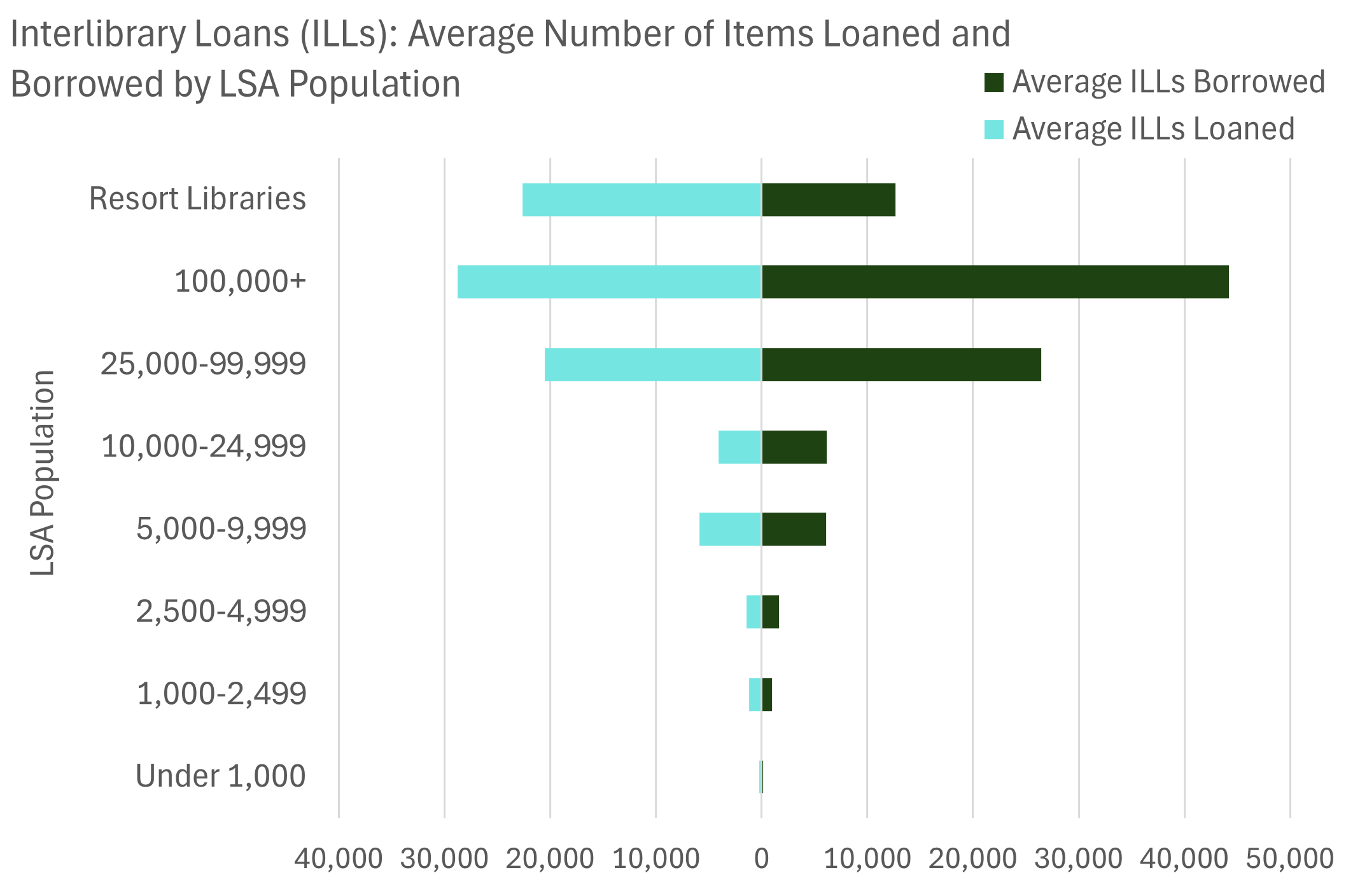
The first diverging bar chart in this post groups libraries by legal service area (LSA) population to compare the number of ILLs loaned and borrowed. As you may expect, larger libraries generally have more capacity to loan ILLs and receive more requests for ILLs. However, the number of ILLs a library loans and borrows could also be affected by a multitude of other factors including the demographics or reading preferences of the communities the library serves and whether the library advertises the availability of ILLs. To adjust for LSA population differences, and explore additional factors that may impact a library’s participation in the ILL system, we’ll also take a look at ILLs by circulation per capita, materials expenditures per capita, and a handful of individual library comparisons. Before we dig in though, let’s first introduce diverging bar charts to ensure we’re interpreting the data correctly.
Diverging bar charts shine when data has two sides, oftentimes a positive side and a negative side or an input and an output. This doesn’t mean that the data needs to consist of positive and negative numbers, though it could. If the data consists of only positive numbers, there could still be two sides to the data which fit well in a diverging bar chart. For example, diverging bar charts are often used for Likert scale data, where respondents express the extent to which they agree or disagree with a statement, and in which case the count of disagree responses would be placed to the left of a 0 line in the middle, and the agree responses would be charted to the right of the 0 line. The chart could also be flipped so the two sides of data point up and down instead of left and right, though this is less common.
About Our Data
The PLAR ILL data does not consist of positive and negative numbers, nor necessarily “favorable” and “unfavorable” response categories. However, ILLs borrowed and loaned can be viewed as inputs and outputs, with ILLs borrowed charted on the right side of the diverging bar chart to show the number of items being received and ILLs loaned on the left side to show the number of items being sent to other libraries. Diverging bar charts help indicate in which direction the data is skewed. Although this data is not skewed particularly strongly in either direction, Figure A shows that libraries with an LSA population over 10,000 tended to borrow more ILLs than they loaned on average, with the exception of resort libraries which loaned more ILLs than they borrowed. In Figures A, B and C, resort libraries are separated out because their unique traits result in notably different data than libraries with similar LSA populations which would greatly impact the averages of certain library groups. One possible reason that resort libraries loan more ILLs than they borrow could be that they contain more extensive collections than their neighboring libraries, and when a nearby library is looking for a certain item, the resort library is able to fulfill the request more efficiently than a library farther away.
What Influences ILLs?
As stated earlier, it is challenging to pinpoint the exact reasons why a library may borrow or loan more ILLs because there are numerous factors at play, some of which may be within a library’s control and some of which may not be. Because a library may request an ILL if a patron asks for an item that the library does not already have in its collection, the number of ILLs borrowed may be impacted by what their library users are most interested in, how actively they use the library, and/or how well a library’s existing collection meets these community needs. Considering these factors led to the question of whether ILL counts are more impacted by a library’s circulation per capita or materials expenditures per capita and whether diverging bar charts could provide an answer.
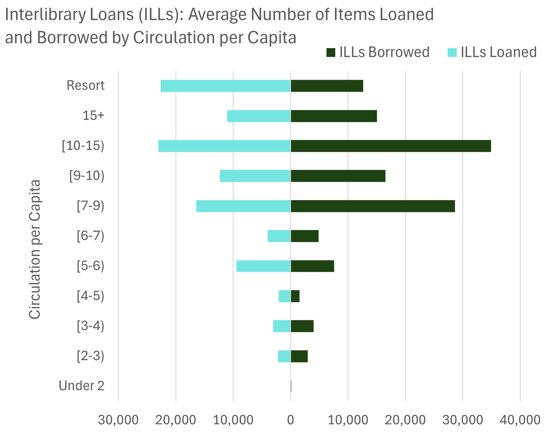
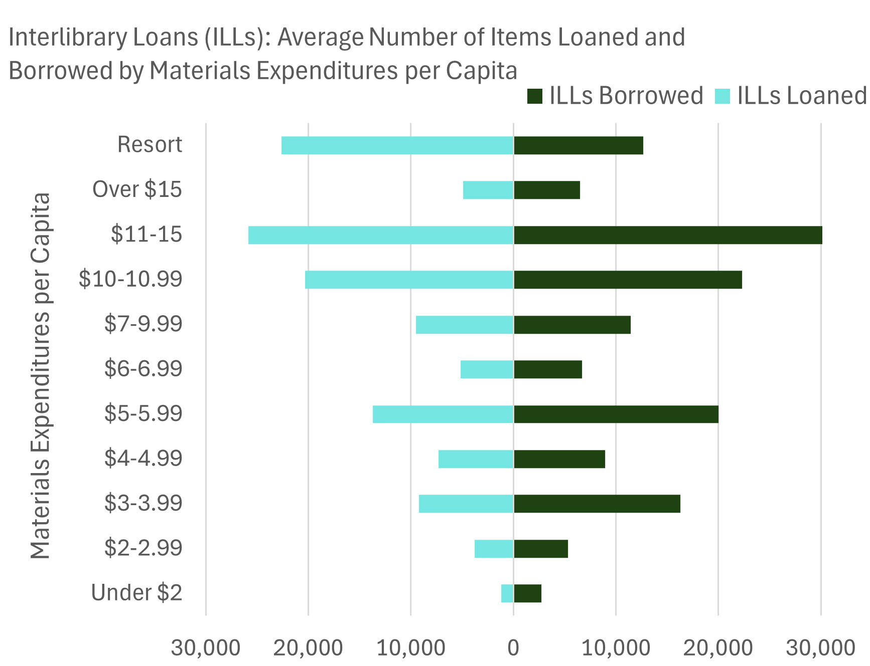
In Figures A, B and C, smaller libraries and those with less circulation and lower spending on materials all have less ILL activity, and this is shown through the generally shorter bars for both loaned and borrowed ILLs near the bottom of each chart. This is most pronounced in Figure A, but in both Figures B and C the “funnel shape” of the chart is less dramatic, meaning that the groupings did not have as large of an impact on the average number of ILLs loaned and borrowed. However, there is still a notable difference between groupings in Figure B; each group consisting of libraries with over 7 circulations per capita, have both more ILLs loaned and ILLs borrowed on average than the groups with a circulation per capita of less than 7. The same can not be said for materials expenditures per capita in Figure C. Although there’s a slight decrease in the average ILLs overall for libraries that spend less on materials per capita, the participation in ILLs in Figure C is more dispersed between materials expenditures per capita groupings than Figure B’s circulation per capita groupings. This suggests that a library’s circulation per capita is a better predictor of their level of participation in the ILL system than how much they spend on their collection per capita.
Peer Library Comparisons
The charts above show averages of every library that provided data for the groupings used, but diverging bar charts can also compare individual libraries.
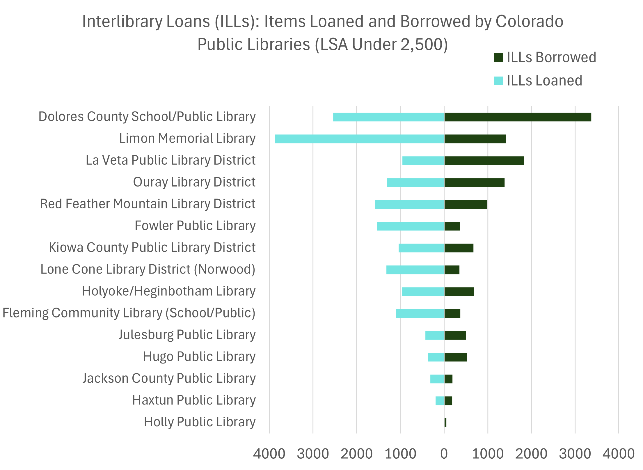
Figure D shows the number of ILLs loaned and borrowed for individual libraries with an LSA population under 2,500. Only libraries that reported on both pieces of data and reported a number greater than 0 for either ILLs loaned or ILLs borrowed are included on this chart. The libraries are ordered from most ILLs to least, so readers can easily identify how their library relates to peer libraries. The diverging bar chart also makes it easy to see which way each library’s data is skewed in comparison to their peer libraries.
Conclusion
Diverging bar charts can be an engaging and unique way to show data consisting of two sides or related measures. Though they are often used for Likert scale data, since the PLAR doesn’t contain Likert scale data, the ILL data highlighted in this post serves as a fine alternative for introducing this chart type and showing some of its strengths and weaknesses. Diverging bar charts can be more complicated and time consuming to build depending on the platform used, so it’s worth carefully considering whether this chart type is the best choice for your data before beginning to build one. A grouped bar chart is a better choice for your audience if your goal is to compare values side by side since it can be difficult to notice differences in values in diverging bar charts unless they are quite large. Instead, diverging bar charts tend to tell their story through the overall shape the bars make from top to bottom and whether the bars are skewed to one side of the chart or the other. Last but not least, as with all charts, the colors that you choose for the bars on each side of the chart will impact how the reader perceives and interprets the two pieces of data. Colors that are easily distinguishable will aid the reader, and color pairings that have positive and negative connotations (such as red and green) should be avoided unless they are appropriate for the data.
This ILL data from the PLAR shows high usage of Colorado’s ILL system which is important because even the largest libraries in Colorado don’t have the space to house all-encompassing collections. The ILL system gives library users access to the combined collections of all participating libraries, exponentially expanding the amount of information, recordings, perspectives, and stories that a library card can provide. If you have Colorado library data that you would like help visualizing in a diverging bar chart, or you would like to see how your library’s total number of loaned and borrowed ILLs compares to peer libraries, please don’t hesitate to reach out to LRS@LRS.org. Thanks for reading!
LRS’s Colorado Public Library Data Users Group (DUG) mailing list provides instructions on data analysis and visualization, LRS news, and PLAR updates. To receive posts via email, please complete this form.