Outreach is a hot topic in the library world, and one that the Library Research Service (LRS) has incorporated into the Public Library Annual Report (PLAR) since 2015. In the PLAR outreach is described as an event, but not a program, which engages the public outside the library facilities. This is an event where library staff provide printed, verbal, and/or visual information about the library’s resources and services. The PLAR asks Colorado public libraries two questions about outreach: How many individuals are exposed to the library? And, how many individuals are directly engaged with the library throughout the year? Before diving into this data, it’s important to acknowledge that there are much more comprehensive ways to measure the impact of library outreach services, and these questions don’t even begin to capture all the ways libraries engage and serve communities outside of library buildings. Although counting the number of people exposed to or engaged by the library beyond its walls does not address the benefits that discovering the library can have on individuals and families, tracking this information can at least tell us how outreach efforts are progressing from year to year in regards to how many people are being reached.
This March post presents three different ways this readily available outreach data can be visualized and discusses the scenarios that best fit each visualization type. Instead of using different data to show multiple versions of one chart type, this post uses the same data to briefly introduce three different types of charts. Future posts will engage with each type of chart in more detail. In the visualizations below both pieces of PLAR outreach data are combined into one chart, so befittingly, the first type of chart we will look at is called a combination chart.
Combination Charts
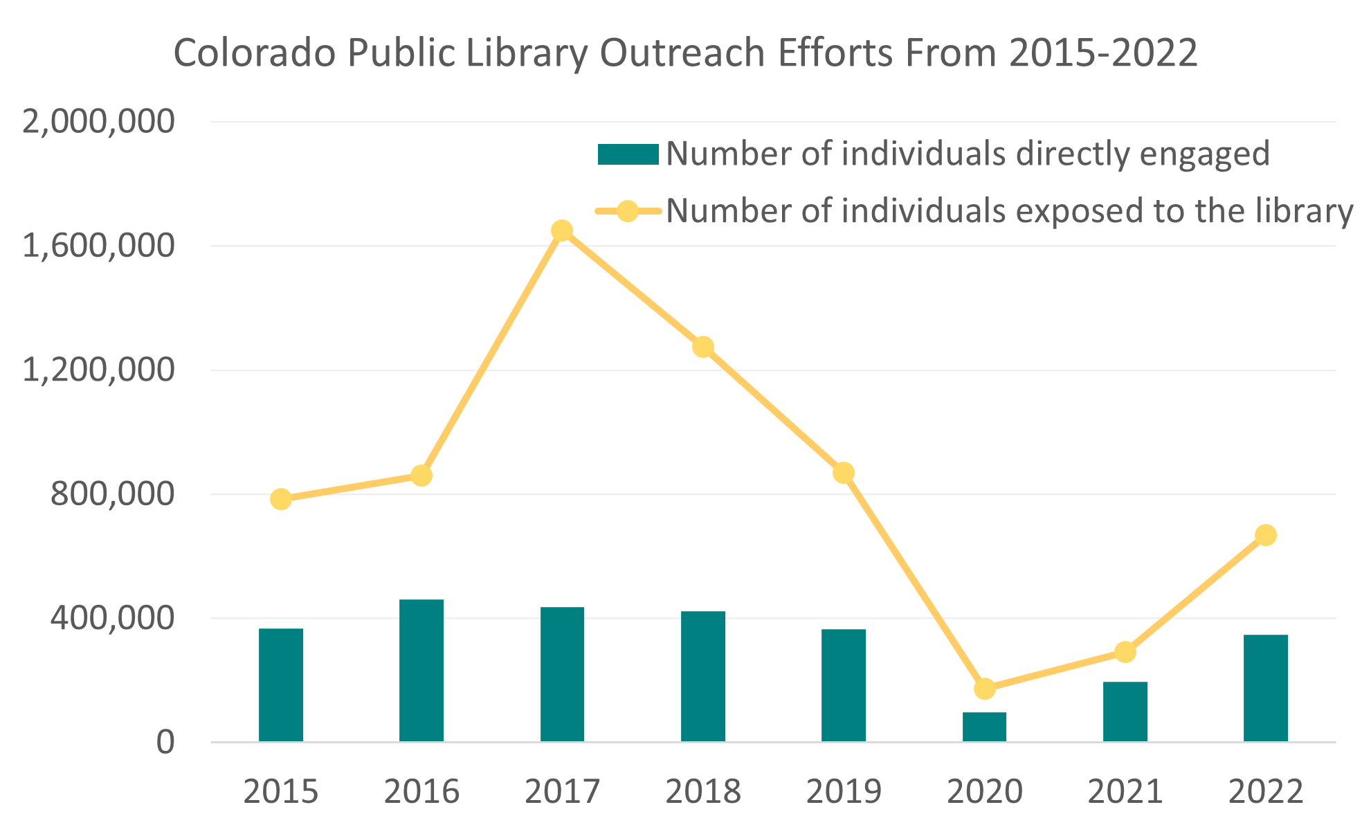
There are several different types of combination charts, but they typically use both bars and lines to represent two or three categories of data along the same axes. Similar to a line chart, they often show data through time. In Figure A, the bars indicate the number of individuals directly engaged by the library from 2015-2022, and the line shows the number of individuals exposed to the library during this same timeframe. It’s important to note that these two pieces of data do not overlap because, according to the PLAR instructions, the number of individuals exposed to the library is a count of “people who were exposed to the library but did NOT have direct contact with library staff.” Some outreach events, such as a parade in which the library has a float, are more conducive to this type of outreach and do not provide as much opportunity for direct engagement. On the other hand, more people are likely to be directly engaged at a fair booth where they are speaking with library staff and given printed materials. This combination chart clearly shows that year after year a significantly higher number of people are exposed to the library than those who are directly engaged.
Because these two categories of data are both related but clearly distinct, they are a good fit for a combination chart. Combination charts are great at displaying relationships and patterns between two different, yet complimentary, data sets. In fact, they are so good at this that readers may automatically assume there is a relationship or correlation between the data sets displayed on a combination chart even if there is none. Therefore, when building a combination chart, one must carefully select data that does not mislead the audience in this way and pay close attention to the scale, labels, and colors used to ensure the chart remains a clear and accurate representation of the data and highlights all necessary information. When this is done well, a combination chart can help an audience quickly identify relationships within the data that would take longer to decipher from two separate charts.
Stacked Area Charts
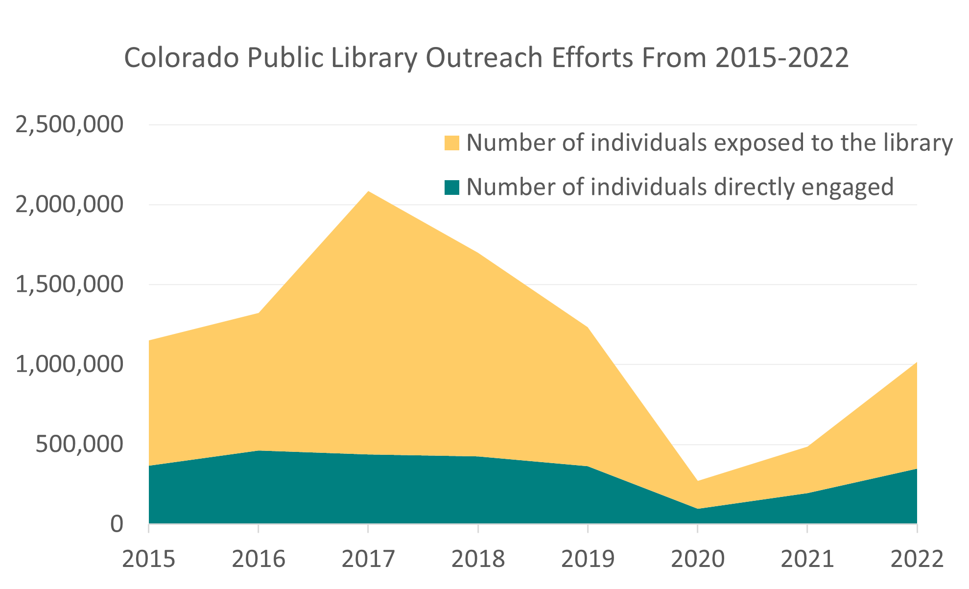
Figure B is an entirely different chart type from Figure A, called a stacked area chart. While Figure B may look very similar at first glance, a closer look reveals that its y-axis reaches higher numbers than in Figure A. For instance, in the year 2017 the number of individuals exposed to the library in Figure A is just over 1.6 million, but in Figure B, the top of the yellow peak reaches just over 2 million. This is because a stacked area chart shows pieces of a whole (similar to a stacked bar chart but across time). The blue and yellow elements in Figure A are not “stacked” like building blocks on top of each other, and so their relationship looks different. Figure B’s 2017 total of over 2 million is the number of individuals both engaged with and exposed to the library added together.
Essentially, Stacked area charts show total values along with the categories that make up this total over time, and the different colored areas build on top of each other to represent the values of each category. As with combination charts, careful consideration should be given to the type of data used in a stacked area chart because the very top of the chart’s filled in area must accurately represent a total count, but the exact value of each category within this area will be difficult for the audience to discern.
To correctly interpret Figure B, the reader must understand that the number of individuals exposed to the library (the yellow section) is the difference between the total number of people reached and the number of people directly engaged (the bottom section). It’s difficult for readers to decipher the number of individuals exposed to the library for each year because the baseline of the yellow area fluctuates along the top of the area below it. If the exact amount in each category is important, this is not the best type of chart to choose. Figure B does, however, show the total number of people reached by library outreach services along with a general idea of whether the majority of these people were exposed to or directly engaged with the library. Unlike Figure A, Figure B shows the proportion of individuals directly engaged in relation to the total reached by outreach efforts. Although, if the sole purpose of the chart is to show proportions through time, a 100% stacked area chart may be a better option.
100% Stacked Area Charts
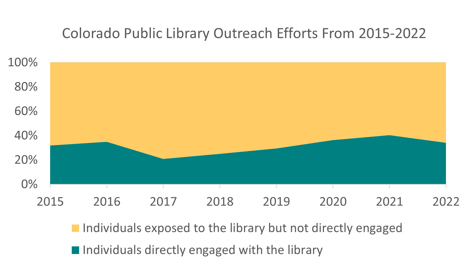
Figure C is a 100% stacked area chart, the third and final type of chart we will introduce in this post. This chart puts a different spin on the data in Figure B by depicting the proportions as percentages. A 100% stacked area chart will always be completely filled in with color because the parts of the whole need to add up to 100%. Just as you wouldn’t create a pie chart that doesn’t add up to 100%, a 100% stacked area chart also needs to add up to 100% for each unit of measure along the x-axis.
One thing to note about Figure C is that it omits the exact values when showing what proportion of people reached through library outreach were directly engaged. In both Figures A and B the large drop in people exposed to and engaged with the library through outreach during 2020 and 2021 is one of the first things the reader may notice. Although it’s not addressed within these charts specifically, we know this was due to the COVID-19 pandemic. However, in Figure C, the total proportion of people directly engaged in relation to the total number of people reached continues to increase in 2020 and 2021, and the dip in total counts is hidden. While the proportion in Figure C is correct, it does not show the whole story, and this can be deceiving. Somebody may overlook the fact that 2020 and 2021 were drastically impacted by COVID-19 and when looking at Figure C, interpret these years as positive years for outreach because the proportion of people directly engaged increased. In reality, it is likely that the number of events where people could be exposed to the library was significantly reduced, and many outreach services were paused altogether. In some cases, ignoring total counts in a 100% stacked area chart helps readers focus on an important message without distraction. In this case, however, Figure C leaves out significant information about the history of library outreach efforts through the pandemic which is key to understanding the data.
In Summary
Combination charts excel at showing relationships between related but distinct data sets. A stacked area chart shows the trend of a total count through time along with a general idea of how parts of this whole have also changed. 100% stacked area charts are best to use when the change in proportions through time is important but total counts are not relevant.
Hopefully, this post introduced you to a new chart type that you can now identify and read or even build yourself. If you were already familiar with combination charts, stacked area charts, and 100% stacked area charts, we hope the visualization of PLAR outreach data helped you engage with the strengths and weaknesses of each chart type in a new way. We will return to these charts again in future posts, but in the meantime, please reach out to LRS@LRS.org if you have any questions about collecting, analyzing or visualizing Colorado library data. Thanks for reading!
LRS’s Colorado Public Library Data Users Group (DUG) mailing list provides instructions on data analysis and visualization, LRS news, and PLAR updates. To receive posts via email, please complete this form.