
I love color. As long as I can remember, I have kept my crayons organized in rainbow order. It makes me happy to see them that way! It’s a little tedious with the magical 64 pack of crayons, but totally worth it. I am an extreme example, but humans in general are visual creatures. Color impacts how we perceive and understand visual information—including graphs, charts, and infographics.
A good data visualization combines a thoughtful display of the data with strong art and design principles, including color. Our brains are wired to pay attention to color, even if some of us perceive it differently (read more here). While color can help you understand visual information, it can also confuse or mislead you. Understanding the principles that data visualization designers use can give you insight into the role that color plays when you process visual information.
When we make charts at LRS, we try to use several different shades of one color or one main color and a highlight color. Why just one or two colors? Believe me, if it worked, I would make all of our charts look like rainbows. The problem is that for each color you use, a viewer has to process how they personally feel about it and what that color symbolizes in our culture. Then they have to sort out what that color means in the chart.
Our emotional reactions to color are not always conscious. If I went to the dentist and found myself sitting in a neon yellow waiting room, I would become incredibly anxious, but I may not know why. Designers spend a lot of time studying color and use it strategically, which is both good and bad for you, the viewer. The power of color can help you understand and it can emotionally manipulate you.
What’s your favorite color? Do you know why? What about your least favorite color? Why? You carry around those preferences in your brain all the time. We’re going to look at some examples now, and I want you to keep track of how you feel about the colors.
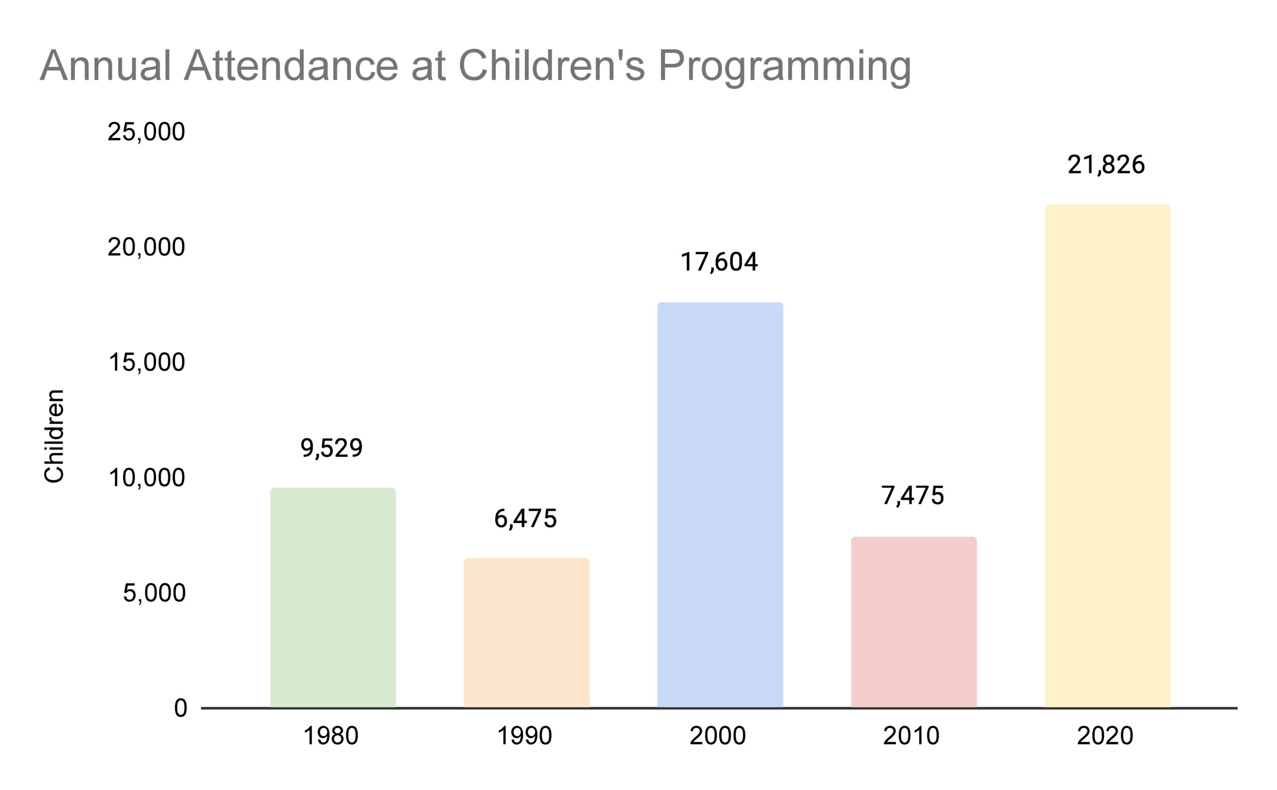
Look at that beautiful rainbow! These pale shades of basic colors makes me think about spring and a happy version of childhood where nothing ever goes wrong—like a fanciful children’s book about talking animals. As a designer, I would use these colors to evoke viewers’ sense of nostalgia about childhood before I talk about children’s programming at the library.
As a viewer, I’m distracted by the colors even though I like them. I really like that shade of green, so I just want to think about that column. Is the green column the most important data in this chart? I have no idea. My eye also keeps getting drawn to the red color—is that where I’m supposed to focus? While these colors are all different, they still have a similar level of saturation or brightness. What happens when that is not consistent?
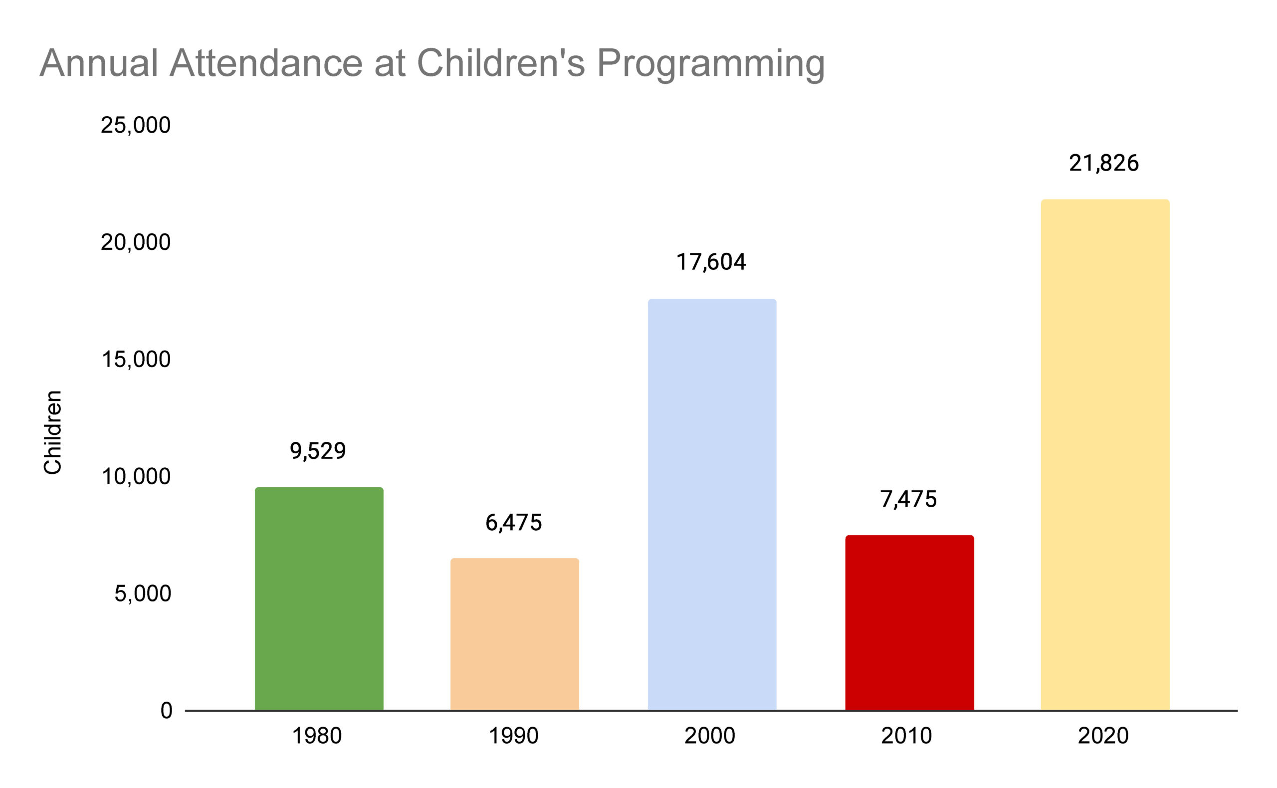
This chart is really hard for me to interpret as a viewer. I think I’m supposed to focus on 2010—I can barely pull my eyes away from it. The data from 1980 is bright too. I don’t know why the data for 1980 and 2010 are shown in brighter, more saturated colors. I’m losing track of 2020, even though it has the largest value.
Two color choices are creating a lot of confusion here. One is the use of red. Red holds a special place in our brain (read more here). It’s one of our brain’s priority colors—meaning that we are particularly skilled at perceiving it and its different shades. The cultural symbolism of red is also important. Think about the places red shows up in our world: stop signs, stop lights, warning symbols, and sports cars. Red says to us: pay attention. And sometimes also “bad” or “danger.” We can’t help but stare at the saturated red color and assume it’s important.
The second confusing choice is the saturation of the colors. The green column is as saturated as the red column, which makes me assume it is the second most important data here. My intuition thinks more color = more attendance, but in this chart the two most saturated columns are not the ones with the highest values. Overall, color is not helping here.
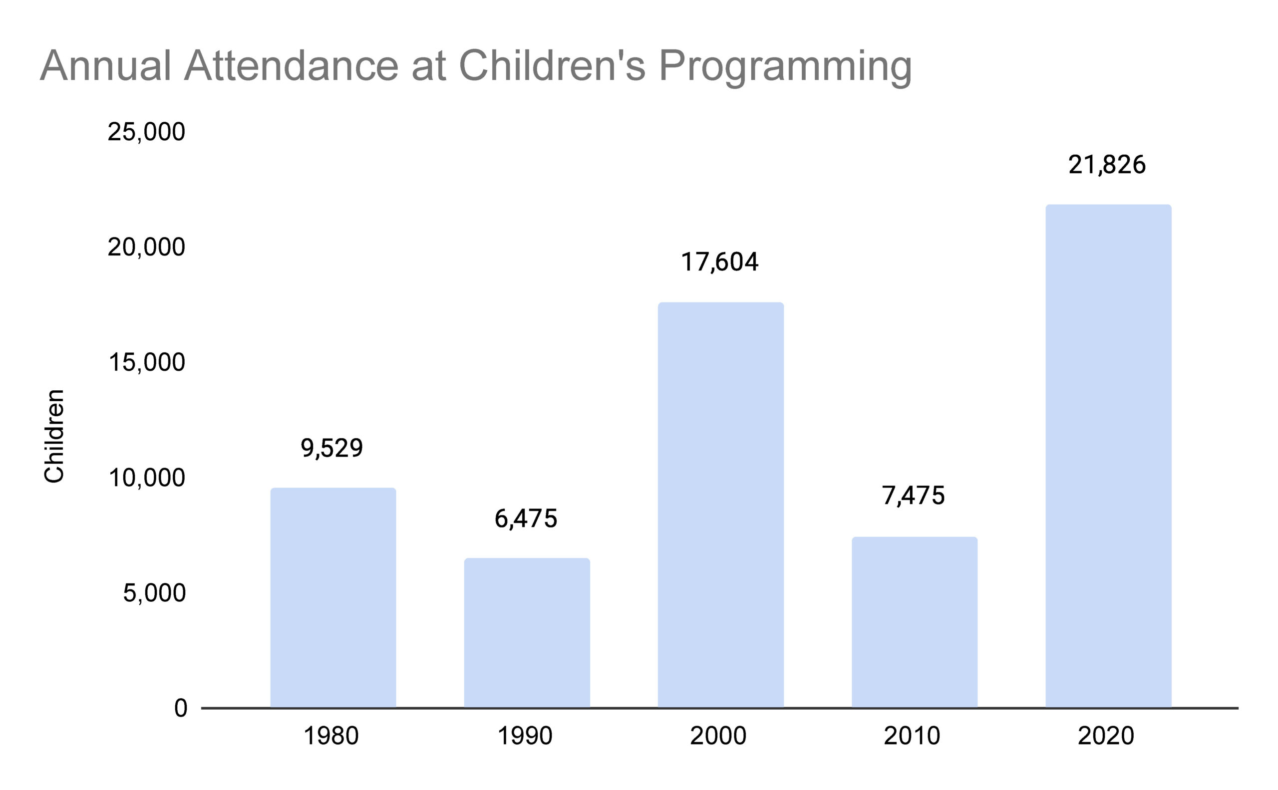
Ah, ok. I’m still not sure what the takeaway message from this chart is, but at least I don’t want to run away from it. It’s easier for me to think about the data now that I’m not distracted by the colors. I can focus and develop some questions. The one thing that is missing is a visual cue about where I should focus or what is most important.
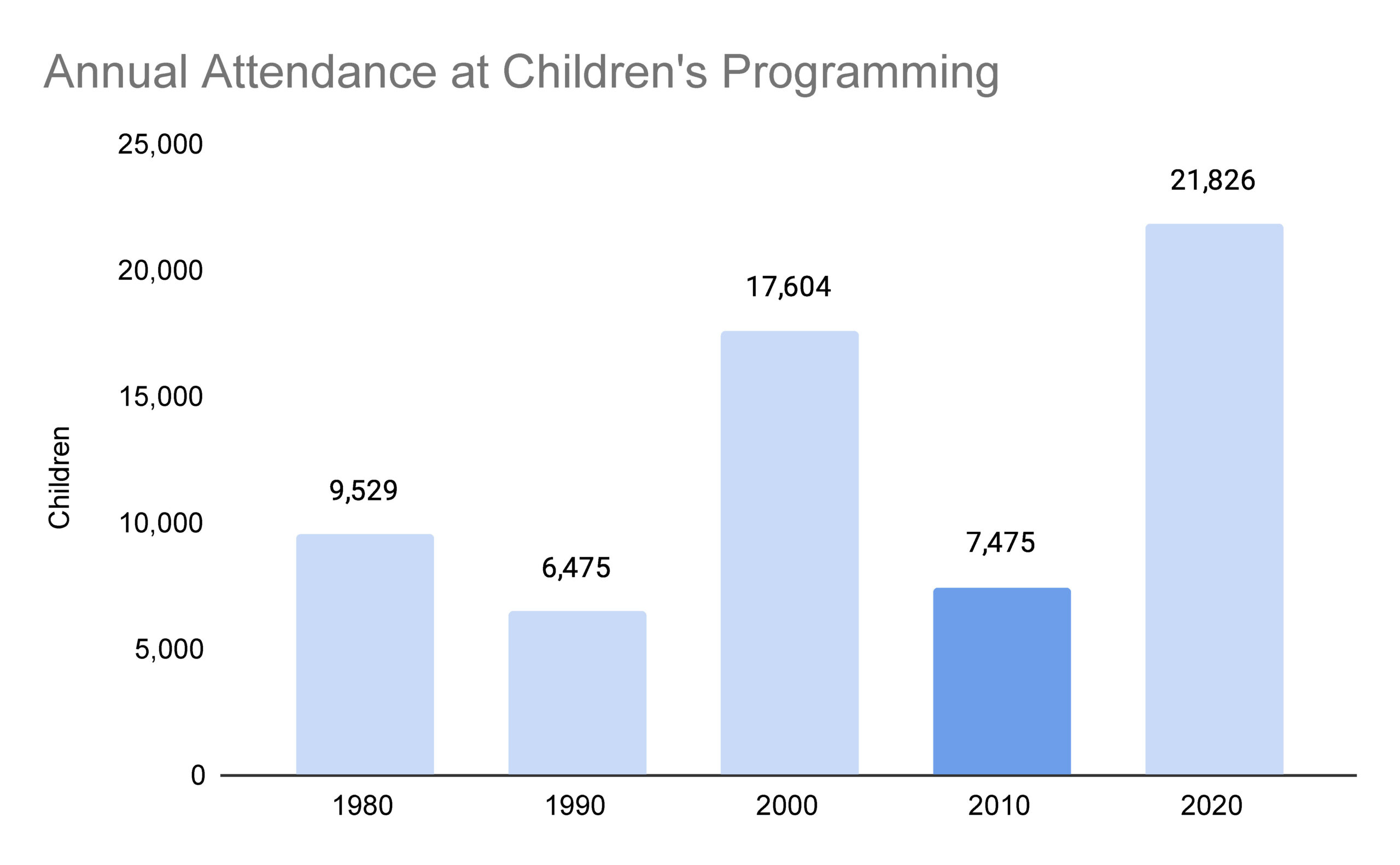
Ah, there’s my cue! This chart provides both a cohesive experience and a good indication of where the viewer is supposed to focus. I don’t need to spend a lot of energy deciphering it. I still don’t know what happened in 2010, but I feel curious and ready to find out more. The use of color augments my understanding of the data.
Out there in the wilds of the internet, there are some data visualizations where color is a barrier to understanding the data or used to elicit an emotional response. As a viewer, you don’t get to change the colors to be less distracting or add in a helpful cue about where to focus. If only we could! Instead, notice if the colors are distracting you or producing a strong emotional reaction and do your best to work around it. Often that means focusing on the data in spite of the colors. I have also printed data visualizations in grayscale to strip the color out myself.
I could go on about color, but I want you to get back out there, using these skills! If you want to learn more about color, I recommend this episode of the podcast Radiolab.