The Public Library Annual Report (PLAR) data is packed with the potential to help inform all sorts of decision making in libraries. In this blog series, The Public Library Blueprints, I’m searching for the most meaningful pieces of data to demonstrate data analysis and visualization techniques. With that in mind, this post’s topic of discussion is overdue fines – a topic that library staff may find themselves needing to present data on if they are working to eliminate fines at their library.
| Also in 2019, two posts were added to Colorado Virtual Library: Eliminating Fines – Resources and Eliminating Fines FAQs. Both of these posts (along with many news articles on this topic) explain the benefits of eliminating overdue fines, which include bringing back patrons and providing more equitable services. If you’re interested in learning more about the far-reaching impacts of libraries eliminating fines, I highly recommend checking out these additional resources. |
In 2019, the PLAR survey began asking libraries whether overdue fines were being charged for children’s, young adult (YA), or adult books. We now have three years of data on overdue fines in Colorado public libraries which shows a definitive trend toward eliminating fines. Below, we will take a look at several different data visualizations to see which methods communicate meaning effectively (and which don’t work at all).
Particularly when you’re excited about the data, it may be tempting to show all of it at once or in one large visualization. This temptation is exactly what led me to begin by building visualizations that depict the percentage of Colorado public libraries charging overdue fines for children’s books, YA books, and adult books over a three year time period. Below are two bar charts that were produced during this endeavor. Let’s compare!

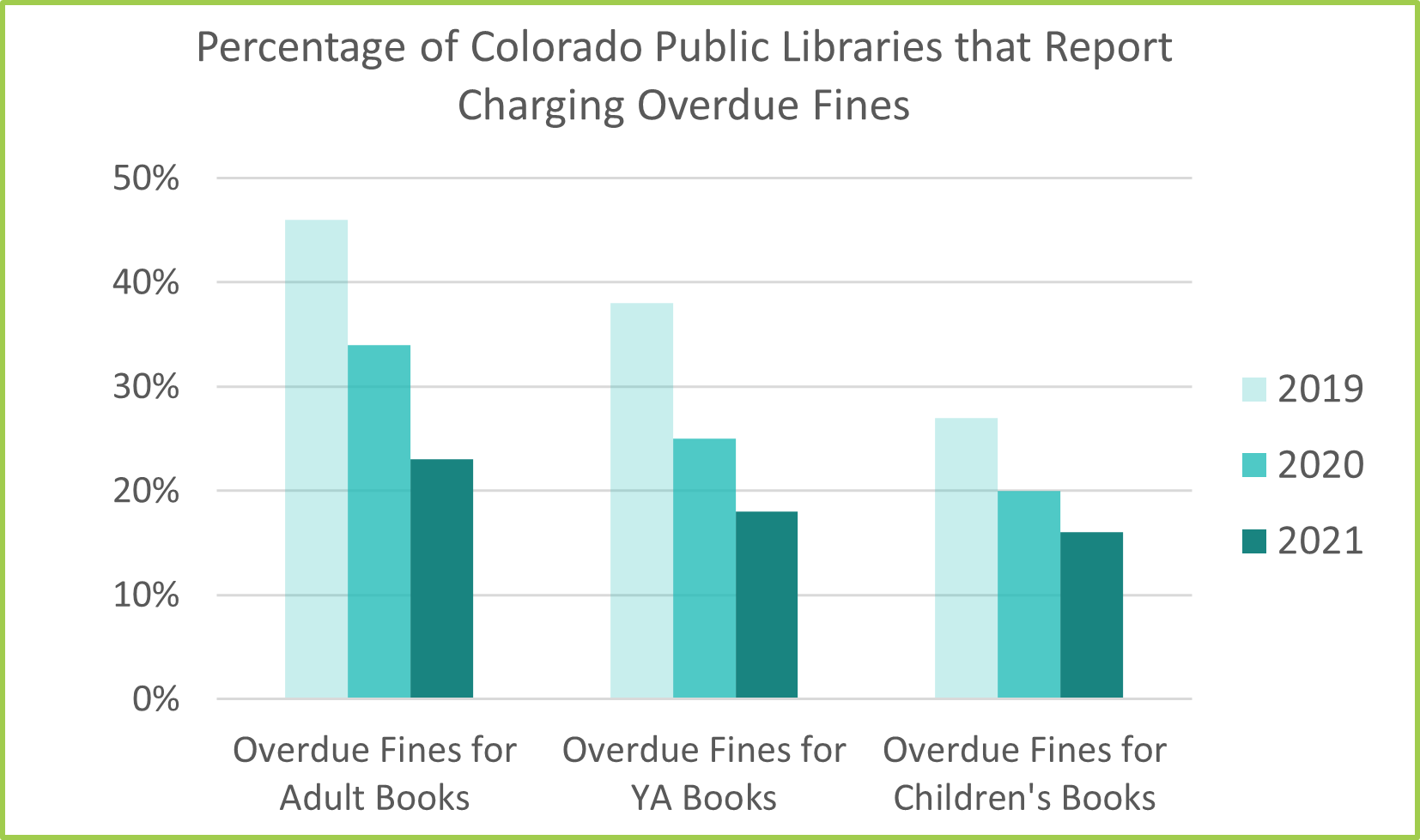
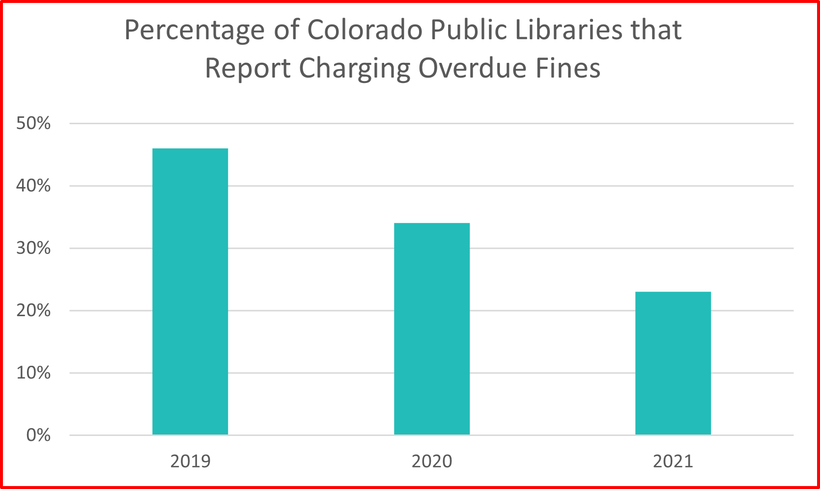
Figure A depicts the percentage of Colorado libraries that report charging overdue fines from years 2019 to 2021. Three different colored bars represent the percentage of libraries that charged overdue fines for YA books, children’s books, and adult books. Where do your eyes go first when looking at this chart? Are they drawn to the data labels, a certain bar color, or the legend? We might all have a different answer, but my point is that many aspects of this chart are overwhelming or distracting. Hopefully, looking at Figure B feels a little more manageable. This second chart shares the exact same data in a more purposefully organized visual.
So what did I change in Figure B? First off, the legend and x-axis are opposite of Figure A. I made this design choice because the legend containing three years felt more easily and quickly readable than the legend with longer text. The order of the three x-axis categories (fines for adult, YA, and children’s books) was placed purposefully in Figure B as well. The goal of these charts is to show that there has been a decrease in libraries charging fines for each age group over this three year period. When reading Figure B from left to right, the percentages in each category are also decreasing. In contrast, the categories in the top chart are randomly ordered (YA, children’s then adult books) which draws attention away from the decrease in fines collected year to year and obscures the overall message of the chart. Although both charts are technically accurate, someone viewing Figure A may not intuitively grasp that the percentages in each category are decreasing from year to year.
Additional visual aspects that lead me to prefer Figure B include the lack of data labels and colors. The percentage labels over the bars in Figure A, though informative, are also a distraction from the chart’s intended message. A text-heavy data visualization often defeats the purpose of visualizing the data because visualizations should allow the audience to quickly absorb the main takeaways. Additionally, the different color choices in Figure A may lead the audience astray. Certain colors and contrasts, such as the dark gray against blue and green, can stand out and mistakenly draw attention to one specific aspect of the chart for no particular reason. This is why I chose to use different shades of the same color in Figure B – to avoid unintentionally drawing the audience’s attention to one category over another. I also wanted to be sure I created enough color contrast to accommodate visually impaired or color blind individuals.
Finally, color has psychological connotations. For example, (broadly speaking) people in the US tend to associate the color green with something positive or benign and red with something negative or extreme. I used this to my advantage by outlining Figure A in red and Figure B in green because I feel Figure B more effectively communicates the data. Using the color green for the bars representing overdue fines for YA books in Figure A is not meant to indicate that there is anything better about the data in this category, but that color may mislead the audience into thinking there is. In general, try to avoid using green or red in your charts unless you are specifically trying to indicate that something is positive or negative, as I’m doing with the chart borders in these posts. Even then, be careful not to rely on these colors too heavily because they are often inaccessible to people with color blindness.
Keep it Simple
The two charts above cover all the data the PLAR collects on overdue fines in public libraries, but what if you’re working to eliminate all overdue fines at your library regardless of the material’s age category? It is possible that the visualizations above could serve only to complicate your argument if your goal is simply to show that the number of Colorado libraries charging overdue fines is decreasing. If Colorado libraries charged overdue fines for children’s or YA books then they also charged for adult books. For that reason, using the percentages from the adult books category correctly indicates which percentage of libraries reported charging any overdue fines from 2019-2021 with only three data points. Here are two methods for visualizing these three data points:
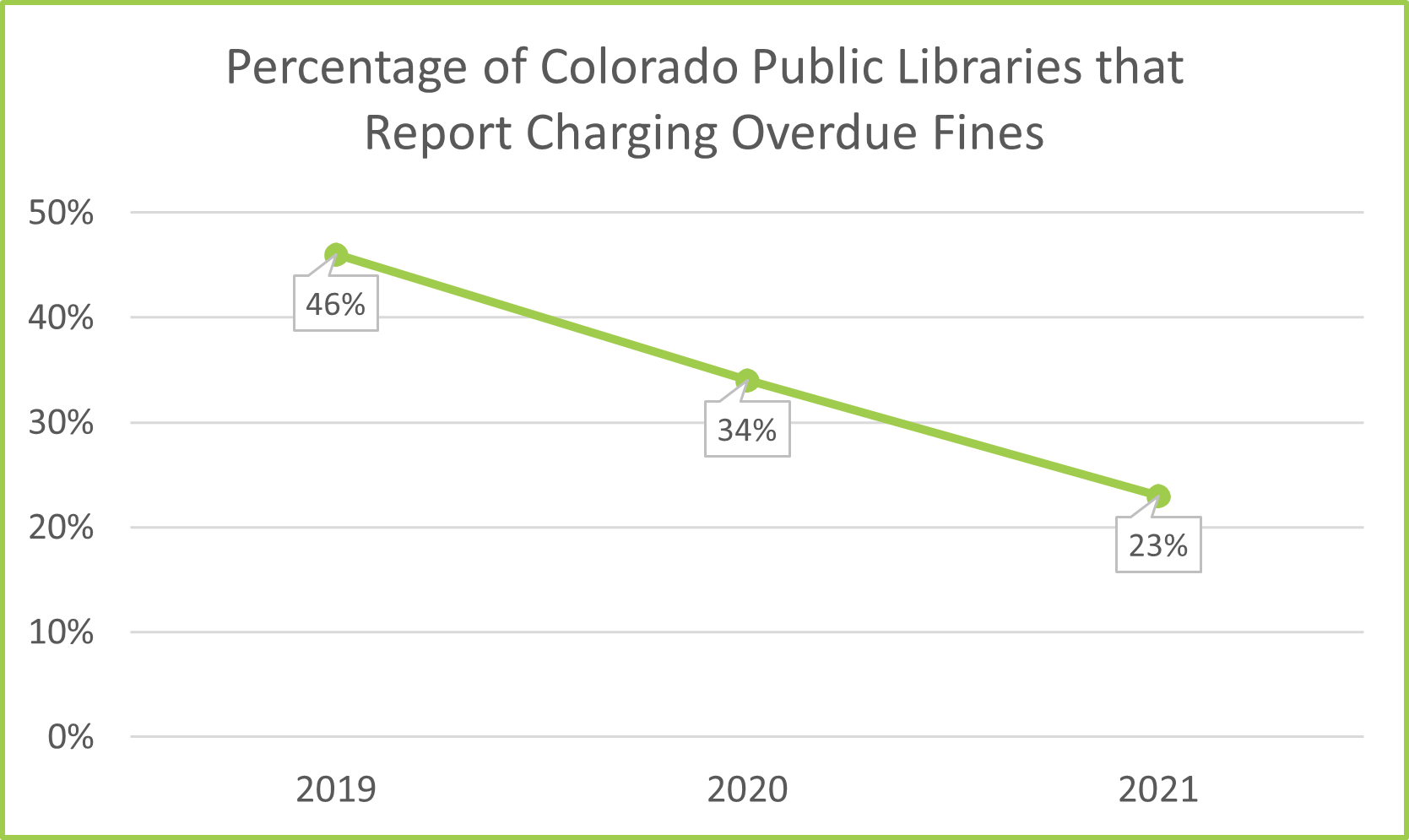
Because less data are included, both of these charts are much easier to read than the earlier visualizations. These new charts allow the audience to decipher the decrease in Colorado public libraries who report charging overdue fines (23 percentage points) much faster than the first two charts we discussed. Between these two new charts, either one may be preferred by the audience. I prefer Figure D because the line connecting the data points naturally leads the reader’s eye, so the decreasing trend is more apparent. Also, you will notice that in Figure D I decided to include data labels. Even though I warned against adding too many labels or too much text previously, because this chart is much simpler, I think data labels add to the chart rather than take away from it. In Figure C the audience is left to approximate the percentages being indicated based on the y-axis. Carefully consider what you want your audience to take away from your data visualizations because, if it is possible, using fewer data points will generally send a stronger message.
A Word of Caution
Data visualization is both an art and a science. While there are rules and guidelines to follow, many of them are not universally applicable to every visualization or scenario. That being said, I couldn’t help but notice while creating these charts that sometimes the tools we rely on can lead us astray. For example, after organizing my data table in Excel, I checked out the “recommended charts” button only to find that the second chart Excel would recommend for my data was very misleading.
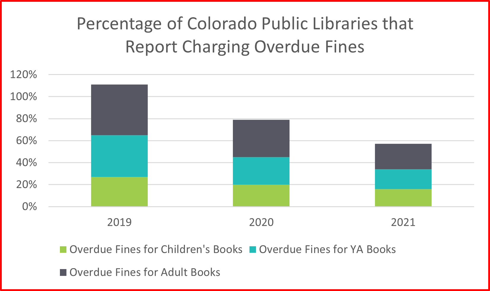
In Figure E, you can see how this stacked bar chart Excel recommended adds up the categories of overdue fines for children’s, YA, and adult books to make it appear that each category is a part of a total percentage for each year. This chart shows a percent decrease from year to year but gives the impression that the overall percentage of Colorado public libraries charging overdue fines is much higher than it actually is! Beware that these visualization tools, while helpful, do not have the whole story. Ultimately, it is up to all of us to make sure our visualizations are not false or misleading for our audience.
In these posts I will share insight into my process for working with data and the decisions I’m making, but I will never claim that the way I choose to visualize something is the only way it can or should be done. That being said, I hope quick warnings and reminders such as these can keep you on the right track as you exercise your creativity while building data visualizations. There’s a lot for all of us still to learn, and I would love to hear from you. If you have any suggestions for my visualizations, topics to discuss, aspects of the PLAR you would like to explore, or general questions please email them to wicen_s@cde.state.co.us. In the next post we will move away from line and bar charts to try a more unique data visualization tool!
LRS’s Colorado Public Library Data Users Group (DUG) mailing list provides instructions on data analysis and visualization, LRS news, and PLAR updates. To receive posts via email, please complete this form.