Is it really March already? Time has been flying by at Library Research Service, and hopefully this year is off to a great start for all of your libraries as well. If you have big plans to add to your library’s collection in 2023, you may find the following scatter plots on materials expenditures and circulation throughout Colorado public libraries particularly interesting. The data below is still from 2021, but with the Public Library Annual Report (PLAR) survey currently collecting data from 2022, in just a few months these posts will include fresh findings! In the meantime, let’s discuss the advantages of visualizing data with scatter plots, and find out whether there is a correlation between the amount libraries spend on their materials and how much these materials circulate.
The Scatter Plot Scheme
Scatter plots are used to chart two variables and indicate if a correlation exists between them. Scatter plots can show a negative correlation, no correlation or a positive correlation of varying strengths. If there is a correlation it means that there is a relationship between the two variables, but it does not necessarily mean that one variable directly affects the other. If you can prove that one variable directly impacts the other that would indicate causation between the two variables. If the difference between correlation and causation is fuzzy to you, LRS’ previous article, ‘Correlation doesn’t equal causation (but it does equal a lot of other things)’ will help to clarify the difference.
In 2021, 107 of the total 112 Colorado public library systems reported on both materials expenditures and circulation. In the first scatter plot I included a data point for each of these reporting libraries. Materials expenditures per capita is plotted along the x-axis and circulation per capita is plotted along the y-axis to produce the graph below:
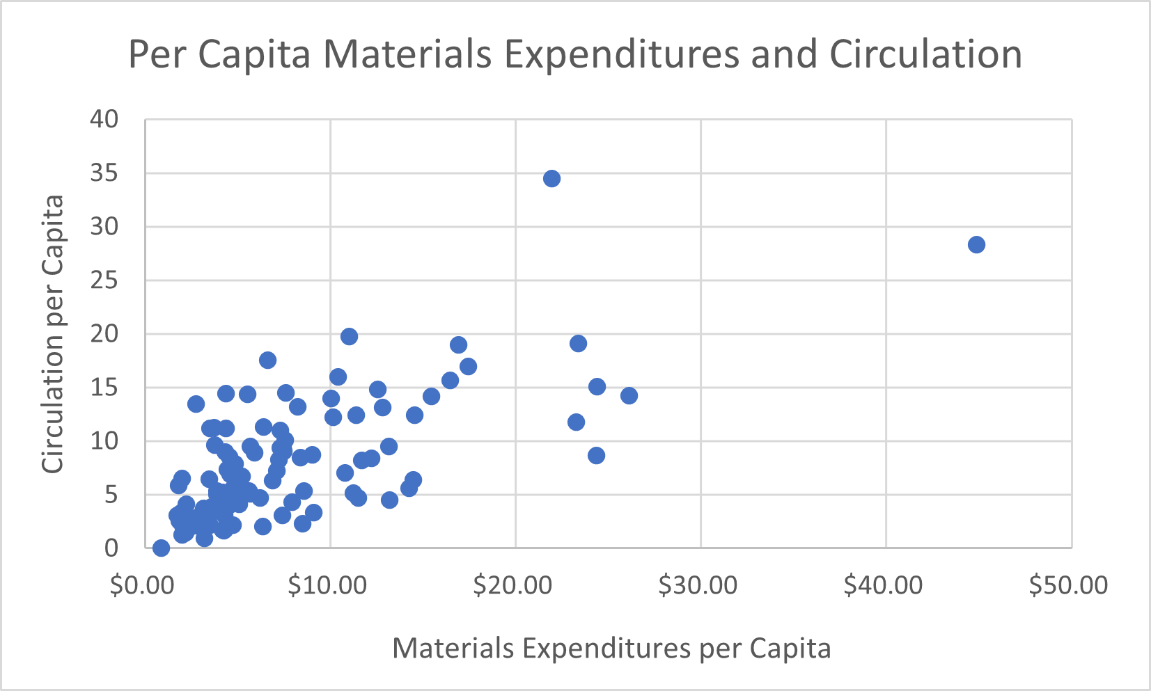
From this graph you can see that, in general, if a data point is plotted further right on the x-axis it is also likely to fall further up on the y-axis. This is indicative of a positive correlation or trend between materials expenditures and circulation. Again, keep in mind that this does not necessarily mean that spending more on materials directly causes your circulation to rise. There could be many different factors at play between material spending and a rise in circulation that are more directly influencing these numbers. For example, it’s very possible that libraries are able to spend more on materials if they have substantial support and engagement from their community which could also lead to higher circulation. If this is the case, community support and engagement are the factors that cause both materials expenditures and circulation to rise together, and it would be incorrect to assume that spending more on materials will directly lead to higher circulation of those materials without community support. An extensive investigation would be needed in order to say exactly what is causing a positive relationship between materials expenditures and circulation.
Mathematical Clues
Alright, so now that we’ve established what this graph might and might not be showing us, let’s take an even closer look at it. How confident are we that there is actually a positive correlation between materials expenditures and circulation? Well, luckily we don’t have to just guess because there is a mathematical equation that can tell us the correlation coefficient – a statistical measure of the relationship between two variables. From a scale of -1 to 1, the correlation coefficient of this data set is 0.68 (which I found using this formula in Excel). A correlation coefficient of 1 indicates the strongest positive relationship possible and -1 indicates the strongest negative relationship possible with no outliers in the data. A correlation coefficient of zero means that there is no relationship, so this data set’s correlation coefficient of 0.68 does indicate a moderate, positive relationship between materials expenditures and circulation.
Correlation coefficients can be very helpful in supporting your assertions, but always keep in mind that different areas of study will have different standards for a correlation coefficient to meet, and it is still imperative to consider the two variables you are comparing and what other factors may be at play. In other words, typing a formula into Excel should never completely take the place of thinking critically about the data.
Color Coding for Clarity
In the interest of critically thinking about the data, even after calculating the correlation coefficient I still had lots of questions. There are several outliers on this graph, meaning libraries that have low circulation and high materials expenditures or vice versa, as well as libraries with particularly high materials expenditures and circulation. With the goal of finding the cause of these outliers, I added a third dimension to this scatter plot by color coding each data point based on the library’s legal service area (LSA) population. I was hoping to see if there is a difference in material spending and circulation per capita between libraries with different LSA populations. Here are two graphs that were created in this endeavor:
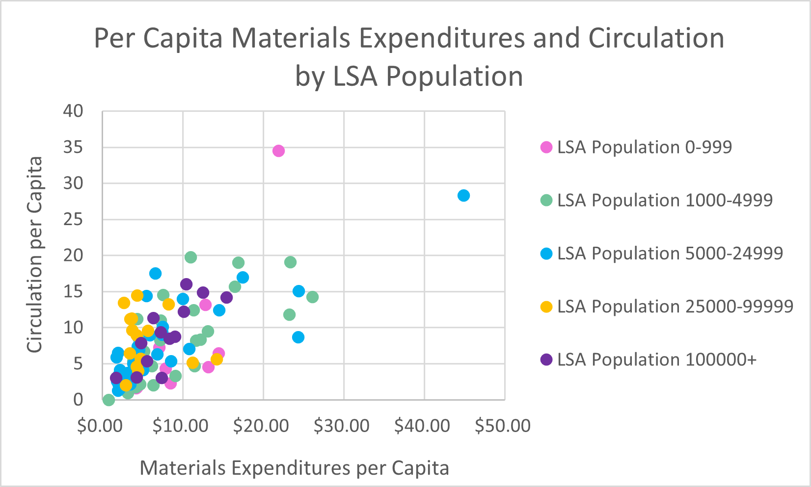
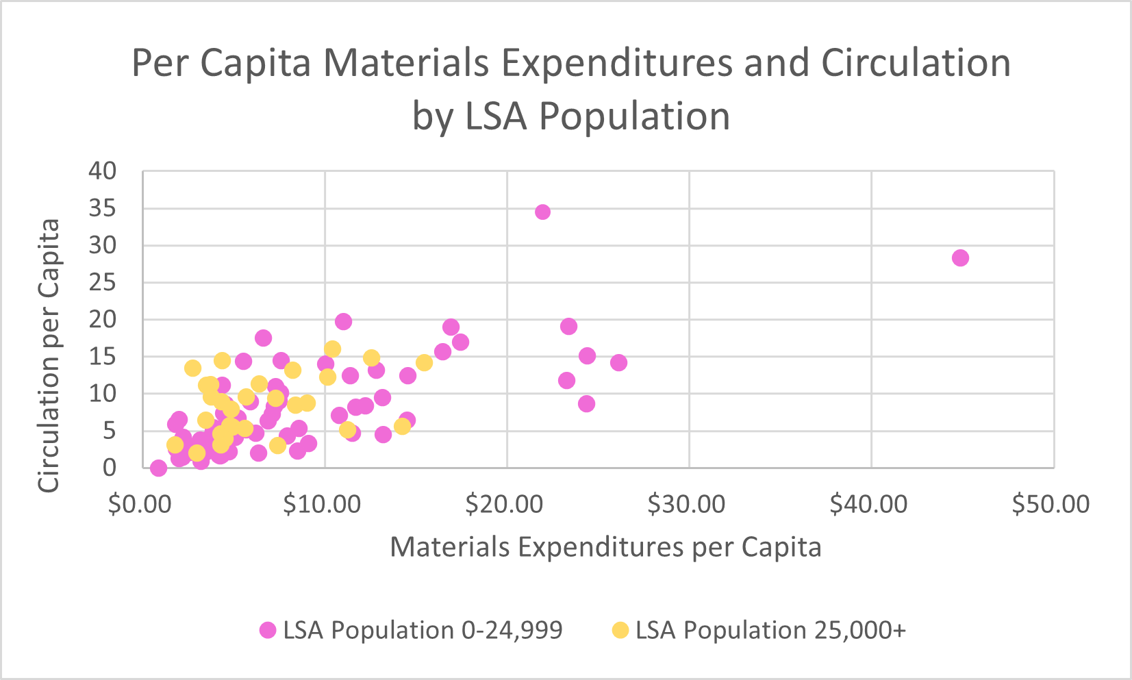
Figure B divides the libraries into five LSA population classes. Because of the overlap between each color, Figure B is a bit challenging to read. After taking a close look at Figure B, however, I began to wonder if a less complicated graph with only two LSA population classes would bring more clarity to the data. This led to Figure C, which shows that higher materials expenditures and circulation outliers are all attributed to libraries with an LSA population of less than 25,000. This naturally leads to the question, why might these libraries have the higher outlying values? One thing to consider is that there are more libraries that fall into the LSA category of 0-24,999 than 25,000+, so that could naturally lead to more outliers in this section. It could also be the case that these libraries were growing their collections faster in 2021 than libraries with larger LSA populations.
Eliminating Overplotting
In addition to the outlying data points, the dense cluster of data points in the bottom left corner of the graph above is also worth considering further. The data points overlap, so it is difficult to decipher how many data points are actually present in this part of the graph. Overplotting in scatter plots can obscure the relationship between variables in large data sets when you can’t tell how densely packed the data points are. The data set we are working with here is not huge, but I still thought it would be helpful to divide the data into subsets and plot fewer points on each graph. This could be done by taking a random subset of a large data set, but I decided to create individual scatter plots for each LSA population class. Of the five scatter plots this resulted in, four showed positive correlations between materials expenditures and circulation. Below I’ve shared a graph with a strong positive correlation which consists of libraries with an LSA population of over 100,000 and the only graph with a weak negative correlation which consists of libraries with an LSA population of 25,000-99,999.

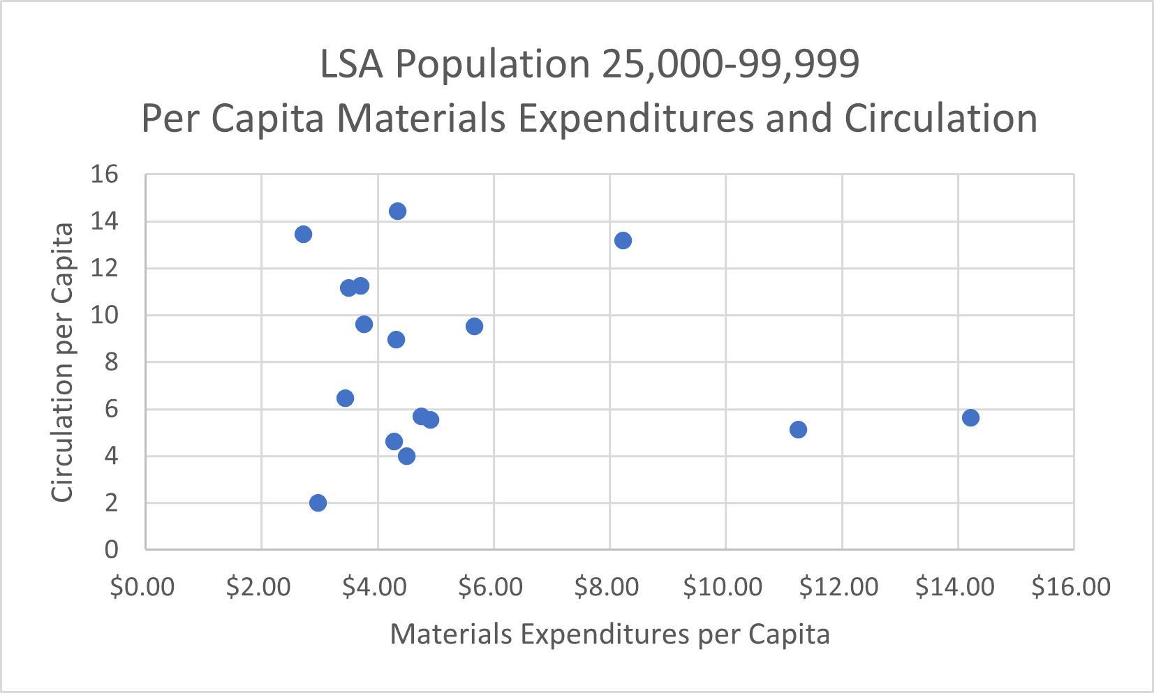
You’ll also notice a trendline in Figure D. This acts as a visual aid to help viewers quickly understand the relationship between these two variables. I did not include a trendline in Figure E because it depicts such a weak correlation that a trendline would be misleading. In fact, the correlation coefficient for Figure E is -0.17. This correlation coefficient is too close to zero to confidently draw any conclusions about the relationship between the variables in this data set. The fact that within the two largest LSA population classes one had a strong positive correlation and one had a slight negative correlation led me to conclude that a library’s LSA population might not have a lot of influence over the relationship between per capita materials expenditures and per capita circulation.
As you’ve probably realized, plotting per capita materials expenditures and circulation for Colorado public libraries in 2021 revealed a moderate, positive correlation between these two variables but also led to more questions than answers. While I wish I could bring more insight to this data in this post, this is also a realistic example of how data analysis often leads to more questions. Asking challenging questions, critically analyzing the data, considering other factors that may be influencing your data, and being cautious with your interpretation instead of jumping to conclusions are all important steps to take after a correlation between two variables is identified. As always, if you have any suggestions for my visualizations, topics to discuss, aspects of the PLAR you would like to explore, or general questions please email them to wicen_s@cde.state.co.us, thank you!
LRS’s Colorado Public Library Data Users Group (DUG) mailing list provides instructions on data analysis and visualization, LRS news, and PLAR updates. To receive posts via email, please complete this form.