Welcome back, library friends! We are already well on our way into 2023, and the new year has brought big changes to the LRS website! Along with the updated site, our blog posts will also take on a new look. In 2023, we will provide blueprints for analyzing and constructing visualizations from the Public Library Annual Report (PLAR) data. This spinoff of our ‘Between a Graph and a Hard Place’ blog series will be distributed through the Colorado Public Library Data Users Group mailing list, so if you would like to receive these posts along with other LRS news and PLAR updates click here to subscribe!
At the Library Research Service one of our main objectives each year is to survey Colorado public libraries for the PLAR. All of the data we collect lives on our site and is available for public use. Here you can find data from as far back as 1987. That’s 35 years’ worth of library data at our fingertips! Of course, the PLAR has evolved throughout the years. The data we collect now is much more robust than it was in 1987, and we are continually reviewing our questions to improve them for the upcoming year. Some of the questions are required nationwide by the Institute of Museum and Library Services (IMLS), but some questions are specific to Colorado. For example, in 2023 we are partnering with the Colorado Broadband Office to include questions on broadband internet services.
Our next several posts will walk through how I am working with this large data set, deciding what to share, and creating effective visualizations from this data. I hope you are as excited as I am to delve into 35 years’ worth of public library data in 2023, to share some interesting findings and learn a few things about data analysis and visualization along the way.
The Building Blocks
When I first started planning this LRS series, I fell into the all-too-common trap of feeling overwhelmed by the amount of data in front of me. I was motivated to create compelling visualizations with PLAR data but lacked direction and quickly realized that I was trying to skip two of the most important steps to take before you even begin creating visualizations. These two steps are considering the audience and keeping the end goal in mind. Returning to these building blocks after data collection and analysis is essential to creating visuals that communicate your findings effectively.
Working with the Audience
Thinking of the audience as part of your team will help ensure you are considering their needs and sharing all the essential information when presenting data. The first step, of course, is to identify the intended audience. Hopefully the intended audience is kept in mind throughout a project, but it’s always worth revisiting at this stage because different audiences will have different levels of data literacy. How experienced an audience is with reading data and how much background information they have will likely influence what you share and how you share it. However, even the most experienced data analysts will still appreciate a clean, simple visualization, so less complicated visualizations will generally be received better by all audiences.
If you’ve read this far, you are presumably part of my intended audience! I’m working with a broad audience, but below are a few assumptions I made about this intended audience to guide my data visualizations. My intended audience –
- Is interested in learning more about data analysis and visualization.
- Cares about libraries and library data.
- Has been introduced to research concepts and library terms.
These points may be broad, but they helped me answer questions such as, “What do I want my audience’s first impressions to be?” and “What does my audience care most about?” Answering these questions significantly narrowed down which pieces of PLAR data to focus on.
Purposeful Construction
Main research questions and goals are often identified at the beginning of a project, but again, returning to them while creating your visualizations is highly encouraged. The main goal of these posts is to teach skills for data analysis and visualization in order to help libraries learn from, share, and act on the data they have collected. Finally, I want to dig into the PLAR data’s information potential and bring to light some key findings.
There are countless stories I could tell from this data, which makes creating a visualization without a specific research question particularly challenging. The PLAR data can be analyzed longitudinally (across time) or cross-sectionally (a comparison at a single point in time). It can be overwhelming to consider all the possible approaches to this data set, so to prevent myself from drowning in the data I decided to first create visualizations with the purpose of illustrating these two ways that the PLAR data will be examined in 2023. We will be looking at our most recently collected data by comparing groups within the data at one point in time (cross-sectional) as well as data through time (longitudinal).
A Cross-Sectional Snapshot
 Cross-sectional studies compare different groups at one point in time. A cross-sectional snapshot of the most recent PLAR data from 2021 (collected in 2022) shows that libraries’ average number of staff per 1000 people served decreases as the library’s legal service area (LSA) increases. As explained on the LRS definition of terms page, “[Staff per 1,000 Served] may be relevant whenever the adequacy of library staffing and staff funding are issues. It is particularly useful when the population or geographical area which the library serves increases dramatically. When that happens, there should be a corresponding increase in staff to offset the population increase.”
If I chose to compare the staff per 1,000 people served at each individual library, without averaging these groups, I would have over 100 data points. From this visualization you may be able to identify general trends or outliers but the meaning behind the data would be tricky to identify. By grouping Colorado public libraries by their Legal Service Area (LSA) population and comparing these groups, a trend in the data suddenly becomes clear. Although libraries with larger LSA populations may have more staff, they have less staff per 1,000 people that they serve compared to libraries with a smaller LSA.
The Longitudinal Look
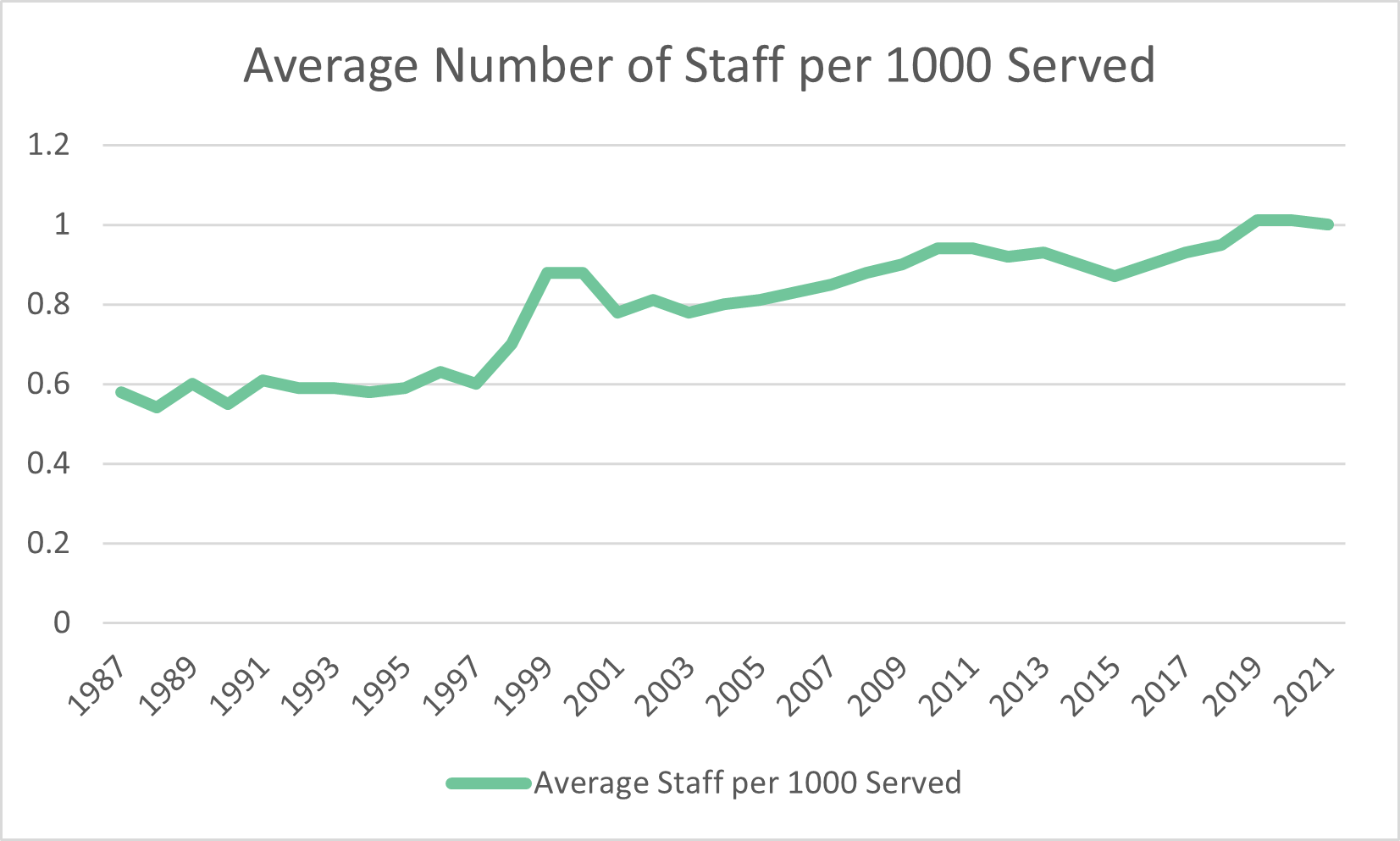 With 35 years worth of data available, I also wanted to consider changes through time, as is done in longitudinal studies. The line chart on the right shows how the average number of library staff in Colorado per 1,000 people served has actually increased in the last 35 years by almost .5 full-time equivalent (FTE) employees. This increase is a positive trend, but it has plateaued in the past three years. One staff member per 1,000 people served was the latest average for Colorado libraries in 2021.
Telling the Whole Story
Ultimately, the goal of data visualization is to tell a story. There’s a lot to consider when transforming your data into a coherent narrative, so I thought it worth digging up the four-part series on data visualization that LRS published in 2020. These four posts, covering a misleading y axis, the logarithmic scale, visualization color, and chart choice, contain helpful information that I will be building on while making more visualizations with PLAR data. Even though some of the heavy lifting is done after data collection and analysis, there’s still a large list of things to piece together when presenting your data. Considering your audience and end goal first, as well as making effective design choices, will ensure that you are able to share the whole story with the data at your fingertips.
LRS’s Colorado Public Library Data Users Group (DUG) mailing list provides instructions on data analysis and visualization, LRS news, and PLAR updates. To receive posts via email, please complete this form.