Happy Pi Day! I hope everyone looking to celebrate today eats a yummy piece of pie or at least momentarily contemplates the remarkable mystery of the number pi. As a quick reminder, pi is the number found when any circle’s circumference is divided by its diameter (3.1415926535…). One of the most significant and mind-boggling facts about this number is that nobody actually knows its exact value because it is infinite, and the digits go on forever with no discernible pattern. This extraordinary number has a long history, and has helped us better understand our universe. It is even found in nature.
Circles are everywhere, including the world of data visualization. Using the Public Library Annual Report (PLAR) data let’s celebrate Pi Day by checking out some circular data visualizations. Of course, the logical place to start is pie charts! Pie charts have become controversial in the data world because of their overuse in situations they are not suited for. The last thing I want to do is lead libraries towards a visualization method that may not be the right fit for their data, but pie charts are tempting to use and easy to create, so it’s valuable to understand their place in data visualization and when not to use them.
The Pie Chart Predicament
The only time you may want to choose a pie chart to visualize your data is when you are comparing parts, or percentages, that add up to 100. Much of the PLAR data is not suited for pie chart visualizations because it consists of more than 100 Colorado library systems and many individual data points, which naturally leads to comparisons between libraries. A pie charts should NOT be used for presenting –
- Over five groups (Pie charts should not be split into more than five categories because the more slices there are in a pie chart, the harder it is to comprehend)
- Multiple pie chart comparisons (It is easier for the human mind to compare things accurately when the difference is shown through height or length, as opposed to the angles of pie pieces.)
- Changes through time (Pie charts capture a moment in time. Line charts are better suited for changes through time.)
Partnerships and Pie Charts
Keeping these limitations in mind, I searched for 2021 PLAR data that divides Colorado public library systems into a few groups and can be converted into percentages. This led me to Colorado public library partnerships, which is definitely something worth celebrating any day!
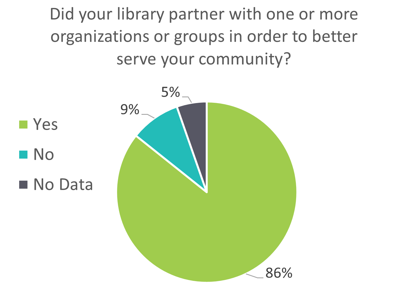
These two pie charts show the percentage of Colorado public library systems that reported partnering with organizations and groups in order to better serve their community and the percentage of library partnerships that included sharing staff, resources, and/or costs. The percentage is displayed by the proportion of the circle colored for each answer option. In Figure A, the vast majority of library systems answered “yes” (86% of Colorado public library systems) to partnering with groups outside of the library to better serve their community. This pie chart also shows the percentage of library systems that answered “no” or did not answer (9% and 5% respectively). On its own, Figure A is an acceptable use of a pie chart if your intention is simply to show that the majority of Colorado public library systems form partnerships to serve their community.
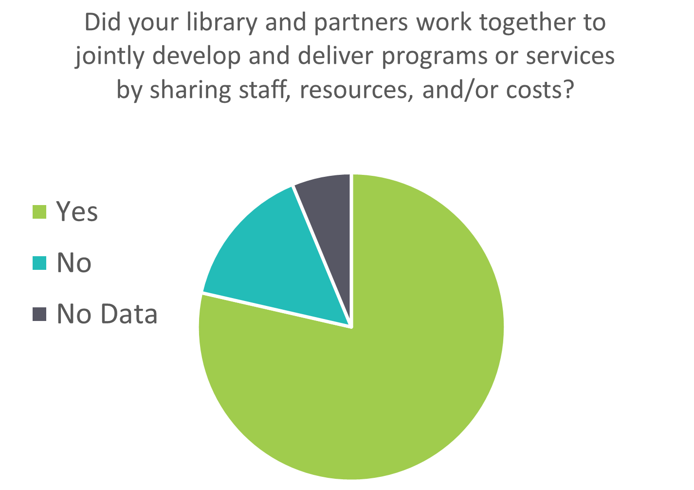
Figure B shows that fewer library systems reported that their partnerships included sharing staff, resources and/or costs. Placing pie charts side by side, as I’ve done here, is an example of comparing pie charts, which is a common mistake in data visualization. Without percent labels in Figure B can you tell that more library systems did not answer the question posed in Figure B than in Figure A? Would you have guessed that there is a seven percentage point difference between the number of library systems that answered “yes” to these questions? As previously stated, it’s generally more challenging for us to accurately perceive a difference in area when it is presented by angles as opposed to length. To demonstrate this point, below is the exact same data displayed on a stacked bar chart:
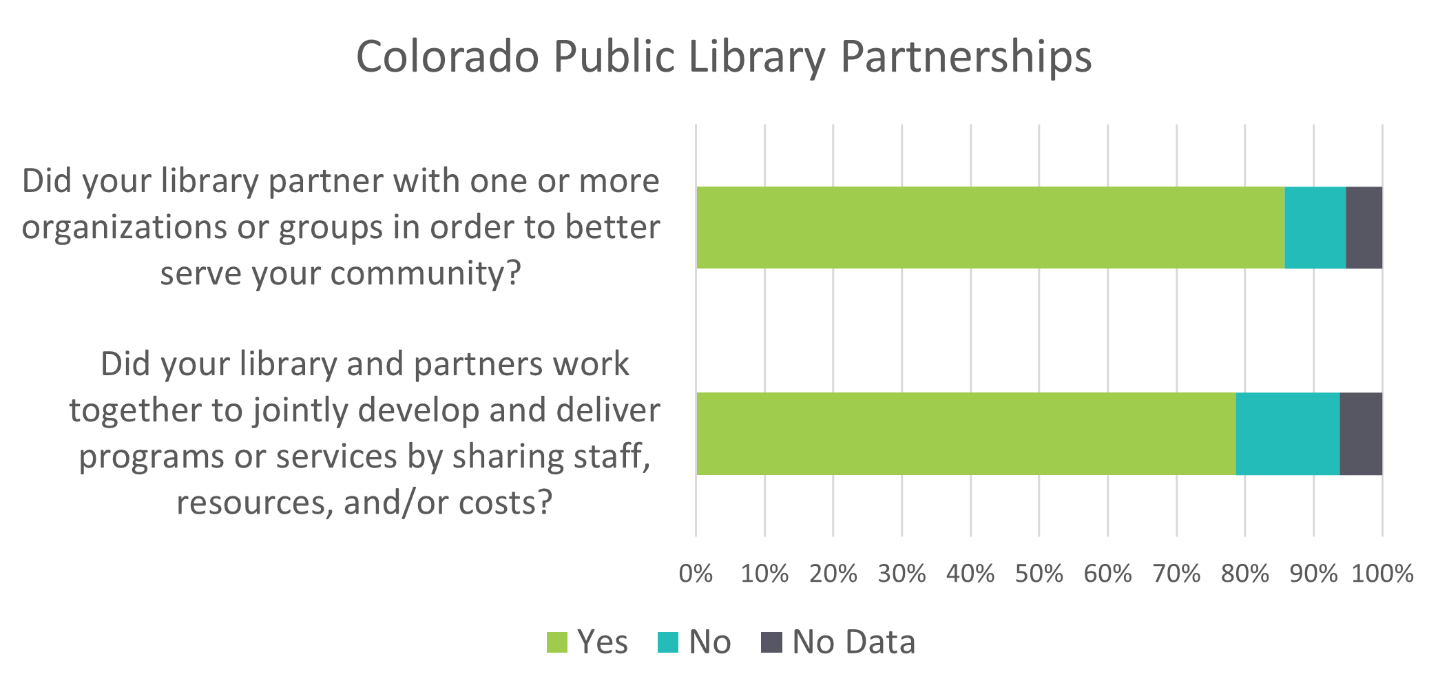
This stacked bar chart is much easier to digest than comparing two pie charts side by side and helps its audience gain a more accurate understanding of the data. Over three quarters (79%) of Colorado public library systems not only partnered with groups outside the library but also worked with these partners to share staff, resources, and/or costs of joint programs in 2021. In conclusion, pie charts can convey a simple snapshot of data, but other data visualization methods are much better at telling stories through data.
Beyond the Pie Chart
As the overuse of pie charts is acknowledged, alternatives to them have gained popularity. Unfortunately, all of these circular charts share the same downfall; our brains just have a hard time comprehending and comparing circular areas. To see how other circular charts, such as the donut chart, are different, I pulled data from the PLAR on how many Colorado public libraries have a Friends group or library foundation to help make services and programs for their community possible.
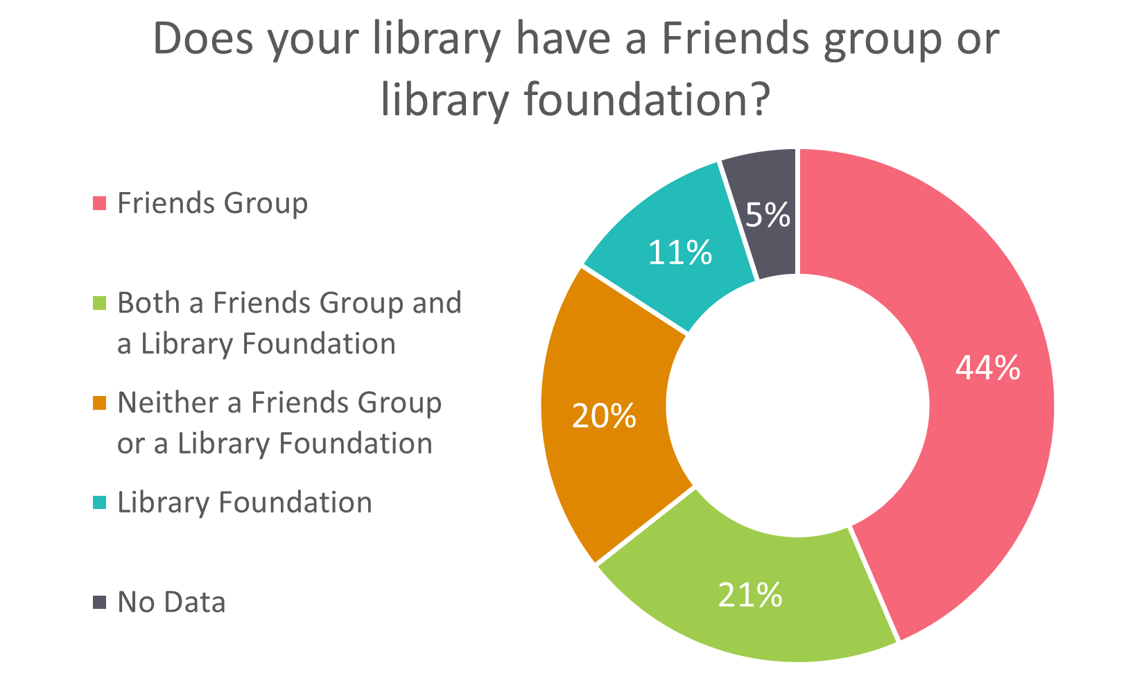
A donut chart is often preferred to a pie chart because it’s less visually dense and draws the reader’s eyes towards the length of each segment rather than the angle of pie slices. The donut chart in Figure D shows that 44% of Colorado public libraries have a Friends group, 11% have a library foundation and 21% have both forms of support. The percentages on this donut chart equal 101 instead of 100 due to rounding. This is the only acceptable reason for a pie or donut chart not to equal 100, and if this is the case, it should be noted on the visual so readers do not think it is an error. Another data visualization tip for both pie charts and donut charts is to ensure your categories are ordered from largest to smallest. Each category in Figure D is purposefully ordered by size. This makes it easier for us to comprehend and reduces the likelihood that a small category will be overlooked.
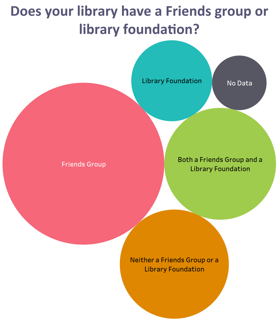
To wrap up our celebratory Pi Day post, I’m introducing one more method for visualizing data with circles! Figure E is called a packed bubble chart, and instead of using proportions of pie slices or donut pieces, it uses an entire circle to proportionally represent the same categories depicted in Figure D. This packed bubble chart is fairly simple, with only five categories, but bubble charts aren’t as limited in the number of categories they can show as pie charts are. There are multiple types of bubble charts, and this packed bubble chart is not concerned with the placement of the circles, only their color and size. More complex bubble charts use an axis to chart the placement of the circles, so they can show three or more dimensions of data at one time. LRS will explore bubble charts further in an upcoming post. In the meantime, let’s return our attention to pi! Figure E shows the proportion of libraries in each category based on the area of its circle. Bubble charts use the area of a circle proportionally to depict data, and the formula for the area of a circle is pi multiplied by the radius squared. Pie charts may not be the answer to all of our data visualization needs, but the number pi has certainly helped us answer a countless number of math problems throughout history.
LRS’s Colorado Public Library Data Users Group (DUG) mailing list provides instructions on data analysis and visualization, LRS news, and PLAR updates. To receive posts via email, please complete this form.