Happy summer to the library community! Though the days have already started to shorten again, hopefully you all can find some time to enjoy the warm weather in the months ahead. As distracting as summer can be, at LRS we’re still knee deep in library data and working on some exciting projects, which include the PRISM study and a report on 2022 challenges to library materials in Colorado. In July, the 2022 Public Library Annual Report (PLAR) data will be verified and available to the public, meaning the Public Library Blueprints blog will also start exploring the latest Colorado public library data. In the meantime, we’re wrapping up our exploration of 2021 PLAR data by visualizing the square footage of Colorado public libraries through treemaps, a type of data visualization that grew on me as I wrote this post.
The Roots
Treemaps consist of categories and subcategories represented proportionally by rectangles clustered together. As with many data visualization methods, the data is conveyed through both size (in this case the area of rectangles) and color. This data visualization came about in the 1990’s as a solution for sorting large data sets in limited space. Treemaps were named such because they were first conceptualized as an actual tree-shaped structure, but the problem with using a branching tree structure to display data is that it takes up a lot of space. Even though I like the thought of an elaborate tree structure depicting library data, it would likely not be easy to read or an efficient use of space. On the other hand, compacted rectangles eliminate white space while still keeping some visual appeal.
I chose to focus on treemaps in this post partly because I have minimal experience with them, and what better way to learn than to create them myself! Also, LRS has received a couple of inquiries from libraries about square footage, and a visualization that depicts data proportionally through rectangular areas struck me as a fitting way to show library square footage. Building the following treemaps was a learning experience, and I was surprised by the number of possibilities for these visualizations that opened up along the way.
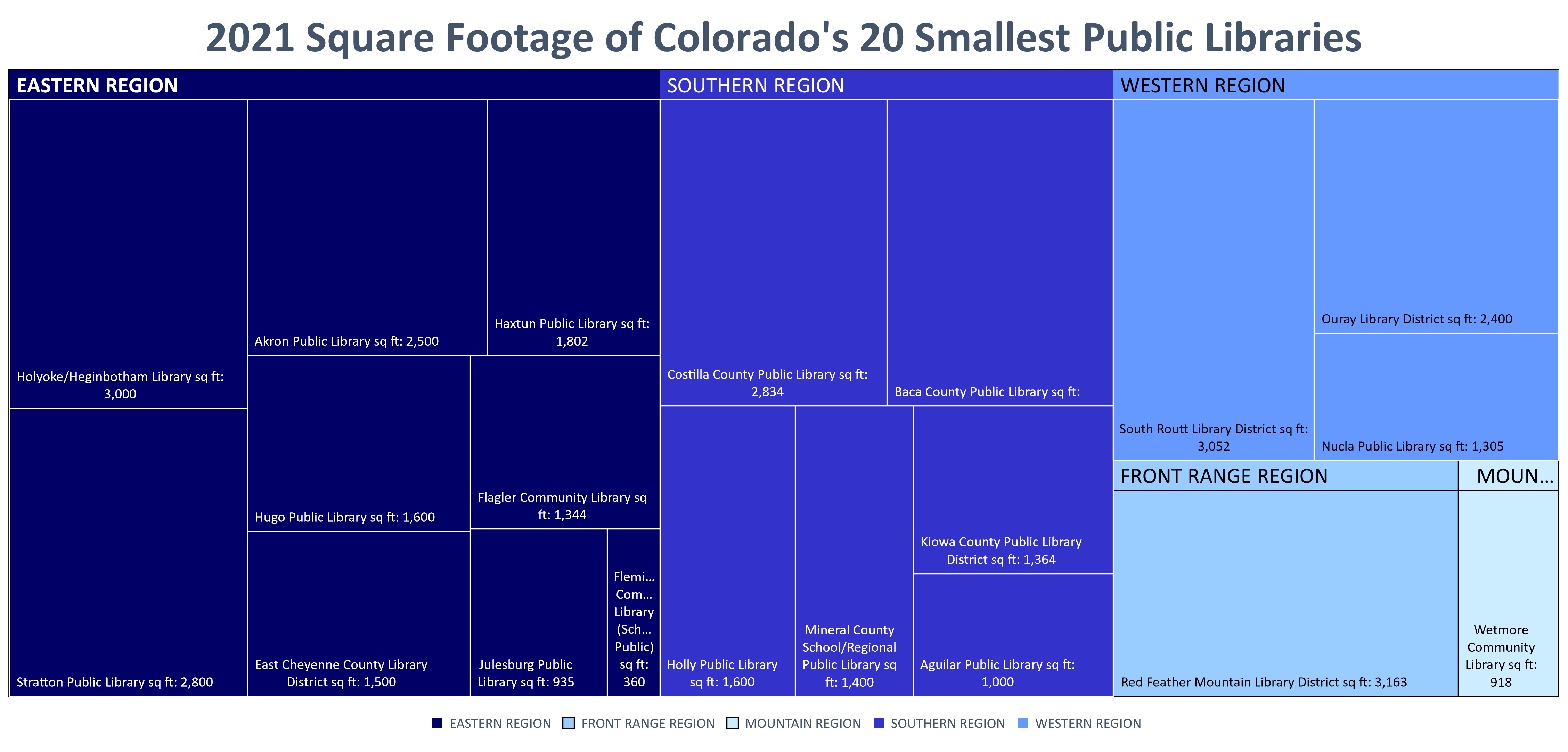
This first treemap, Figure A, shows the square footage of the 20 smallest public libraries in Colorado categorized by region. It should be noted that the square footage listed is the combined square footage of every indoor location for each library. Each color represents a different region of Colorado, and within each region the libraries are sorted with the largest in the top left and the smallest in the bottom right. Separating the libraries by region shows how many libraries each region has in this data set. For example, the Front Range and Mountain Regions only have one library each in the 20 smallest libraries list. The Eastern Region contains nine of the 20 smallest libraries.
Showing only the 20 smallest libraries allows each rectangle to be sized so that its label is still visible. Wide ranging data sets can be challenging for treemaps because some rectangles will be overwhelmingly large while others will be very small proportionally, making them challenging to read. I tried to make Figure A as easy to read as possible by limiting the amount of data in the chart, including both banner labels for each region and a legend, and using different shades of the same color, because color contrast is more accessible for people with color blindness.
Branching Out
After creating Figure A, I decided to try to add a third dimension to a treemap. Comparing square footage is interesting in and of itself, but it’s especially useful when compared to how many visitors each library receives. It’s important to have enough physical space for the number of people spending time at the library, the materials they utilize, and the activities they partake in. Below, Figure B shows the square footage of Colorado’s 20 largest public libraries by region and uses color to convey how many visitors each received in 2021. Data from 2021 is the latest PLAR data currently available, however, in 2021 some public libraries still had restrictions in place due to the pandemic, so it should be noted that the number of visits in the following two treemaps were influenced by the COVID 19 pandemic and may not represent normal trends.
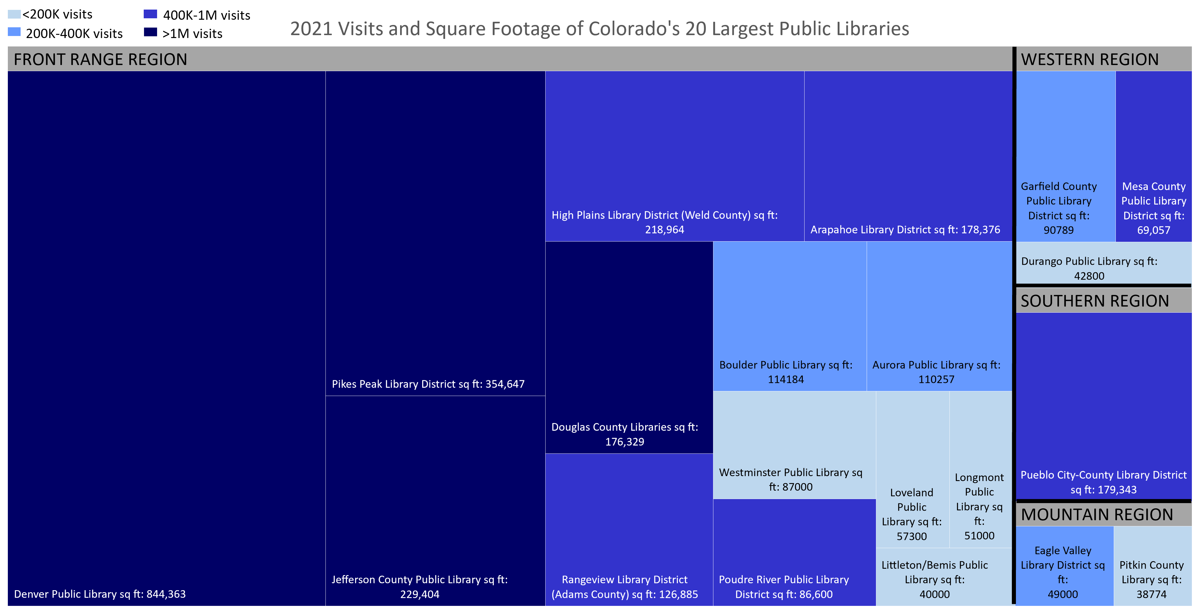
After reviewing the annual visits for each library in this data set, I decided to use four categories to represent visits: less than 200K visits, 200K to 400K visits, 400K to 1M visits, and over 1M visits. Excel allows users to change the color of each rectangle in a treemap individually, so I could color code each library based on which category of visits it fell within. Then, of course, it was necessary to add a legend so readers know what each color means. Lastly, I added a more defined black border between each region to make it easier for readers to differentiate between them. This chart allows readers to compare both the size and visits for each library to see whether libraries of a similar size have a similar number of visits both in and outside of their Colorado region.
I found Figure B to be useful but also a little busy. When the treemap is separated by region, libraries with similar square footage are not necessarily placed next to each other. For example, Pueblo City-County Library District is slightly larger than Douglas County Libraries but receives fewer visits. Because Pueblo City-County Library District is headquartered in the Southern Region, however, this chart sets it apart from other libraries that are similar in size. If the main goal of this treemap is to compare square footage and visits, also dividing up the libraries by region distracts from the message. In Figure C the region is removed to focus on visits and square footage.
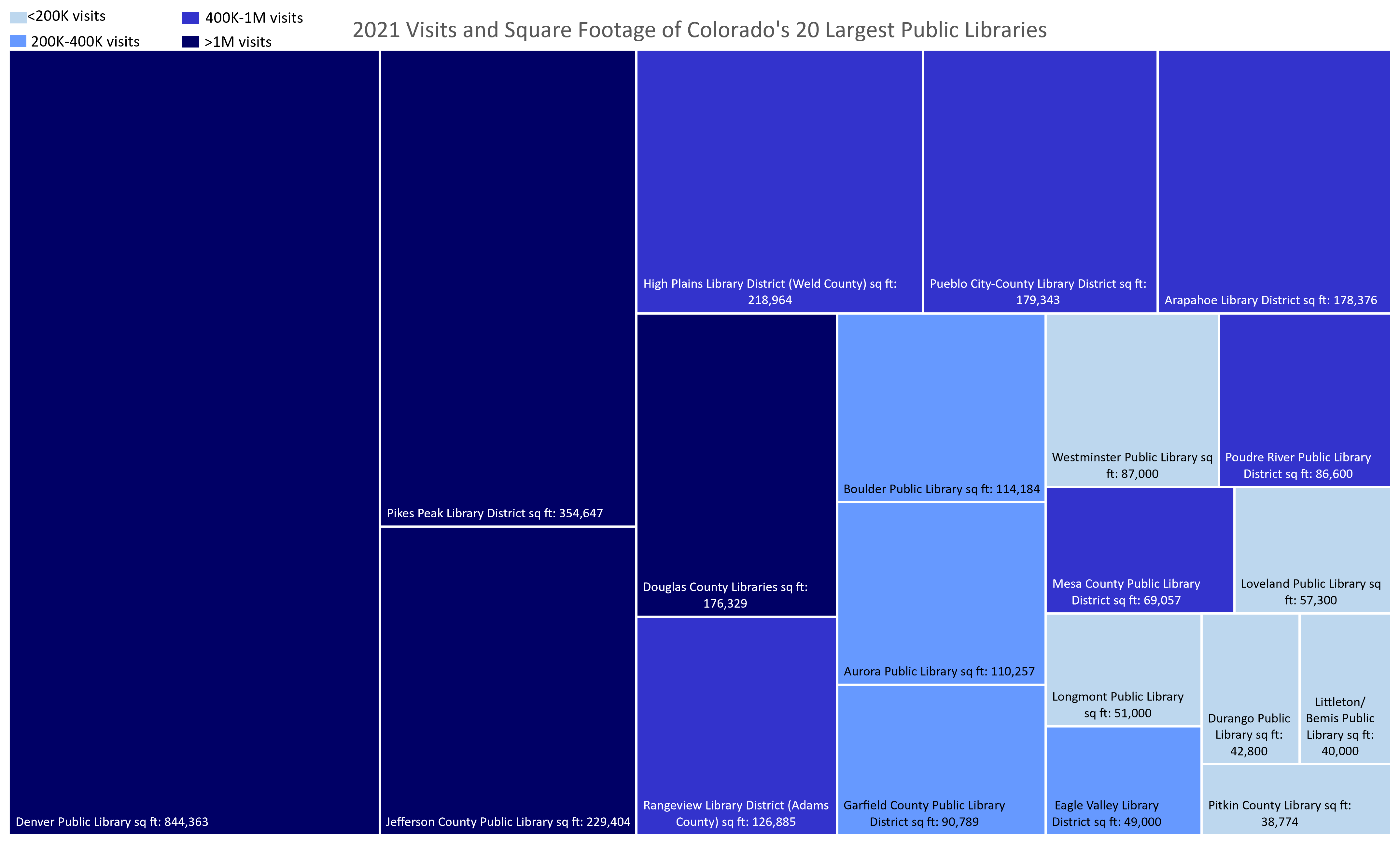
Without incorporating regions it is easier to see if libraries have a similar number of visits to other libraries their size. For example, Mesa County Public Library has more visits than Westminster Public Library, Boulder Public Library, Aurora Public Library, and Garfield County Public Library, all of which have more space than Mesa County Public Library.
Last Bud Not Least
Treemaps are versatile, but they are not the right fit for every scenario. In this post I was limited by space because I wanted the label for each rectangle to be easily readable. Showing only 20 libraries at a time was a great solution. Also, treemaps can take up a lot of space on a data visualization dashboard, and there are often alternative visualization types (such as bar charts) that will show the same data in less space. The rectangular areas not only take up a lot of space but can also be challenging for an audience to decipher especially if the sizes are too similar.
That being said, once I understood how treemaps convey data and how to make them, possibilities for comparisons sprouted up everywhere. For example, a treemap could also compare the three largest or smallest libraries from each region or be color coded by the Legal Service Area (LSA) population instead of visits. Treemaps are a fun way to sort data sets and reveal outliers, and building these three treemaps shed new light on the PLAR data. If you’re curious how your Colorado public library compares and don’t see it on the charts above please reach out to LRS by emailing wicen_s@cde.state.co.us, and we can make a similar chart that includes your library.
LRS’s Colorado Public Library Data Users Group (DUG) mailing list provides instructions on data analysis and visualization, LRS news, and PLAR updates. To receive posts via email, please complete this form.