Back in March, The Public Library Blueprints discussed both scatter plots and packed bubble charts and promised to follow up these two visualization methods with a post on bubble charts, which are a combination of both. After spending lots of time with the Public Library Annual Report (PLAR) data, it’s finally time to tackle bubble charts. While preparing this post, however, we learned that you need a very specific type of data set for a bubble chart to work at all. This post will discuss which circumstances work with bubble charts and which do not, so you are prepared to recognize when and when not to try visualizing your data with a bubble chart.
A much younger, littler version of myself used to love chasing down bubbles only to watch them disappear into thin air as they popped in front of me. I couldn’t help but draw a comparison between those memories and the process of building bubble charts with PLAR data, as I chased down the data I wanted to visualize only to have the idea blow up when I tried to fit this data into a bubble chart. So what does it take to build a chart with bubbles? To answer this question, let’s first address what a bubble chart is and then look at a couple of examples that chart Colorado public library visitation and circulation by region.
So, Why Bubbles?
Bubble charts are scatter plots with an added dimension. Scatter plots visualize two variables along an x and y-axis. The same is true of bubble charts but they also incorporate an additional variable through the size of each data point, creating the “bubbles” in the chart. Bubble charts may also include color, so they generally chart either three (x-axis, y-axis, and bubble size) or four (x-axis, y-axis, bubble size, and color) variables. Scatter plots, on the other hand, only chart two or three variables depending on whether or not they incorporate color. Adding an additional variable to a scatter plot may sound simple enough to begin with, but bubble charts become complicated quickly because they have to balance three or four variables at once and preferably should show a clear trend in this data. The right sized data set with multiple interrelated variables forming a clear trend between them is a rare find, but if the data does fit, bubble charts are a fun, engaging way to visualize complex relationships and a powerful tool for communicating data findings.
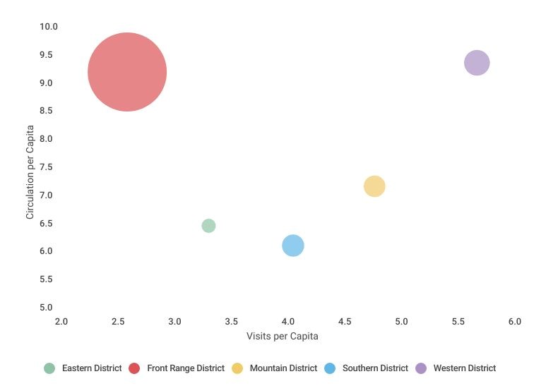
To demonstrate bubble charts, I purposefully used two straightforward library measures in an attempt to simplify the visualization of multiple variables at once: circulation and visitation per capita. It’s also common for bubble charts to contain a geographical component. This is by no means a requirement of bubble charts, but it can be helpful in revealing trends between multiple variables. I grouped Colorado public libraries by region based on the county that their headquarters is located in. In Colorado, counties are divided into five different districts: Eastern, Front Range, Mountain, Southern, and Western. Each bubble in Figure A represents the libraries headquartered in one of these regions, and the color that corresponds to each region is explained by the legend. Where each bubble is plotted on the x and y-axes shows the average visits per capita (x-axis) and circulation per capita (y-axis) for the libraries in each region of Colorado. Finally, the variable that ultimately makes this a bubble chart is the size of each bubble. In Figure A, each data point also indicates the average legal service area (LSA) population of the libraries in each region. The larger the bubble, the more people the libraries in that region of Colorado serve.
These four variables (region, circulation per capita, visitation per capita, and LSA population) work together in a bubble chart because they all have the potential to influence each other. For example, Figure A shows that libraries in the Front Range District have a much larger LSA population on average, and this may be why visits per capita are lower than any other region. You can also see that, even though visits per capita are low, Front Range libraries still have high usage based on their average circulation per capita. Because this chart averages the data from each region, however, there are a lot of nuances to the data not visible in Figure A, and it’s challenging to discern true trends from a bubble chart with only five bubbles.
The Bubble Variable
The size of the data points is the variable that distinguishes a bubble chart from a scatter plot, but as we’ve previously discussed, representing size with circles is tricky. The human mind has a harder time discerning differences in circular areas than, for example, the length of a bar, so when and how should you use a bubble chart instead of a bar chart? First, when scaling the bubbles by size, it is important to ensure the sizes are proportional based on the overall area of each circle. For example, libraries in the Front Range have an average LSA population that’s more than 36 times that of libraries in the East, but in order to size these bubbles proportionally to each other, Infogram (the data visualization platform that I used) did not multiply the diameter of the Eastern District’s bubble by 36. Instead, it made the entire circular area 36 times larger, not the radius or the diameter. If you scale the radius or diameter instead of the area, the size difference in bubbles will be misleading.
Because incorporating this additional size variable adds a layer of complexity, and it is difficult for the human eye to discern subtle differences in circular areas, it is important that incorporating this additional variable adds clear meaning to the chart. If the values for any of the variables visualized by a bubble chart are too similar it can make the chart unreadable, and the size variable is no exception. The bubble chart below shows how challenging it can be to meaningfully discern size in a bubble chart.
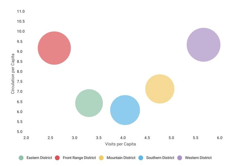
Figure B shows the number of libraries in each region rather than their average LSA population. While each region has a different number of libraries in it, this chart does not make those differences very clear. The Front Range and Western Districts have a larger number of libraries, which may be discernible, but without labels the actual difference is a mystery. In reality, the Western District has the most libraries (27) while the Eastern District has the least with 18 libraries. Not only are these differences hard to see, but this information does not add any significant meaning to the chart’s overall message.
The Challenge of Building With Bubbles
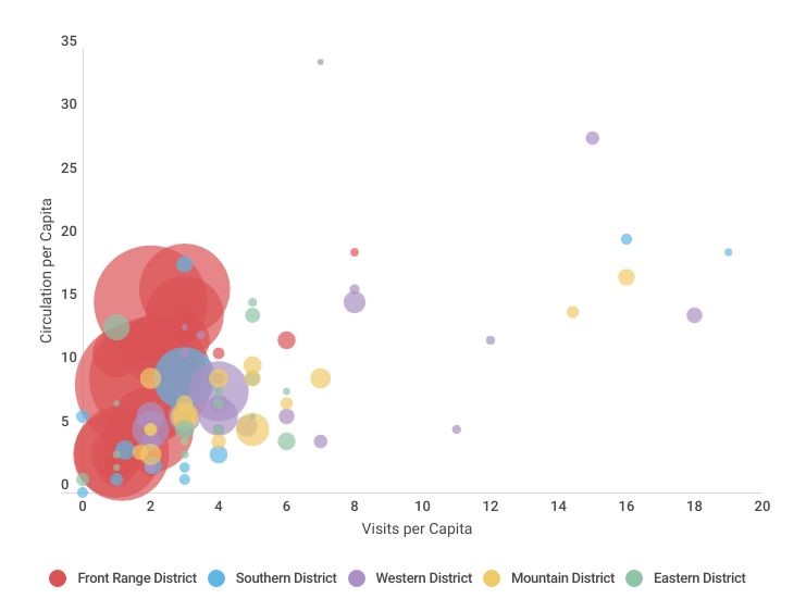
Earlier, we stated that bubble charts should show a clear trend, and five points may not be enough to show a trend. That does not mean, however, that more data points are always better. Figure C depicts the same variables as Figures A and B, but it contains a bubble for each library instead of averaging the data from each region. This chart shows the range of values in each region, with the Southern, Western, and Mountain districts having particularly wide spread data. Still, displaying a data point for each of the 106 libraries that reported on these variables is not a clear or practical way to visualize this data. Identifying each individual data point is practically impossible because of how the LSA population size variable causes the bubbles to overlap. The difference of LSA population between libraries is also so wide that proportionally representing this with bubbles causes some of the bubbles to be so small that they are easily overlooked. On the other hand, many of the libraries have similar visitation and circulation per capita, which causes these bubbles to be placed too close together or even on top of each other. When building bubble charts, both too much variation within the data and a lack of variation within the data can make the visualization difficult to interpret.
Challenges, such as densely packed data, are why bubble charts often show relationships between categories–like region–rather than including a bubble for each individual data point. If your data naturally falls into several categories that you need to compare multiple variables within, that might be a sign to try a bubble chart.
Clarity and ease of interpretation for your audience is especially important with bubble charts because of their complexity. Storytelling with Data’s blog post “what is a bubble chart” explains that, “The human brain’s short-term memory can store only about four pieces of visual information at once, so a four-dimensional bubble chart…tests the limits of our working memory.” That’s why, in an ideal world, not only would the spread allow each bubble to be clearly discernible, but the data should also show a clear trend. If you have your audience go through the work of understanding each variable the bubble chart visualizes and how they relate, the message from the chart should be clear to make it worth this time and energy.
Lastly, if your data is well suited for a bubble chart, be sure to label it adequately. Even the clearest trends will be meaningless if the audience doesn’t know what the size of each bubble represents. Unfortunately, I’ve yet to find data from the PLAR that fits a bubble chart perfectly, but I learned something important about bubble charts each time I tried.
Conclusion
An important takeaway from all of this talk about bubble charts is that you need the right type of data set to make one work. They can be very visually appealing and informative if used correctly but incredibly confusing and frustrating without the right data set. While none of the PLAR data in these three bubble charts is an ideal fit, it serves the purpose of visualizing the main components of bubble charts and some bubble chart traps that are easy to fall into. Oftentimes, the PLAR data did not work with a bubble chart because the values either had extreme outliers or were too similar causing bubbles to be packed too close together to read. If the PLAR data was more evenly spread or showed clearer trends a bubble chart would be a more suitable option. If, like me, you’re finding that your data is just not suited for a bubble chart but you would still like to visualize how three or four variables are related, you could make a series of different types of charts instead that tell the same story as one bubble chart. This alternative also helps avoid information overload by breaking down the information for your audience into multiple charts.
As challenging as it was to build bubble charts from the PLAR data, there are so many variations of bubble charts that I’m sure we will return to them in The Public Library Blueprints another time. In the meantime, check out these intriguing bubble charts for some data visualization inspiration, and as always, if you have any suggestions, comments or questions about The Public Library Blueprints topics or the data used please email them to wicen_s@cde.state.co.us. Thanks for reading!
LRS’s Colorado Public Library Data Users Group (DUG) mailing list provides instructions on data analysis and visualization, LRS news, and PLAR updates. To receive posts via email, please complete this form.