One of the first times I gave much thought to what makes color I was playing with a rainbow suncatcher at my grandma’s house. Young me was amazed by the little, vibrant pieces of rainbow it cast around an entire room and had a zillion questions about why and how this happened. I was told that sunlight is actually made up of all the colors in the rainbow and by reflecting the sunlight, this ornament breaks the light up into the different wavelengths of each color. I definitely did not fully understand this response back then, and even now that I have a better grasp on it, I still find it fascinating to think about the many different wavelengths that are absorbed or reflected to show us all the various colors. I’m by no means a color expert, but lately I have been giving a lot of thought to color as I design my data visualizations and reports with care, so they are accessible to people who see color differently or not at all.
Data visualizations are one of many pieces of research that cross the divide between math, science, and art. The colors we use in our visualizations can influence how people interact with the data, how they feel about it, and what they take away from it. Color can be used to guide the readers’ eyes and highlight key pieces of information in data visualizations. A visually appealing chart is going to be more engaging for an audience and the more engaged an audience is, the more likely they are to understand and retain the information being presented to them. That being said, imagine how frustrating it would be to try to decipher a legend that is difficult to read because the color choices aren’t accessible.
Around 1 in 200 people assigned female at birth (0.5%) and 1 in 12 (8%) people assigned male at birth experience some form of color vision deficiency (CVD), also called color blindness. This means a data visualization made with accessible color choices will engage many more people than one using inaccessible color choices. In addition to reaching more people, accessible color choices help libraries stay compliant with current accessibility guidelines such as WCAG (web content accessibility guidelines). However, even after recognizing the prevalence of color vision deficiencies, it can be challenging to know how to move forward with accessible color choices if you don’t understand what CVD really means and what makes a color palette accessible.
What causes CVD?
Color vision deficiency (CVD) is a more accurate and encompassing term than color blindness because complete color blindness is quite rare, affecting around 1 in 33,000 people. This is because there are three different types of cones in the human eye that help us detect the wavelengths of different colors, cones for red, green, and blue light. People with CVD might have all three cones but with one not functioning properly, or they could be missing one type of cone completely. If someone doesn’t have any of the three types of color-receiving cones then they are completely color blind.
By far the most common type of color vision deficiency is called deuteranomaly, where there is a weakness in the cones that detect green which can make it difficult to discern differences between greens and reds. This type of color vision deficiency is more common in people assigned male at birth because it is a recessive gene linked to the X chromosome, and people with only one X chromosome only need to inherit one recessive gene, as opposed to people with two X chromosomes who would need to inherit two recessive genes to have this type of color vision deficiency.
Another type of CVD is called protanopia, where the red light cones are completely absent. An absence of red detecting cells causes some blues and purples to be indistinguishable and pure red to look black. These are just two of many ways people with protanopia see color differently. Often it is the green or red detecting cones that are irregular or absent, but there are also rare forms of CVD where the blue detecting cones are absent or weak. This causes blue colors to look more green and purple colors to look more red among other changes. CVD can be hereditary or it can develop during one’s lifetime due to factors such as illness, damage to the eye, chemical exposure, certain medications, or aging.
Because most colors are not purely one color but a blend, understanding CVD is not as simple as assuming that if you don’t have the green detecting cones then you just can’t see green or if you don’t have the red detecting cones then you just don’t see red. I used the Coblis Color Blindness Simulator to create simulations of two different types of CVD using the LRS logo. Figure A is the LRS logo unaltered, and Figure B shows the logo as it would look to someone with weak green detecting cones. Figure C shows the LRS logo for someone with completely absent red detecting cones, and it’s clear that the absence of color is stronger in Figure C because one type of cone is completely absent. Of course, these are just two of many different types of CVD. For example, it is also possible for the green detecting cone to be completely absent or the red detecting cone to be present but weak.
Solutions for Accessibility
So, with many different types and severities of CVD, how do we use colors that are accessible to all? To answer this question, let’s first look at what is not accessible. There are certain color combinations that should be avoided in general. As you can probably guess from the information above, it will be challenging for most people with CVD to distinguish red and green within a chart. Other color combinations that can cause problems for people with CVD include green/brown, green/blue and blue/purple. This does not mean that these colors should never be present in data visualizations, but if the use of these colors is vital to understanding the visualization, it’s not recommended to rely on these color combinations to convey your message particularly if the colors have similar values.
A color’s value means the relative lightness or darkness of the color. Contrasting color values are key to accessible data visualizations. Even most people who are completely color blind can differentiate a lighter color from a darker color. They just see a lighter or darker gray color instead. This means that sometimes it is more beneficial to use different values of one color instead of multiple colors of a similar lightness or darkness.
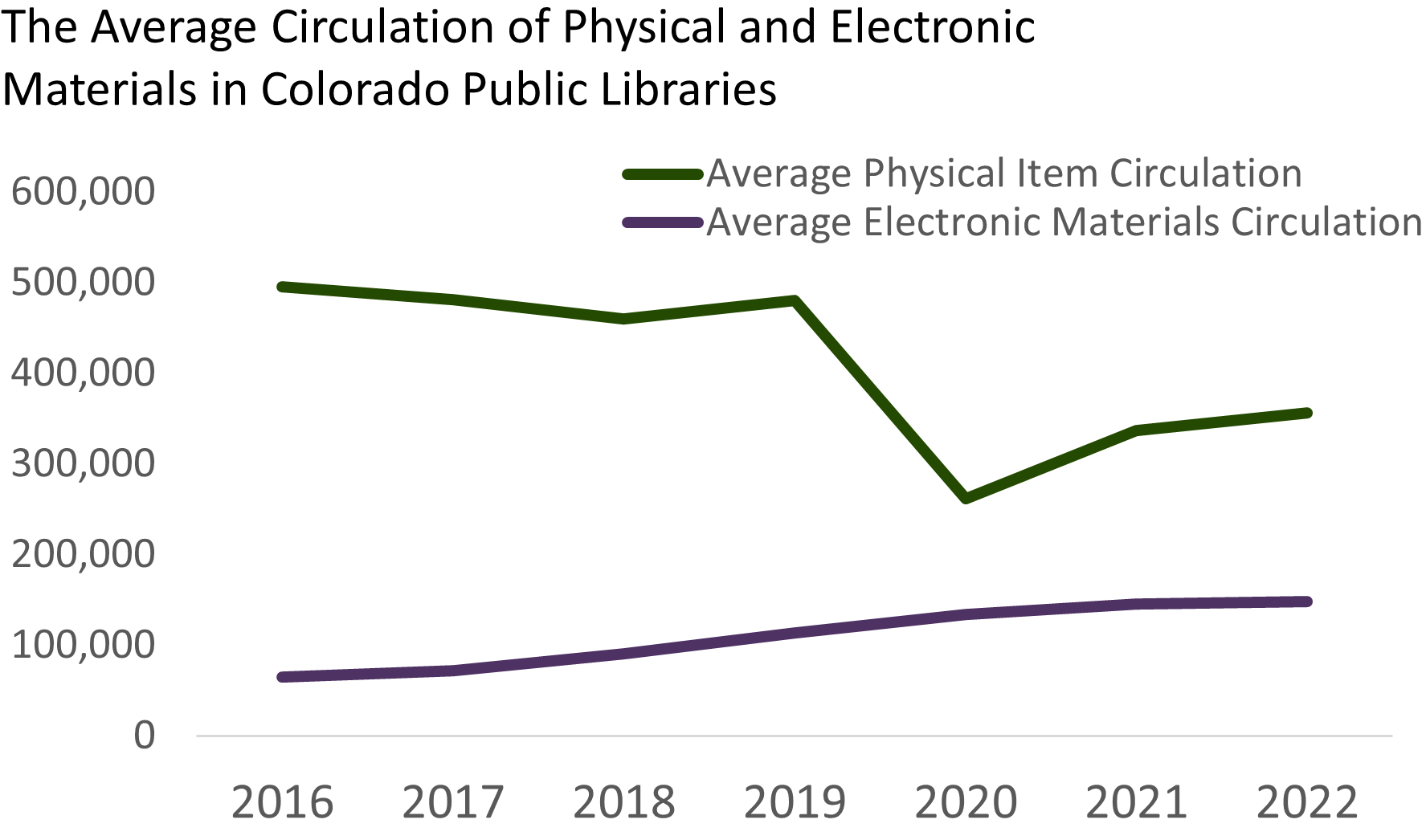
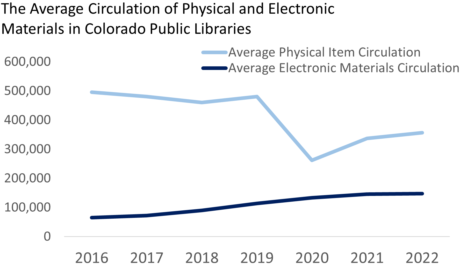
To demonstrate this, Figures D and E are the same image but Figure E has been put through the Coblis Color Blindness Simulator to show what the green and purple in Figure D would look like if you were completely color blind. It is almost impossible to tell them apart. On the other hand, the light and dark blue used in Figure F can still be differentiated in Figure G, which shows what Figure F would look like to someone who is completely color blind.
Although contrasting color values is a good tool for creating accessible charts, it is not always a feasible solution. The contrast between colors needs to be significant enough that each color can be easily distinguished from the next lightest or darkest color used, and this means that there are limited color options. Generally, it is difficult to use more than three or four values of the same color in a single chart because the colors end up being too similar to each other for both people with and without CVD to easily differentiate between them. If you are using color to distinguish between a larger number of categories in your data visualizations, you will have to be more creative with your accessible color palettes. Luckily, there are lots of online tools that help you create accessible color palettes and tools that simulate what the colors you are using look like to people with different forms of CVD.
When in doubt (always), write it out!
With a better understanding of color vision deficiency and a greater awareness of the tools and resources available, making visualizations with accessible color palettes can become second nature. Still, data visualizations need more than just accessible color palettes to ensure they are accessible to all. For instance, if your visualization is included online or electronically as an image, it will need alt text to be accessible to screen readers. Alt text should always be kept short and concise, even for charts, so you likely won’t be able to include all the information from a chart in its alt text. Alt text for a chart can tell the audience where to find more information about the chart and/or can briefly share the type of chart shown and the data the chart includes. For example, the alt text for Figure F could read, “A line chart showing the average circulation of Colorado public libraries’ physical and electronic materials from 2016-2022”. For more information on writing alt text, check out Babi Hammond’s article Common Content Accessibility Problems, Part 2: Images and Text Alternatives. Hammond is the Colorado state library’s digital experience consultant.
In addition to writing alt text, the main takeaway of the chart should also be written out in text next to it whenever possible. Try not to rely solely on a data visualization to convey a message. Explaining what you want your readers to take away from the chart in the text will help people with vision impairments and also people who learn better from text as opposed to visualizations. Including or linking to raw data also makes content more accessible. Many people will find the data visualization easier to understand, but for people who want to dive deeper into your data or people who cannot read data visualizations it’s important for the raw data to also be available.
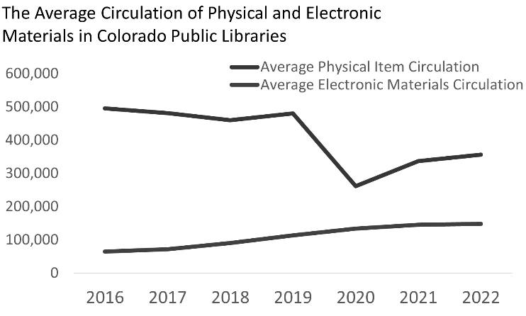
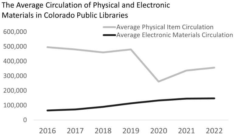
Lastly, including text and design elements other than color within a chart will make for more accessible data visualizations. All data visualizations need a title that clearly describes what the chart is showing. A title can either be a description of the chart as a whole or a descriptive statement that shares the main takeaway from the chart. Axis labels, data labels, and legends are all pieces of text and information that may also need to be included depending on what type of chart you’re creating. In addition to text, other chart elements such as patterns or icons can make a chart more accessible to people with CVD. Just as we shouldn’t rely solely on a data visualization to convey a message, we should also try not to rely solely on color within a chart for it to make sense.
So, all in all, the header “When in doubt (always), write it out!” refers to three things:
- Include alt text for charts and data visualization.
- Write out the chart’s message in text around the visualization.
- Use text, data labels, patterns, and icons wherever applicable within the chart.
Although data visualizations do, in general, make data more accessible to a larger audience, accessibility and data visualization do not always go hand in hand. Therefore, we need to take some simple steps to ensure we’re also communicating with everyone who can’t receive our message through visualizations. Although color is an instrumental component of data visualization, it is not a universal method of communication.
LRS’s Colorado Public Library Data Users Group (DUG) mailing list provides instructions on data analysis and visualization, LRS news, and PLAR updates. To receive posts via email, please complete this form.