Happy fall to the library community! The official first day of autumn is still a day away, but the air is starting to have that crisp, fresh feeling to it, so I’m celebrating early. At Library Research Service (LRS), we can also celebrate the posting of another year’s worth of library data. The 2022 Public Library Annual Report (PLAR) data is now publicly available, which means data visualizations in The Public Library Blueprints will contain the latest 2022 public library data.
The first topic we’ll explore with 2022 data is a universal concern throughout the library world: funding and expenditures. In a previous Public Library Blueprints post we explored materials expenditures per capita in relation to circulation, but in this post we’ll zoom out to take a look at total expenditures per capita and the breakdown of expenditures. The Public Library Survey divides operating expenditures into three categories: materials, staffing and other expenditures. Within materials expenditures, data is collected on expenditures for print volumes, subscriptions, e-resources, and other material expenditures.
Naturally, different types and sizes of libraries are going to have different sources and levels of funding as well as different methods for allocating funds to best meet the needs of their community, so it’s logical to wonder what these differences look like. The charts below visualize total expenditures per capita and the breakdown of expenditures per capita for rural, town, suburban and city libraries in search of an answer. Dividing expenditures by the legal service area (LSA) population of a library to calculate per capita expenditures helps account for size differences, so comparisons can be made across different types of libraries. The types of libraries we’re comparing in this post (rural, town, suburban, and city) are the locale designations which come from the Institute of Museum and Library Services’ (IMLS) Library Search and Compare tool. Before diving into the charts below, it should be noted that there are many different ways that libraries are funded including federal, state, and local funds. Although per person expenditures are presented in the charts below, this does not mean that all of the money being spent was acquired through local funding. Alright, now with these notes in mind, let’s dive into stacked bar charts and library budgets!
Understanding Stacked Bar Charts
Bar charts are one of the most common, standard types of data visualizations out there. They compare quantifiable variables between categories. A stacked bar chart adds an additional component to a regular bar chart by dividing the bar into segments, which depict the values or proportions of subcategories. They are a trendy visualization tool but also often misused, when a different type of chat would actually be better. Thinking about the end goal of a visualization will help determine whether using a stacked bar chart would be appropriate. Stacked bar charts are best at conveying general meaning through size comparisons but not specific values or differences. Stacked bar charts show both total values and the pieces of the whole at once, but doing so makes them more challenging for the audience to read than a normal bar chart. Still, a stacked bar chart is a decent choice if it’s important for your audience to quickly gain a general understanding of the distribution of subcategories that make up a whole.
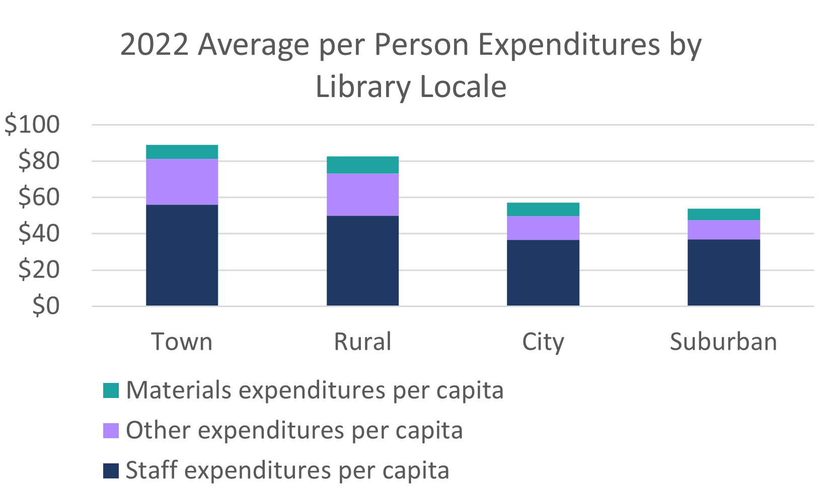
Figure A compares the average per person (also known as per capita) expenditures of the town, rural, city, and suburban libraries that reported on material, staff and other expenditures. To make this stacked bar chart easier to read, the four locale categories are ordered from highest average per capita expenditures (town libraries at $89.04) to the lowest (suburban libraries at $53.89). The top of each bar gives you an idea of overall per capita expenditures and the colors show the breakdown between staff, materials, and other expenditures. It’s easy to quickly see that town and rural libraries have higher expenditures per capita and city and suburban libraries’ expenditures per capita are lower. All library locales spend the most on staff, then other expenditures, and the least on materials. By looking more closely at Figure A, you can also see that materials expenditures per capita stay fairly steady between library locales, with suburban libraries spending only slightly less per capita. The majority of the difference in expenditures per capita comes from other expenditures, where rural and town libraries are spending over twice as much per capita as suburban libraries.
Is a stacked bar chart a good choice to represent this data? I think it’s adequate because both total per capita expenditures and where these expenditures are occurring are important pieces to the story of different budgeting between library locales. One flaw of visualizing this data in a stacked bar chart, however, is that it’s tricky to precisely compare the length of the color-coded subcategories. The first subcategory starting at the x-axis, in Figure A staffing expenditures per capita, is easiest to judge because the x-axis is a consistent baseline across locale categories. Because the other two categories build off of staffing expenditures, they do not start in the same place, making the difference between their lengths harder to judge. For this reason, it’s best to start with the subcategory that is most important to your audience. Staffing makes up over half of all operating expenditures for each library locale, so it makes sense to place it at the bottom of the stack. If the tricky comparison of offset subcategories complicates the message of your visualization, a standard bar chart may be a better alternative.
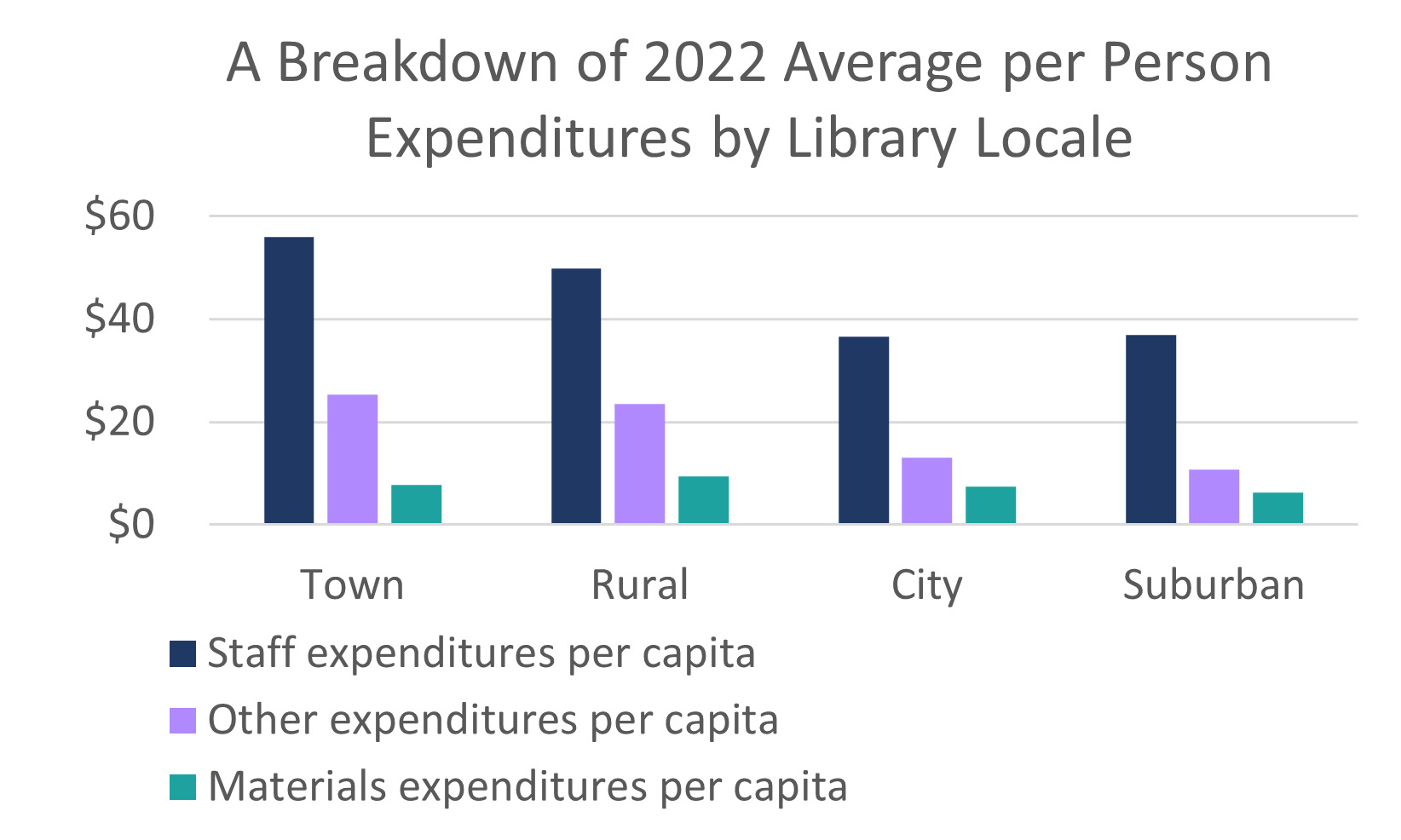
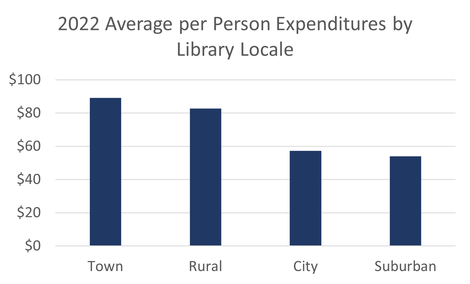
In Figure B, the same data is used to create a grouped bar chart. Using a separate bar for each expenditure subcategory makes for easier subcategory comparisons. If the difference between staffing, materials, and other expenditures per capita is the most important piece of data, Figure B is a great chart choice. The downside of Figure B is that it does not clearly show the total per capita expenditures for each library locale. City and suburban libraries have shorter bars in general, but to know what their total expenditures per capita are, you would have to add up the three subcategories. On the other hand, Figure C only shows total expenditures per capita. The simplicity of Figure C makes it easier to read, so if the total per person expenditures for each locale are the only important data to convey, it’s probably better not to bother with a stacked bar chart at all. Remember, sometimes two separate charts will tell a clearer story than squishing all the data into one chart. If you prefer the simplicity of Figures B and C but think all the pieces of data are important, using two charts may be your best choice.
100% Stacked Bar Charts
Stacked bar charts containing exact values, such as Figure A, should tell a data story in which the total of each bar is important. If your data story focuses more on the proportion of each subcategory, a 100% stacked bar chart will serve you better. A 100% stacked bar chart visualizes the data as percentages, so each bar adds up to 100% and is the same length.
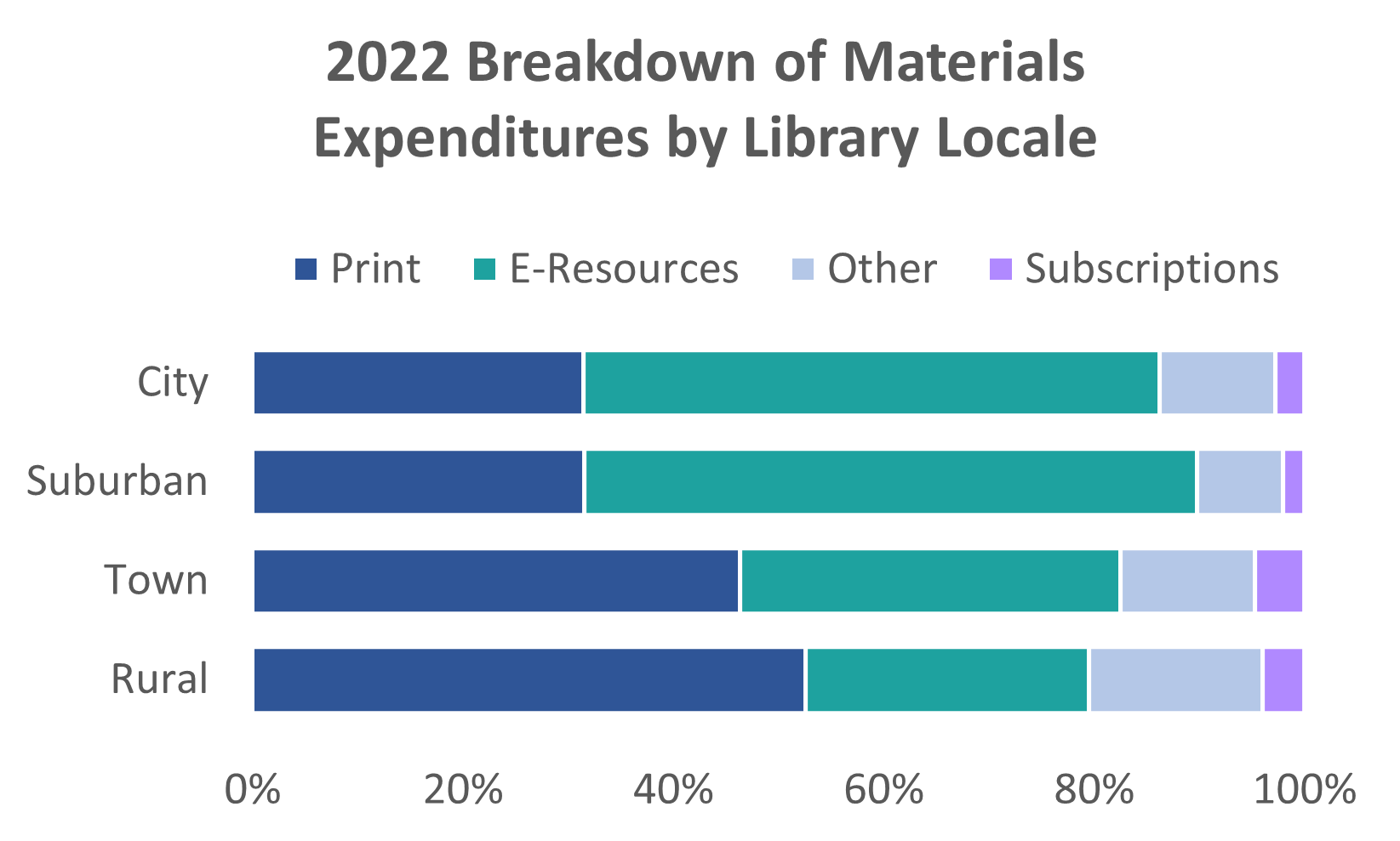
Figure D is a 100% stacked bar chart which breaks down materials expenditures by type of material and compares these breakdowns across locales. Using a 100% stacked bar chart means eliminating exact values from the visualization in favor of better displaying the proportion of each subcategory in relation to the whole. In this case, a 100% stacked bar chart is a more appropriate representation of the data because rural and city libraries have such different sized budgets, so the focus is on the percentage of funds spent on each type of material, not the exact amount of money.
Again, town and rural libraries differ from city and suburban libraries. The main difference in materials expenditures is that rural and town libraries spent the largest portion of their budget on print materials while city and suburban libraries spent the largest portion of their budget on e-resources in 2022.
To simplify and declutter Figure D, I increased the font size, removed the gridlines, moved the legend to the top of the chart and checked my color scheme with this Coloring for Colorblindness tool. I also organized the locales by increasing percentages of funds spent on print materials and added small white gaps between each subcategory to help them visually stand out from each other. You’ll also notice that in Figure D the bars run horizontally, while in Figure A they are vertical columns. Each type of stacked bar chart can be visualized either vertically or horizontally. Vertical columns may be more familiar to people, but horizontal bars can be a good alternative if your axis labels are too long to easily fit beneath vertical bars. There are so many options to play around with, so just be sure you are being intentional with your decision making to prioritize the viewing experience of your audience.
Stacking Up Your Toolkit
Stacked bar charts have raised some controversy, but understanding their strengths and weaknesses will help you determine when they are a suitable type of visualization for your data. They are better at revealing which subcategories are contributing the most to overall totals than they are at detailed comparisons. They also excel when there are only a few subcategories; color coding ten subcategories along a single bar is both challenging and confusing for readers. Likert scale data is often visualized with 100% stacked bar charts, and there are many instances when an overview of total values and the subcategories that make them up is exactly the information your audience needs. Precise comparisons between categories can be left to standard bar charts, grouped bar charts, or another type of data visualization.
As for answering the question of how different types and sizes of libraries use their funds to best serve their community, stacked bar charts comparing library expenditures by locale shed a little light on the answer. Rural and town libraries have a significantly smaller LSA population and spend more per capita, particularly on staffing and other expenditures. City and suburban libraries spent over half of their materials budget on e-resources in 2022, while rural and town libraries spent the largest portion of their materials budget on print materials. There’s plenty more PLAR data to explore to build a strong answer to this question, so we’ll return to this topic in future Public Library Blueprint posts. Libraries are funded in many different ways, and looking at where libraries have invested their funds in the past can help us better plan for the future.
LRS’s Colorado Public Library Data Users Group (DUG) mailing list provides instructions on data analysis and visualization, LRS news, and PLAR updates. To receive posts via email, please complete this form.