Happy (belated) new year, library world! This time of year I often have to hesitate a moment before writing the date and find myself asking questions such as, “What year is it again?” or “How did the holidays go by so fast?” Even when it feels like it’s flying by to us humans, in the data world time is still a reliable tool for revealing patterns and long-term trends, or even relationships between variables, as long as data is collected at consistent intervals. After a year of Public Library Blueprint posts, a standard type of chart that we have yet to tackle in detail is the line chart, so this feels like the right time to introduce it.
Line charts are for tracking data over time. Of course, the timeframe can vary, and in rare scenarios the x-axis may not have a time component at all, but patterns through time are where line charts excel. The Library Research Service (LRS) has a collection of Colorado public library data spanning from 1987-2022, so we have the data needed for many line charts. However, the public library survey has changed a lot over the last 36 years. As libraries evolve so has the data we collect about them, and consistency is incredibly important when tracking data through time. Regardless of whether data is collected over weeks, months, or years, how the data is collected each time will influence it. This includes how a survey question is worded, or even how the survey is distributed. There are public library survey questions that have been asked consistently since 1987, but it should still be recognized that data collection across 36 years will likely have a few discrepancies.
Factors Influencing Data Across Time
Consistency of the data collection and research methods across time is incredibly important and, for the most part, within the researcher’s control. However, when working with data across time, there will likely be factors outside of the researcher’s control that must be recognized and accounted for because the data can be influenced by evolving trends and historic events. Can you think of any recent, significant historical events that impacted library data? The COVID-19 pandemic probably comes to mind, and as you would expect, much of the public library annual report (PLAR) data drops off significantly in 2020, when libraries’ physical locations shut down. Of course, there are also less dramatic (and less traumatic) changes that can influence data across time. As an example, let’s take a look at public library registered borrowers from 2000-2022.
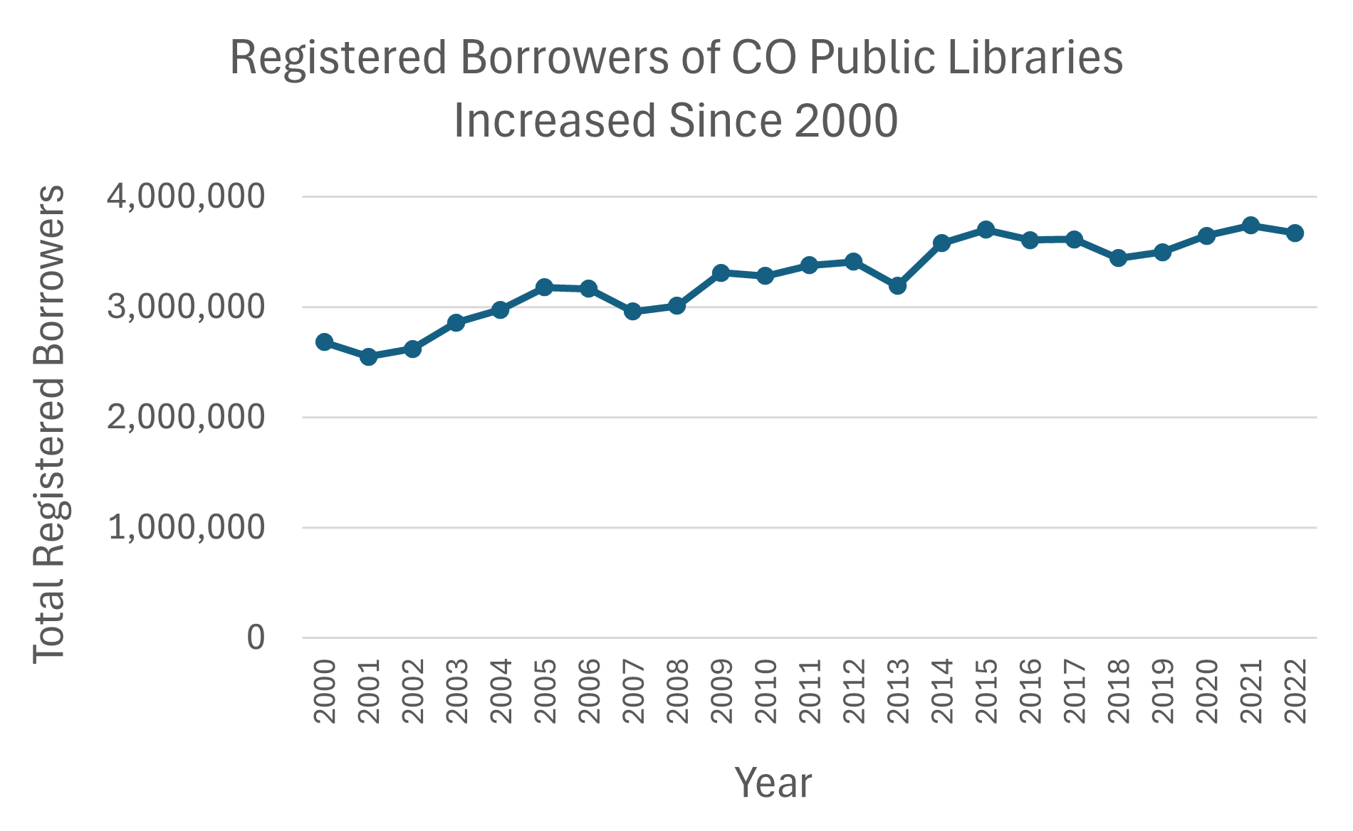
The line chart above shows that the total number of registered borrowers has increased since 2000 (the first year that we collected this data). As is typical for line charts, the time period is represented along the x-axis, and the variable (total registered borrowers) is tracked along the y-axis. The line shows ups and downs in the number of registered borrowers but also that the general trend has been an increase, which is good news for libraries! This line chart doesn’t clearly depict exact values, but it does allow us to identify the trajectory of the data to predict where future data points will land, which is a strength of line charts.
Before making predictions, let’s take a closer look at this data so as not to draw conclusions from Figure A without the whole story. In 2000, the total number of registered borrowers was 2,683,278 and in 2022 it had increased 37% to 3,670,400. From this information we might assume that interest in libraries has increased. This isn’t necessarily wrong, but for a more accurate interpretation we should consider what else has changed over this time that may impact these numbers; the population of Colorado has also increased. In fact, the legal service area (LSA) population of all Colorado public libraries has increased 38% from 2000-2022. This information gives us the context needed to understand that the number of registered borrowers, while on a positive trajectory, might be due to the increase in population rather than increased awareness of the library.
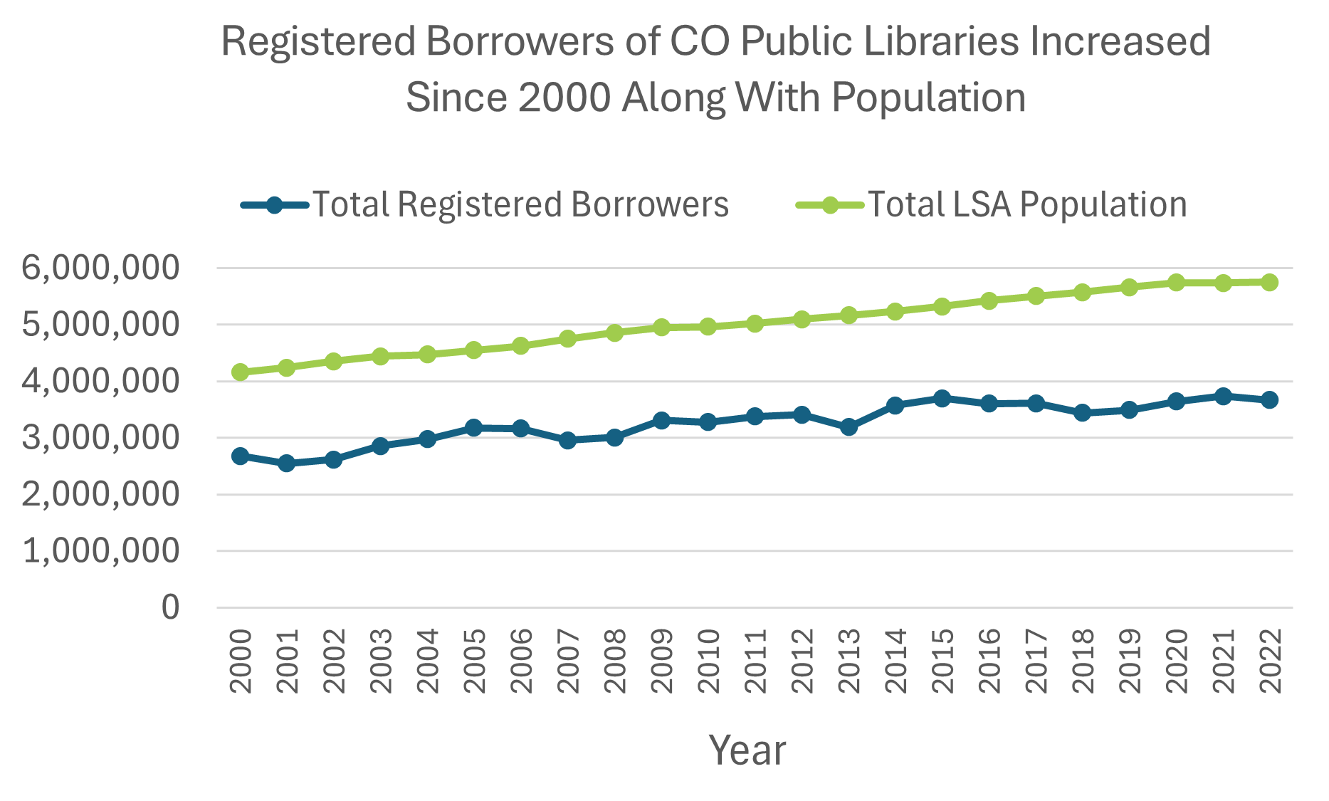
In Figure B, LSA population and registered borrowers are charted together to visualize the relationship between them. The trajectory of total registered borrowers appears flatter than in Figure A because the range of y-axis values has increased to include total LSA population values. In other words, because the y-axis now extends to six million, the growth of registered borrowers appears less significant at first glance. This comparison also tells a different story than Figure A because it shows that the gap between LSA population and registered borrowers has actually increased slightly from 2000 to 2022.
It should be noted that total registered borrowers is a tricky number to pin down. A family could all use one library card, or one person could have multiple library cards at different libraries. There are also borrowers from outside of LSAs included in this count, and the program Colorado Libraries Collaborate (CLC) allows registered borrowers of one library to also borrow materials from other CLC member libraries. Nevertheless, as mentioned earlier, the strength of line charts is to show patterns and trends rather than exact values. Looking at Figures A and B together reveals how a chart’s axis range and the information included can influence a chart’s message.
Evolving Towards Audio and Electronic Items
Line charts often show relationships between subgroups of a variable. For example, Figure C charts print volumes and audio, two different categories of library collections.
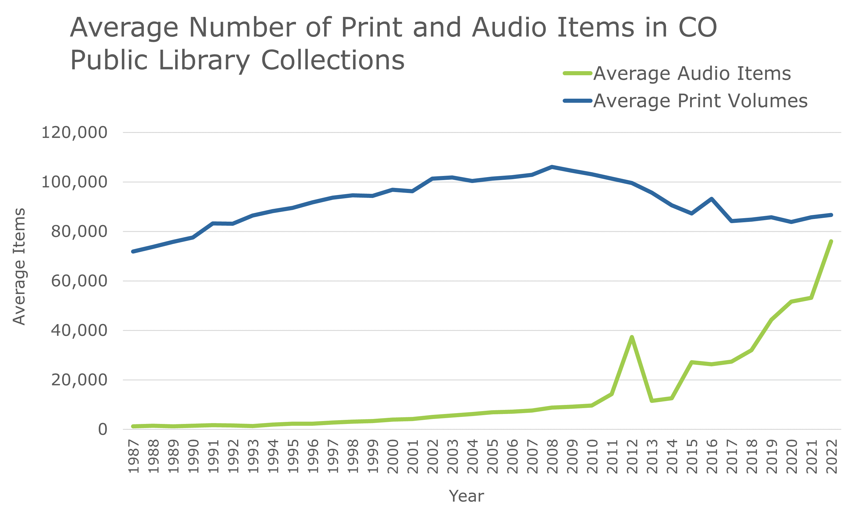
The number of lines that can be placed on a line chart varies depending on the relationship between each category. For example, print volumes and total audio items work well on a single line chart because their relationship is clearly displayed in Figure C. Audio items and print volumes started with vastly different averages in 1987, but since audio items began to increase rapidly in the 2010s their averages have almost converged. It will be interesting to see if audio items surpass physical volumes in the years to come. On the other hand, ebooks, audiobooks, and music charted in Figure D (outlined in red) do not all fit well on the same line chart together.
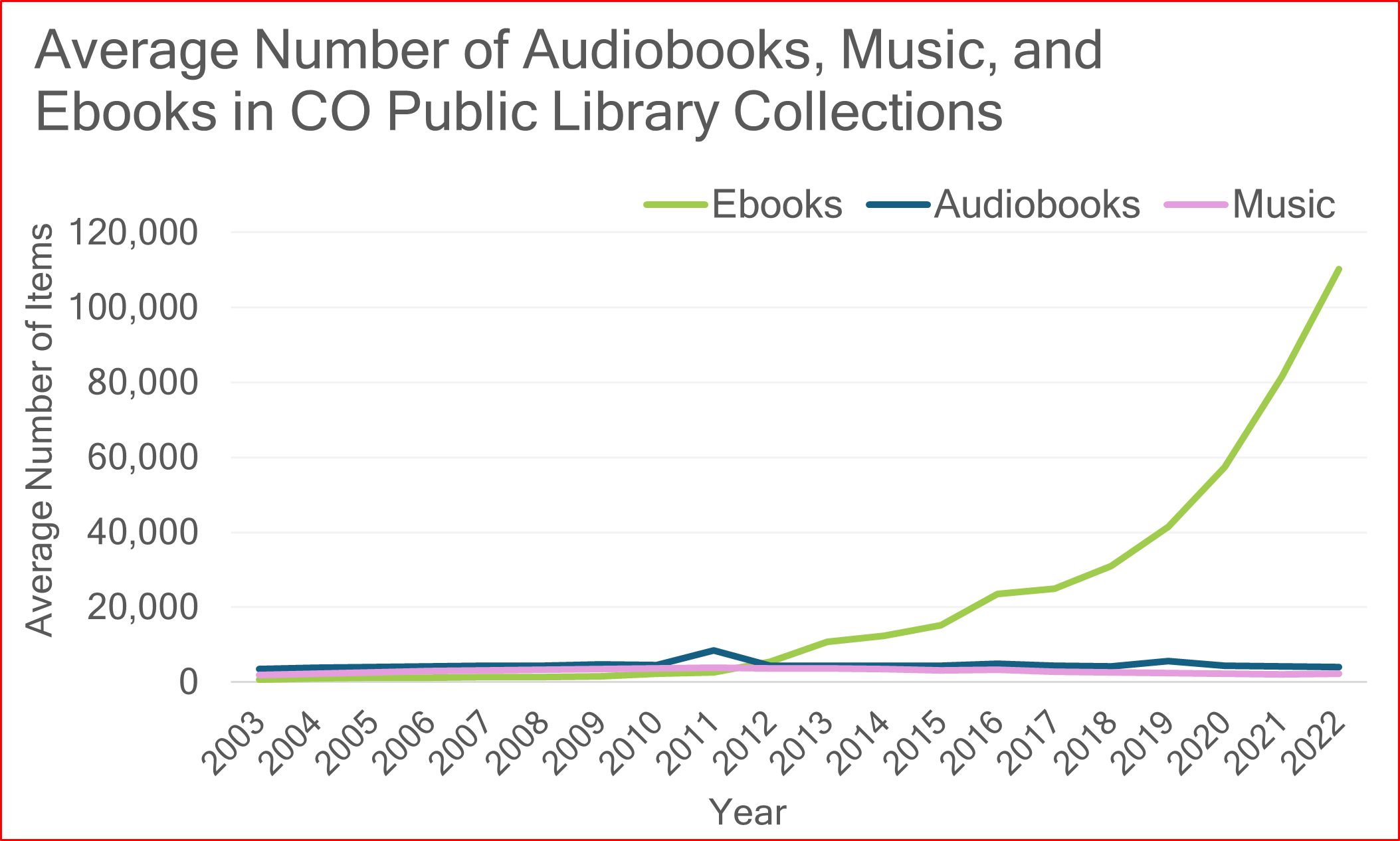
In Figure D, the average number of ebooks grows so large that the y-axis range makes the values of audiobooks and music difficult to meaningfully differentiate from each other. It’s also hard to see that ebooks start out with an average significantly below both audiobooks and music because the lines are all packed together for the chart’s first eight years. If ebooks were not included in this chart, the y-axis range could be shifted to reveal the difference between music and audiobooks. If the priority was to show the relationship between audiobooks and ebooks, then music could be removed from the chart entirely. Three lines is not necessarily too many to include in one chart, but each line should add clarity to the chart’s message, not complicate it.
That being said, counting and comparing materials is complex, particularly when it comes to downloadable and electronic items. Multiple libraries participate in consortiums with access to the same electronic materials and the number of checkouts allowed per item is yet another factor to consider. It’s for this reason that Figures C and D show the averages of materials across Colorado public libraries instead of comparing total counts.
Details and Design
Many stylistic design choices went into the line charts above. For instance, Figures A and B include dots along their lines for each data point, and Figures C and D do not. These dots can help the reader’s eye connect where the data point falls along the x and y-axes, but they can also clutter the graph if there are too many data points. Each of the line charts above show data points collected annually, but different data will have different intervals, such as weekly or monthly data collection. Charting shorter intervals shares more detailed data, but in some cases this is not necessary to show patterns in the data. For example, if data points in Figures C and D were only marked every two years the chart would still reveal the same trends. Choosing the right time interval and how many data points to chart will depend on the goal of the project and the data collected.
Simplifying large data sets is a strength of line charts, so it’s best to let them shine by keeping them clean and to the point. Including too many lines or two y-axes (also known as a dual axis line chart) can be misleading. There are also alternative versions of line charts, such as area charts, that we will build in future posts. As one of the most common types of data visualizations, there is a lot to discuss about line charts, so you can count on more line charts from PLAR data down the road. In the meantime, we hope this post has provided some insight into visualizing Colorado public library changes through time. If there’s a piece of PLAR data that you would like visualized in a line chart, please don’t hesitate to reach out to lrs@lrs.org. Thanks for reading!
LRS’s Colorado Public Library Data Users Group (DUG) mailing list provides instructions on data analysis and visualization, LRS news, and PLAR updates. To receive posts via email, please complete this form.