Hello again, data folks! I’m excited to introduce a type of chart that we haven’t yet touched upon in The Public Library Blueprints – the histogram! Histograms are a great tool for data analysis because they visualize the distribution of a single variable to help us understand the spread of the data. Because they also use bars to indicate values along a y-axis, histograms can be easily confused with bar charts. The big difference is that bar charts may present categorical data or two variables at once along the x- and y-axes, while histograms chart the distribution of one continuous variable. Statistics Canada provides a helpful refresher on the terms “variable,” “categorical,” and “continuous” if this terminology is tripping you up.
To demonstrate the difference in this post, we’ll use histograms to analyze the amount of time library outlets were open to the public in 2022. A bar chart could depict the average number of hours Colorado public libraries were open to the public by grouping libraries into distinct groups, such as by Legal Service Area (LSA) population, and then using the height of each bar to show the average number of hours each library group was open. However, we’re just going to focus on the distribution of average hours open per week, without additional variables, so it’s a histogram’s time to shine!
A histogram will visualize the spread of average hours open to the public by creating groups, called bins, from the range of average hours libraries were open and then charting the number of libraries that fall within each bin along the y-axis. We might predict this data to have a symmetrical normal distribution, which would mean most data fall around the middle of the range, and the frequency of data points decreases at higher and lower time frames until they peter out on either end with a couple potential outliers making a bell-shaped curve. Later in this post, we’ll see whether this prediction is correct.
Prepping the Data
There are 271 central or branch public library locations in Colorado and of these, 268 reported their total annual operating hours and are included within these charts. After removing the null data, I divided each remaining libraries’ annual operating hours by 52 to calculate their average hours open to the public per week because this is easier for most people to comprehend. After I gathered and cleaned the data, I used Excel to generate a histogram of average hours open per week for each central and branch library that reported operating hours in 2022. I added a title and axis labels to this histogram to make Figure A, a chart which is technically accurate but definitely needs improvement.
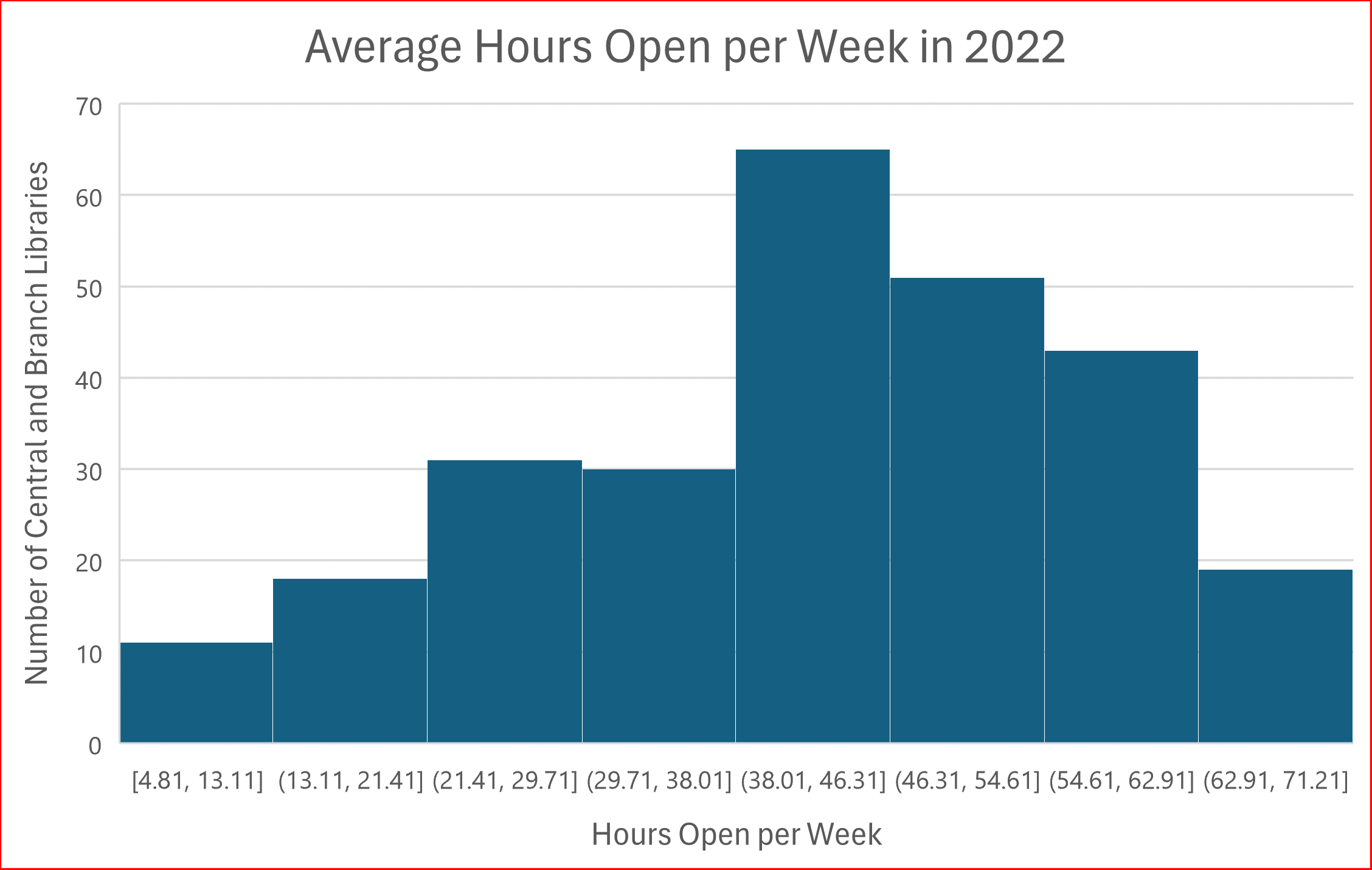
Figure A shows the distribution of hours open per week in 2022 by grouping the hours into 8 bins along the x-axis, starting at the minimum of the data set, 4.81 hours. Each bin has a bar showing the number of libraries that fall within that bin along the y-axis, and each bin has a width of 8.3 hours. One reason Figure A needs more work is that Excel automatically started the bins at the decimal 4.81, and each bin after that is also set at numbers with decimal places. This histogram would be much easier to read if the bins were divided by whole numbers, so that is one of the first things I worked to fix.
Adjusting Bin Width
Excel allows users to set the number of decimal places included on the x-axis, but due to rounding, changing this setting to 0 decimal places caused the 8 bins in Figure A to be uneven. For example, some bins had a range of 8 (13-21) while some bins had a range of 9 (21-30). It’s best practice for all the bins in a histogram to be the same size, but exceptions can be made for the lowest and highest bins when outliers in a data set make this difficult. In Figure B, I used Excel’s “overflow bin” and “underflow bin” settings to count all the libraries that were open for an average of over 65 hours per week (15 libraries) in the highest bin and count the libraries open less than or equal to 5 hours per week (one library) in the lowest bin. It’s important to note that designing the lowest and highest bins this way will hide outliers in the data, so if outliers are important to the audience this is not a helpful visualization technique. After setting the lowest and highest bins, I divided the 60 integers between 5 and 65 into evenly sized groups of 10 to make 6 middle bins, for a total of 8 bins like Figure A.
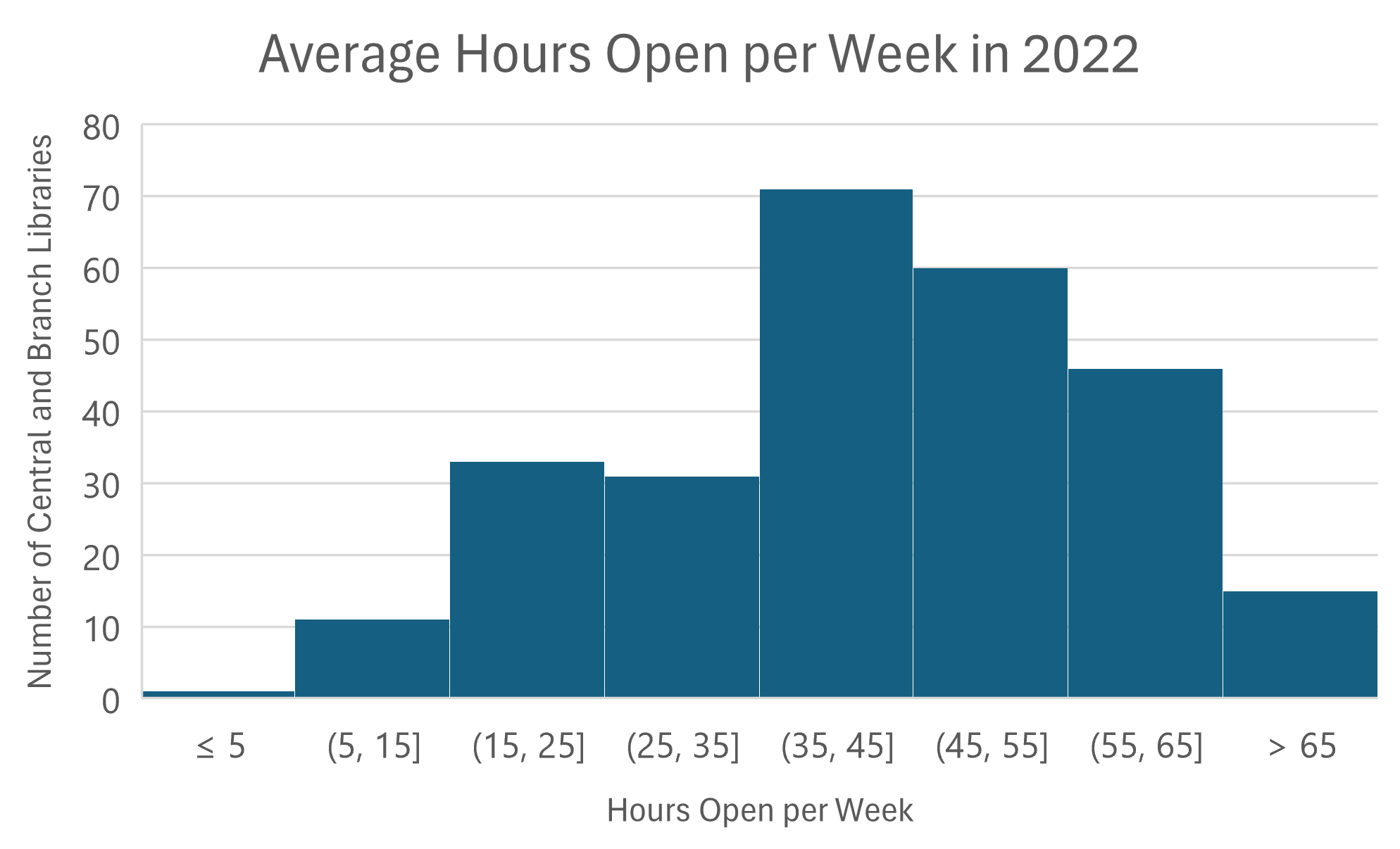
Figure B looks much cleaner than Figure A because it uses whole numbers to define the bins, and the bins count up by 10 which is an easy number for us to compute. Many of us understand hours per week in relation to the 40-hour work week, and Figure B shows us that the highest number of library outlets (71 libraries) falls within the bin of 35-45 hours open per week. This bin contains 26% of all central and branch libraries.
Because Figures A and B both have 8 bins, they show similar perspectives. Since the bins are grouped slightly differently there are subtle changes, but both charts give the reader generally the same information about the distribution of the data. The data’s distribution is similar to our earlier prediction, but it is skewed a little to the right and, interestingly, two more library locations were open 15-25 hours per week (33 libraries) than locations that were open 25-35 hours per week (31 libraries). Although Excel automatically created 8 bins, we can adjust the number of bins to see what effect it has on the data’s distribution.
Trying Different Numbers of Bins
The bins along the x-axis can be set up in many different ways, and changing the number of bins can have a big effect on the chart’s look and message. Many statistical equations exist to help determine how many bins you should use, and although I suggest checking them out when making your own histogram, we don’t have the space to discuss the pros and cons of each equation in this post. Using one of these equations is not required, and Statics How To also shares some helpful guidelines for choosing the number of bins in a histogram. It’s suggested to use between 5 and 20 bins, and the larger your data set the more bins you will likely want to use. One simple strategy outlined by multiple sources online is to take the square root of the total number of data points and round it to a whole number. For example, the square root of 168 is ~12.96, so (rounding up) this method suggests using 13 bins for this data set. Let’s take a look at what a graph with 13 bins looks like.
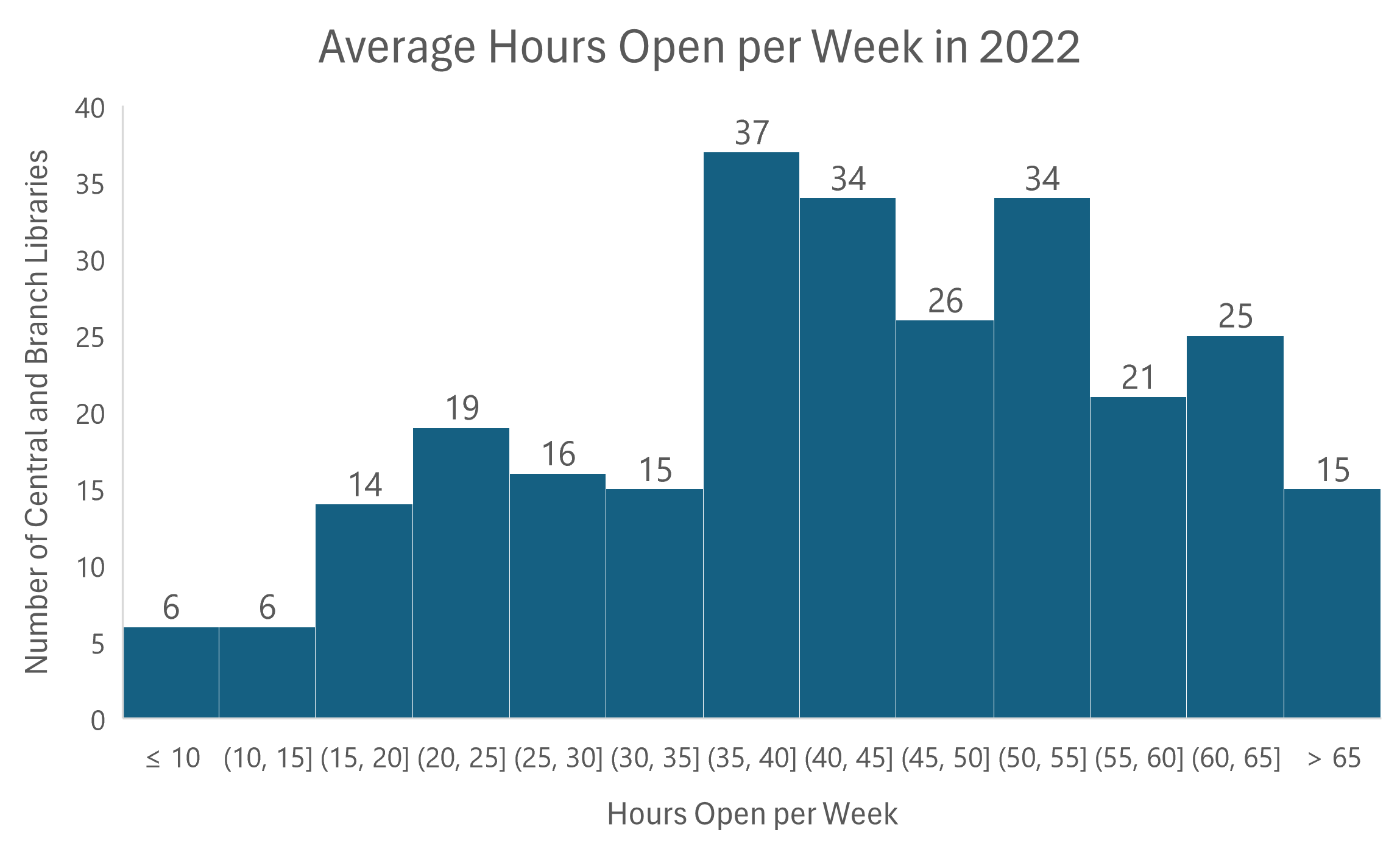
Using 13 bins in Figure C shows more detail in the data’s distribution. Notice that the y-axis only goes up to 40 because with more bins there is a smaller number of library locations within each bin. I also replaced the gridlines with data labels for clarity. This view could be useful if, for example, the detailed distribution of libraries that were open between 10 and 30 hours per week on average was important. There are many reasons why it may be helpful to use more bins to show the distribution of your data in more detail, but if you can meet the chart’s purpose with a smaller number, less bins will make for a simpler, cleaner chart. For example, if the audience just wants to know how many libraries are open over 59 hours per week then Figure D (below) gives a straightforward answer.
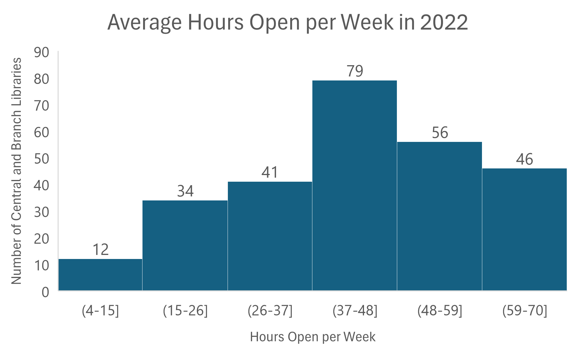
In Figure D, the highest bin shows the number of libraries that are open over 59 hours per week. Although the bin is labeled 59-70, the parenthesis before 59 means that 59 is the edge of that range but is not actually included within that bin. The bracket after 59 in the second highest bin’s label indicates that 59 is included within this second highest bin. This is true for each chart in this post. Also, like each of the charts above it, Figure D shows that this data set generally acts as predicted–the highest number of library locations is near the middle of the data set, but the data set is skewed towards higher hours per week. More libraries are open over 48 hours (102 libraries) than are open 37 hours or less (87 libraries) on average per week.
Although histograms are relatively simple charts, they can be difficult to build because the builder must determine the number of bins and bin size that is most useful for their chart. Figures B, C, and D could all be the correct histogram to use depending on the purpose of the visualization. On the other hand, if the goal was to visualize a detailed distribution of libraries that are open 60 or more hours per week, then none of these histograms may be useful. These histograms are also set up with evenly sized bins that start and end with whole numbers, but this isn’t always a simple task. Knowing the number of data points in the set and the purpose of the visualization as well as the maximum, minimum, and range of the data set are all crucial to determining the number of bins and bin width to use. It took time and patience to ensure that each of the charts above had the preferred number of equally sized bins.
A Brief Recap
To review, we’ve looked at four different histograms in this post, and that is just a small fraction of the many ways a histogram of this data could be set up. Figure A shows what a histogram initially created by Excel might look like, and Figure B is an example of how you can combine Excel’s suggestions with some of your own data analysis to make a clearer histogram. Figures C and D are examples of how this data set’s distribution appears with different numbers of bins. After taking a look at each of these charts it becomes clear how histograms with more bins will answer more detailed questions about your data set, but histograms with less bins can still be informative while eliminating details that might be unnecessary. The key to histograms is to find the right balance for the spread of your data!
LRS’s Colorado Public Library Data Users Group (DUG) mailing list provides instructions on data analysis and visualization, LRS news, and PLAR updates. To receive posts via email, please complete this form.