May 2025
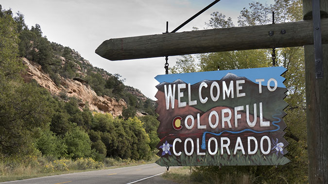
Read up on the recent changes to the Tourism Community Library designation and why this grouping exists in Colorado.
Read up on the recent changes to the Tourism Community Library designation and why this grouping exists in Colorado.

An LRS tool can help you track down community data and test your knowledge.

How much value do you receive from your library for every $1 dollar you invest to help keep it running?

LRS has combined the boundaries of all Colorado public library systems onto one map using the latest data available.

Take a sneak peek at the exciting new tools LRS is building and learn how to map out data unique to your community.

Using tools discussed over the last two years of posts, we’re wrapping up this year by introducing data storytelling!

Comparing Colorado’s PLAR data to national reports can reveal valuable insights, but one must be careful when doing so!

These word clouds reveal the 23 languages reportedly used by Colorado public library staff to communicate with visitors.

Discover what library staff are achieving across the nation to grow digital equity despite the obstacles they face

Explore the many ways that Colorado public libraries are funded and the factors to consider when working with this data.